Corporate events and execution of KPI plans in Excel
An example of the report on correlation of efficiency of corporate events and fulfillment of the plans by key KPI on the dashboard in Excel. Download a ready sample template for presentation of the report and visual analysis at the end of the article. But first let's consider all the principles of its functional, interactive features in data visualization.
Corporate action plan and KPI
"The staff of a successful company is first and foremost a team, not a collection of individuals" - Lee Iacocca. To build a strong company it is important to unite its employees into one team with clearly defined goals and objectives. Along with the growth of the company its internal corporate culture is formed, which is fully responsible for the non-material motivation of employees. For this purpose, it is necessary to hold regular corporate events:
- Present the contributions of the employee team to the company's achievements.
- To broadcast the values of forming a corporate culture.
- Create conditions for team building and team building.
- Develop internal communications.
- Identify potential formal and informal leaders.
- Adapt and motivate newcomers.
- To simply entertain with themed recreation for employees.
But it is equally important to analyze the effectiveness and efficiency of corporate events on the impact of employee activity on the company's key growth indicators. To do this, it is best to use data visualization tools. After all, the level of motivation of employees cannot be calculated by cold, precise calculations. Therefore, by applying data visualization as a solution tool for the analytical task at hand, the result is the best benefits:
- Timely identification of trends to control or change the course of the strategy.
- Increased motivation to achieve the goal through visualization.
- Strengthened belief in the outcome.
- Convenient and comfortable environments with interactive options for analyzing key metrics.
One such budget-friendly solution is an example of a dashboard for visual analysis of a corporate events report in Excel.
Terms of Reference for data visualization in Excel
By tradition, we will first simulate the situation to illustrate the practical use of the dashboard and get acquainted with its principles of operation.
Throughout the year the company held monthly corporate events on different days of each month. As a result, at the end of the accounting period it is necessary to analyze the effectiveness of the corporate events program. And also to determine their influence on four key performance indicators of the employees and the enterprise as a whole:
- Dynamics of change in sales volume.
- Dynamics of meeting monthly and daily sales plans.
- Customer outreach conversion rate into leads and deal closures.
- Employee key performance indicators (KPIs):
- reaches;
- offers;
- leads.
For fastidious analysts, there is an option to sample data in any range of period within a month. This will allow you to analyze in detail the daily changes before and after the corporate event for all the key indicators.
Stages of dashboard visualization
Let's consider step by step the structure and principles of data visualization on the dashboard with interactive functions of comfortable analysis.
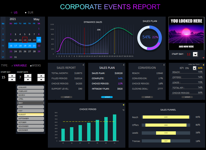
On the left is the control panel block with an interactive visual calendar:
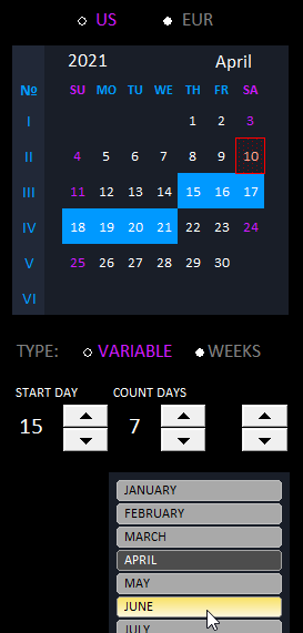
At the very top is a switch between calendar formats (U.S. and European). Below the calendar is a second switch between data sampling modes. Variable (for random period sampling) and Weekly (for convenient weekly data sampling).
Below are 3 sampling controls. The first two counters indicate the beginning and end of the sampling period within a month. The last counter is a switch by week numbers 1-6 (I-VI). It is active only when you switch to the appropriate mode with the switch above. When you select the specified period, the selected days of the month are automatically highlighted in blue on the calendar.
The switch between months is located under the controls of selecting data for any period.
In the center of the upper part of the dashboard there is a block of visualization of the main values of the indicators:
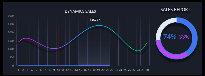
This block consists of two parts of visualization: absolute and relative values.
The right part of the absolute values shows the dynamics of sales. And also the sampling ranges (purple bar from day 15-21 of the month inclusive - total of 7 days) and the range from the beginning of the month to the end of the selected period (blue bar of the period from 1-21 inclusive with a sampling period of 7 days).
The right side shows the relative values depending on the selected one of the four reports using the switch below. The selected periods are also shown here, colored accordingly.
Important note! The purple portion is colored blue around the edges because the selected period (15-21) is nested within the initial period (1-21).
Looking at the image above its data visualization should read like this: the period from days 15-21 of the month accounts for 33% of sales, namely $15795. A total of 74% of the data is selected from the beginning of the month, respectively, from the beginning of the month to the beginning of the sample is 41% of sales (74%-33%), and at the end of the month after the sample is 26% (100%-74%).
A concise approach is taken to display the data with a minimum number of captions on the charts, so as not to turn the visualization into information garbage.
The red bar against the 10th of the month is the date of the corporate event. It is tied to the third upper rightmost block and is also visible on the visual calendar. A holistic picture of the top of the visualization on the dashboard allows you to clearly identify the date:
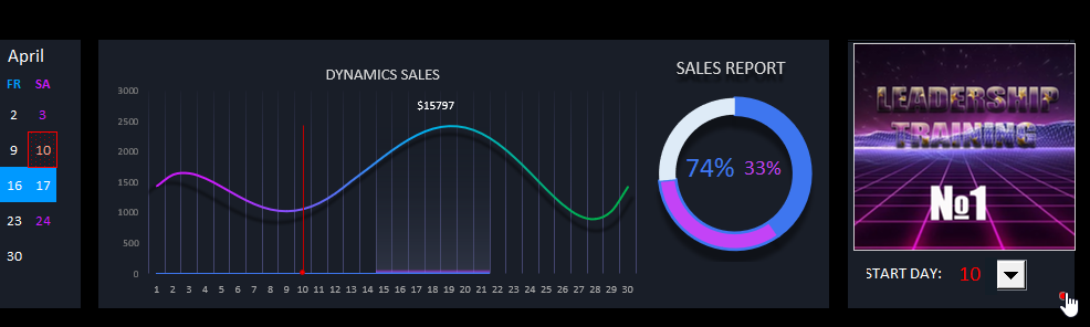
In the upper right block, the promotional banner of the corporate event held and the day of the current month are displayed. The day with the corporate event is displayed on all three blocks:
- On the visual calendar, the number is circled by a red square.
- On the sales trend chart, a vertical red bar.
- The red number opposite the drop-down list.
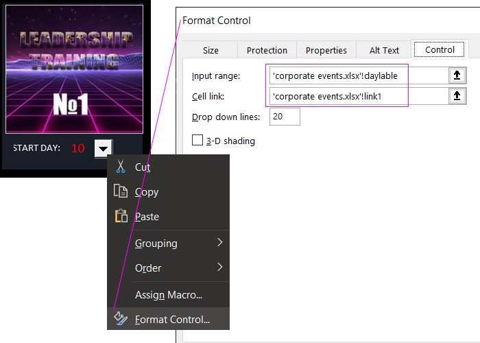
You can use the "drop-down list" control to change the date for the experimental visual analysis. Moreover, the date of change is saved when you switch to the next month.
Useful tip! This technique of dynamically changing values in different cells of a particular range has been implemented in Excel through the use of dynamic named ranges. The references to the named ranges should be written in the fields for filling in the links to the values of the control of the drop-down list, as shown in the picture below:
Using the switch in the lower right corner of the third block (in the form of a red round button), you can disable/enable the date display of both the vertical bar on the chart and the red number outline on the visual calendar.
Below are the 4 report summary boxes for the main key indicators with the above toggle between them:
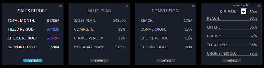
Each report has its own round toggle button in the upper right corner to display auxiliary objects on the main chart. This is convenient for detailed analysis by data visualization tools:
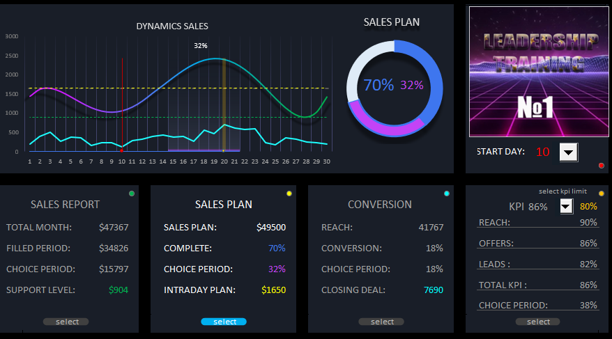
As you can see in the figure, when you switch between reports, the function of the right side of the main central block changes. Now the diagram visualizes the percentage of sales plan fulfillment. Namely, in the period from 1-21 70% of the monthly sales plan was fulfilled. For the detailed analysis, the period from 15-21 is chosen in which 32% of the monthly sales plan was fulfilled. The daily sales plan is at $1650.
In order not to burden the data visualization with a large amount of information at once, you can selectively turn them off with the switches in the upper right corner of each block with the corresponding color.
Each of the 4 blocks corresponds to the 4 indicators, stipulated above in the TOR (Terms of Reference). But the last block of KPI should be considered in more detail.
How to plan the KPI for the personnel of the enterprise?
Before we calculate the KPI (Key Performance Indicators), let us briefly remind you of its main purpose. In order to do so let us answer a simple question: Why do we need KPIs if we have a sales plan? It is very simple - there is no more false reporting of sales than in money. For example, sales growth can be artificially inflated like a financial bubble. All the auxiliary tools of the trade can be used to do this:
- discounts;
- installments;
- product crediting;
- free delivery, etc.
As a result, the sales plan is fulfilled, revenue is growing. BUT! Already in the medium term, profits decrease, working capital decreases, accounts receivable and returns of overdue goods increase.
That is why it is so important to use KPI, which is aimed not at the amounts of money as a result of sales, but at the results of the tasks set for the employees of the company. For example, drawing up and distributing offers to potential customers through specific communication channels, surveys, interactions, consultations and presentations for the target audience and other similar key tasks directly affecting the company's performance.
Helpful Tip! Financial philosophers who speak at corporate events also recommend to focus not on results and end goals, but on specific actions leading to achievement of the target results. Planned segmentation of tasks into subtasks, keeping actions sequenced, etc.
The salary should consist of two parts:
- Monthly salary.
- KPI bonus of two levels:
- lower level bonus coefficient up to 100% KPI plan fulfillment - in which case the bonus will be paid with a decreasing coefficient (for example, if 80% plan fulfillment on a key indicator is paid 80% bonus, 70% plan = 70% bonus, and less than 70% bonus is not paid at all);
- top level bonus coefficient of over 100% - a bonus will be paid with an increasing multiplier (e.g. 110% over-fulfillment of the plan = 110% of the bonus and the maximum ceiling ratio of 120%).
Note! On block 4, you can control the levels of the lower limits of the KPIs. In this example, the lower bonus limit level is set to 80%. That is, if less than 80% of the total KPI plan is met, no bonus is paid, only the salary. The lower level can be dynamically changed directly on the header if necessary. Using the interactive drop-down list control. Also on the chart, the orange vertical line indicates the day on which the lower limit of the KPI bonus has been reached. Specifically the 20th of the current month:
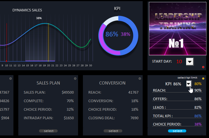
It is very useful to use for financial analysis and planning of personnel remuneration strategies under certain conditions.
Useful tip: In practice it is not recommended to use more than 3 key indicators for drawing up KPI plans.
It is worth noting that when drawing up plans on KPI, bonuses for performance can be averaged out KPI (as in this example). Or separately specify for each key figure its own lower limits and bonus coefficients both for decreasing and increasing levels of bonuses.
Detailed visual analysis for the selected data period
There are 2 more boxes located at the very bottom of the dashboard where the detailed visualization of the indexes within the chosen data period of the current month is represented:
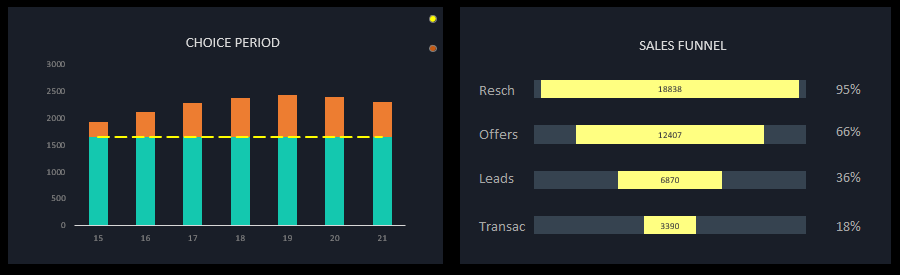
On the left (CHOICE PERIOD) the sales data presented. The level of daily sales plans and their over-fulfillment.
On the right (SALES FUNNEL) you can see the detailed sales funnel conversion chart with the relative values of each stage of the funnel. Also only by selected period.
It is worth noting that the period range for sampling data can cover an entire month. Therefore, the same two blocks can also be applied to the overall analysis for the current month.
All blocks are harmoniously combined into one big data visualization picture on the Excel dashboard:
 Download corporate KPI action plan in Excel
Because of its functionality, this data visualization template has greatly reduced its versatility of practical application. Not all of its features are suitable for most businesses, but it is quite possible to use it as a Terms Of Reference (TOR) for similar future projects in Power BI and other visualization development environments. Without the ToR, the result is XZ! This example contains no macros, is password-protected, and is free to use for any purpose. You can modify and improve the template to suit your needs. The raw data is traditionally filled in on a separate "Data" sheet.
