Example of creating simple interactive Map Chart in Excel
The interactive map tool in Excel is very useful for companies that know how to scale and build their networks of offices and branches. Just as any market strives for monopoly, any business strives for market expansion. That's why so many tools have already been created for Excel to visually analyze the effectiveness of a company's scaling and branch interactions. Both standard solutions and extensible with third-party plug-ins. All of them have a lot of functions, settings and parameters, which on the one hand expands their capabilities, but on the other hand complicates their use. In this example we offer you the easiest solution for building an interactive Map Chart in Excel. Simplicity ensures reliability.
Developing your own interactive Map Chart for data visualization in Excel
To implement this task, we will use the additional application MS PowerPoint, which is included even in the minimum package of MS Office Home. Although you can do without it. Here the choice is yours, first the essence, and then you judge for yourself. The main thing we need to draw or download the point map of the area to be analyzed. In this example, it is a point map of the United States:
Similar maps are very easy to find on the Internet in vector image format. In this example, a point map of USA is drawn from 2040 points. They can be grouped together, but it is much better to combine them into one figure in MS PowerPoint for further work. To do this:
- Select all the dots by first selecting one and pressing the hotkey combination CTRL+A.
- Copy CTRL+C and paste into PowerPoint CTRL+V.
- Combine all the points into one complete shape by selecting the tool: Shape Format → Merge Shapes → Union:
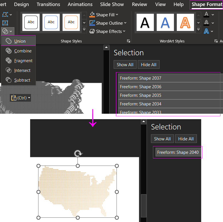
The result is a single point map figure of the United States.
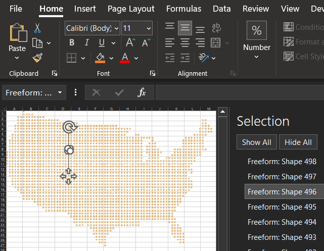
Highlighting cities and branches on the Map Chart by condition
Now we need to prepare the Map Chart for the possibility of interactive highlighting. To do this, we should make holes or simply remove unnecessary points in certain pestles. For example, where geographically there are branches or just zones of influence of cities, it all depends on the specific requirements for the developer of visualization data in Excel.
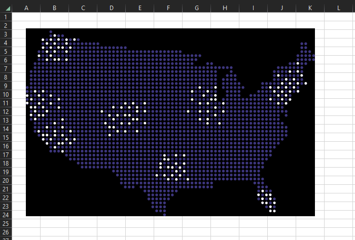
To remove unnecessary points, we will need a new circle shape with the same dimensions as a single point. Set the circle shape to subtract one point at the desired location. Select both shapes and use again the Shape Format tool → Merge Shapes. Only this time, select the Fragment option to remove one fragment on the original point shape. Repeat these actions until all unnecessary points are removed. The result should be something like this:

The map is now perforated for our needs.
It is important to note that this task could have been solved by other methods. For example, initially not to select unnecessary points at the stage of combining them all into one figure of the point map. Or to make perforation not by one point but by a preliminary united group of points. But it was important to show in this example the possibilities of editing vector shapes in MS PowerPoint which are absent in MS Excel. And they are very useful in applications for the development of data visualization.
Preparation of chart background
Next we need to create another perforated figure in MS PowerPoint. Specifically the background on the back of the map. But with the holes of the selected points where branches or cities are located. Create a black rectangle figure with the same dimensions as the map and by the same method of fragmentation subtract circles in the corresponding places. It is necessary to achieve a similar result as in the picture below:

Now it is not difficult to guess on what principle the interactive highlighting will be implemented with the ability to expose selected areas on the map with color.
The highlighting will be performed according to the user's condition, defined in the values of the cells of the initial data tables. But first, let's combine the two cant and background shapes into one group and transfer them to the Excel worksheet:
There can be several ways to implement interactive highlighting of our Chart:
- Conditional formatting. For example, when the cells in the map area are colored in the background, and the cells that are below the exposed points use conditional formatting:
- With a TextBox shape with a reference to the content cell:
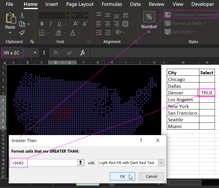
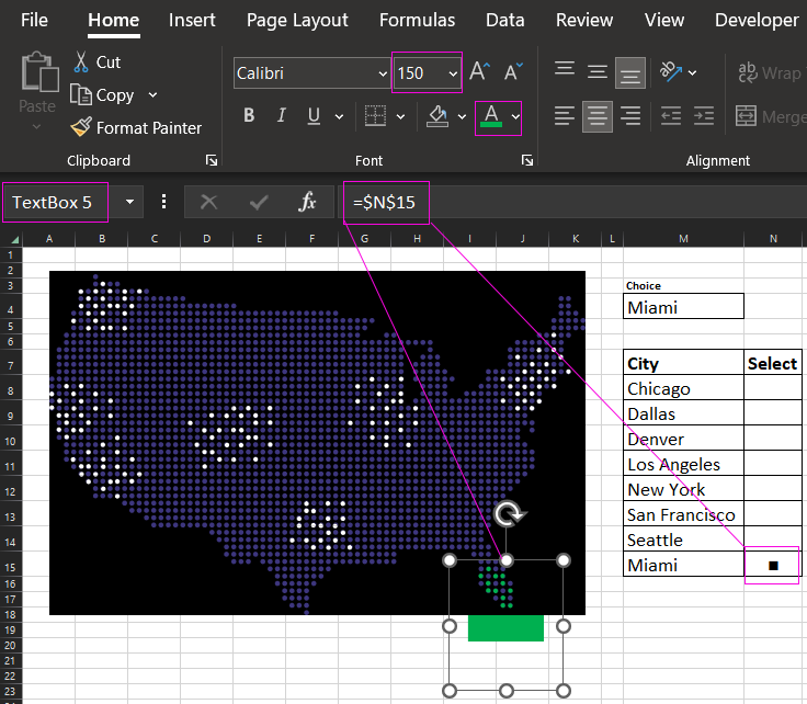
As you can see in the figure above, in the second method we refer from the TextBox figure to the cell at address N15 to get the content of the value. From the cell as a value we pass the special character black square (Alt code 254, Unicode U+25A0). We set the abnormal font size of 150 by manually entering a number from the keyboard. And set the desired color - green. And then for each city to place its own TextBox, which will refer to its own cell of the city.
The formula in the cell as it is not difficult to guess is logical:
The entire column of cell range in table N8:N15 is filled with the formula. At change of initial value in cell M4 the corresponding city will be highlighted, because under it the figure of TextBox is located.
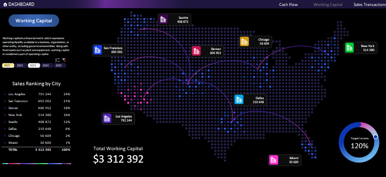
Next, everything should be beautifully designed and packaged for a spectacular presentation of the simplest graphical chart in Excel. So that the overall picture of the visual report will be complete, informative and presentable:
 Download Example of creating interactive Map Chart in Excel
The file contains the full version of the example in two implementations:
- With conditional formatting (on the Working Capital sheet).
- Using a TextBox shape with a special symbol for highlighting (on the DASHBOARD sheet).
As well as all the auxiliary data visualization elements for a complete report on the company's scaling efficiency and the interaction of its branches.
