Dashboard for diversification analysis and test of business niches in Excel
Dashboard template for analyzing testing new niches in business. Also, this dashboard can be used to analyze the effectiveness of an investment portfolio in diversifying capital by investing in different business niches.
Testing new business niches or diversifying investments
Life is an experimental science. In it, even nature cannot predict a 100% result of invested resources and actions. That is why there are more apples on the branches of an apple tree than the number of new trees required. And there are more grains on a spikelet, and there are more stars in the universe. After all, everything has its own survival statistics. Therefore, no matter how thoughtful and successful a business plan is, only experimental testing will unlock its potential for survival and success.
It is very important to apply data visualization technologies when analyzing experiments and testing ideas. After all, people easily notice failure and easily focus on it, while rarely noticing the window of opportunity in their own projects.
Also, visualization in this area allows you to identify the "bottlenecks" of the financial flow and predict the result of their expansion in the correct sequence.
This dashboard will help you conduct a visual analysis of performance when testing new business niches or diversifying for an investment portfolio.
First, let's determine in which category the projects under test are: business or investment. Key factors that distinguish a businessman from an investor:
Earns on operating profits. Earns on capitalization growth.
| Businessman | Investor |
| Must focus | Must diversify |
| Must earn capital | Must keep capital |
| Looks at the benefits of his business | Looks at the risks of his business |
| Earns with his love of work | Earns on someone else's love of work |
| Loves his business | Shouldn't love his business |
A businessman must always be able to find a way to keep his business. The investor is looking only for the entry point and exit point of capital from the business. Like any product, a business has its own 4 life cycles:
- Birth.
- Growth.
- Maturity.
- Decline.
After defining the category of projects, you can proceed to filling the template with source data.
Investment diversification and business niche testing report in Excel
The description of the instructions for filling in with data and using the dashboard template is given on the example of a model of a specific situation.
The amount of allocated capital for testing niches or an investment portfolio for diversification is $ 30,000. To simplify the development of the material, in this example, the capital used will be divided equally for each project. When testing 3 micronishe business projects, each will receive $ 10,000 in investment. It is necessary to achieve profitability at the level of 1/3 of the invested funds. That is about 33% per annum.
Interesting fact! According to statistics, the most successful projects in the modern financial world show a maximum profitability of 70% per annum. Above, it is already extremely difficult to obtain profitability from a business with legitimate activities. Retail trade is able to show an average yield of 30-35%. Small wholesale - up to 10% -15% per annum.
Naturally, in the real financial world, for testing niches and even more so for diversifying investments in a package, capital is never divided in equal shares. Everything is very individual and each niche or investment object requires a special approach with careful analysis. This approach can (and should) be applied in analysis using this template. But back to an easy-to-learn example.
For each business project throughout the entire implementation period, daily statistical information is collected on three indicators throughout the whole year.
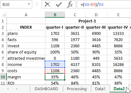
All data is filled in on the "Data1" sheet:
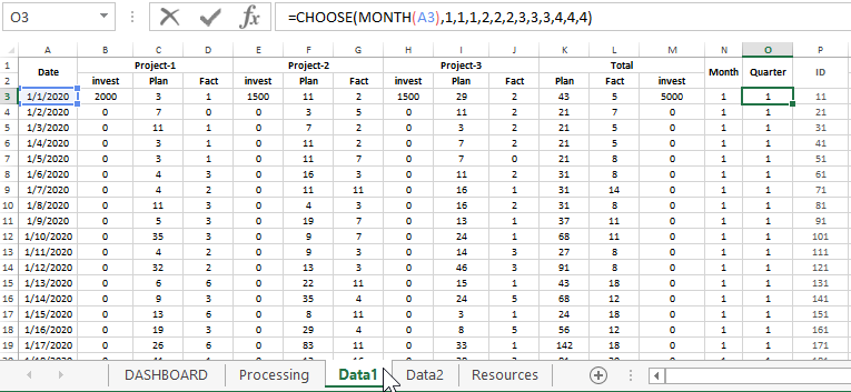
- Invest - The amount of investment.
- Plan - Planned revenue according to the sales plan.
- Fact - The actual sales revenue received.
And also quarterly statistics are collected on 25 indicators of business performance. They are filled in on the "Data2" sheet:
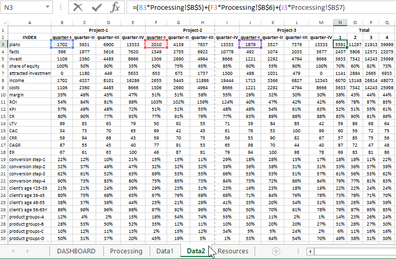
The first 3 indicators (plans, facts, invest) are the values grouped quarterly data from the "Data1" sheet using Excel formulas. Description of the following:
- Share of equity - the share in the percentage of the used equity capital excluding attracted funds from external sources (investors, loans, partners, etc.).
- Attracted investments - the amount of attracted investments from external financial sources.
- Income - income from sales and business activities.
- Costs - all recurring and irregular accompanying costs.
- Margin - the margin is the share of profit from total revenue.
- ROI - Return On Investment an indicator of the effectiveness of each dollar invested.
- KPI - Key Performance Indicators of a business or investment project.
- CR - Conversion Rate.
- LTV - Life Time Value.
- CAC - Customer Acquisition Cost.
- CRR - Capital Requirements Regulation.
- CAGR - Compound Annual Growth Rate.
- ER - Engagement Rate.
- conversion step-1 - target audience conversion rate at the first stage of the sales funnel.
- conversion step-2 is the value of the second step.
- conversion step-3 is the third stage of the funnel.
- conversion step-4 is the final stage of converting potential buyers into sales deals.
- client's age <25-35 - the share of buyers from all reached potential customers from the age category up to 35 years old.
- client's age 36-45 - the share of buyers aged 36 to 45 years.
- client's age 46-55 - the age of customers is 46-55 years old.
- client's age 56-65< - customers over the age of 55.
- product groups-A - a category of similar products offered.
- product groups-B
- product groups-C
- product groups-D
Dashboard data visualization structure in Excel
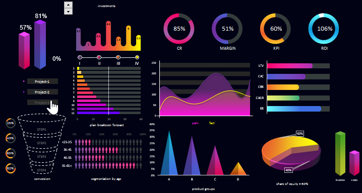
The structure of the dashboard consists of 14 graphical data visualizations for which it is convenient to conduct a visual analysis to identify the flagship project or the weakest link:
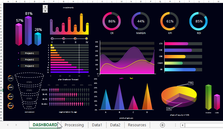
The dashboard is interactive. You can quarterly change the history of the statistics data selected for visualization on the dashboard:
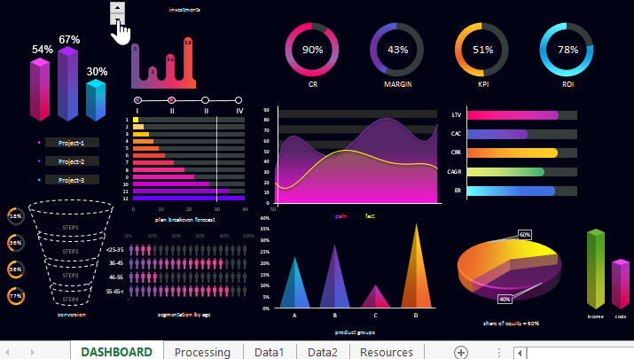
In addition, you can segment visual data by project (separately for each, in pairs to choose from, or all together):
Let's take a closer look at each block of data visualization on the dashboard.
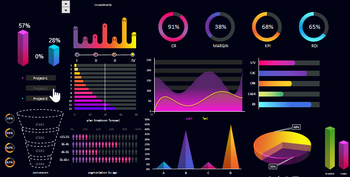
The first block with a chart displays the performance of the plan for each project:
There are also 3 buttons for inclusion or exclusion in the project data report to display them on the dashboard with changes to the overall picture, respectively.
Since the initial profitability was planned at 33% per annum, the total amount of returned investments with a profit should be $ 40,000. So the plan is $ 1,333 separately for each project. The results of the execution of each plan are displayed on this block.
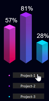
In the next block, tranches of investments are visualized throughout each quarter, the displayed amounts in thousands:
For example, in the middle of the second quarter, a tranche of investments in the amount of 5.8 thousand dollars was passed. At the beginning of the third quarter, 2.9 thousand were invested. And in the middle of the third there was the maximum amount of the investment tranche - 7.1 thousand dollars.
In the same block, there is a control element for switching between quarters according to the history of testing niches and / or diversifying the investment portfolio.
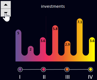
The next is a block of 4 diagrams at once:
The first metric in the first chart is the CR conversion rate of the number of users of the offer who took the target action in relation to the total number of buyers. Calculation formula:
CR = all targeted actions or leads / total number of targeted customers
To a large extent, this indicator depends on the abilities of the sellers. Every person, when he buys something, he suffers from the need to make the right choice. The task of a successful seller is to help and relieve the buyer's suffering.
The second indicator is the value of business marginality. In other words, the profit share in relation to revenue (or income):
Calculation formula:
Margin = (income - expense) / income
The margin can be expressed both in absolute (amount) and in relative value (in percentage).
Note! The margin can never exceed 100% (as opposed to the ROI). This indicator is calculated after the completion of all transactions and therefore is considered the most accurate indicator that you can confidently rely on without overestimating business opportunities.
More details are described: How to calculate margin and markup in Excel.
KPI chart is a performance indicator.
Calculation formula:
KPI = (actual indicator - minimum) / (plan - minimum) x 100%
More details are described: KPI calculation in Excel examples and formulas.
The last diagram in this block is ROI (return on investment) or ROR (rate of return). Investment project profitability / loss ratio:
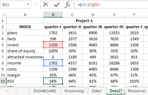
Calculation formula:
ROI = (income - expense) / expense
An important point! ROI can often exceed 100%. Therefore, when 100% is exceeded, the remainder of 100% (or a multiple of 100%) is displayed on the diagram in white:
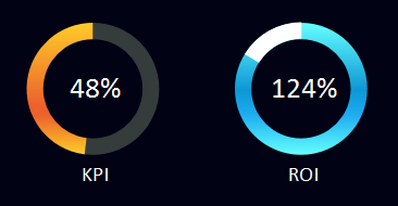
Interesting fact! ROI is the favorite metric of the well-known top investor Warren Buffett, who states: "Investments must return quickly." Quite a fair statement. After all, the main task of the investor is to preserve investments, and only then to increase capital.
One floor below, on the left side of the center, on the dashboard, there is a line histogram "plan and break-even forecast" for 12 months:
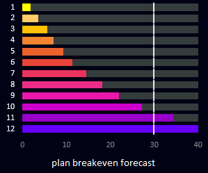
The colored bars are monthly return on investment plans. The white line marks the breakeven point of the projects. Sums are indicated in thousands. Yield growth is projected along an exponential curve.
On the right is a chart of two moving averages of daily sales in the current quarter: the sales plan (purple curve) and their actual actual performance (yellow curve):
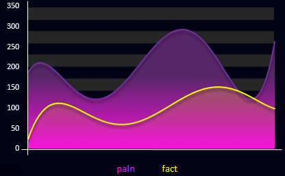
This chart shows actual numbers as these are daily values.
At the end of the current floor, there is another bar chart displaying estimated values for important indicators:
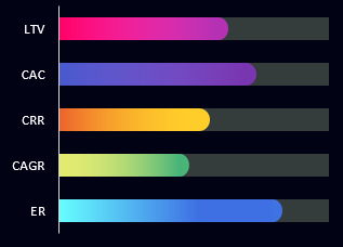
The first indicator of LTV is the lifetime (for the entire period of cooperation) customer value.
Calculation formula:
LTV = profit / number of buyers (for the entire or accounting period)
CAC - the cost of attracting customers during an advertising campaign.
Calculation formula:
CAC = ad spend / number of attracted customers over ad effect
CRR is the number of regular customers.
Calculation formula:
CRR = total number of customers at the end of the period - new customers for the accounting period
CAGR is the average annual growth (in this case, new customers).
Calculation formula:
CAGR = (EV / BV) 1 / n - 1
Where:
- BV (beginning value) - initial value;
- EV (ending value) - final value;
- n is the number of periods.
ER is an indicator of the target audience's engagement by reactions and interactions.
Calculation formula:
ER = total number of reactions / reach
All grades in this block of the histogram are calculated using a 100-point system (0-100).
In the lower left corner of the dashboard is the sales funnel visualization model:
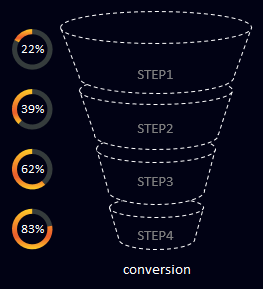
The 4 levels of the funnel are shown schematically, for example:
- Search for potential buyers within the target audience.
- Presentation of the proposal.
- Negotiations and consultations.
- Closing a sale transaction.
Opposite each level of the funnel are conversion visualization charts. In Excel, you can create an interactive sales funnel with an animation of changing results, as shown in this example:
Dashboard for analyzing sales funnel conversion in Excel .
But due to the wide range of values, the funnel is often displayed unreadable. Ugly to say the least. Therefore, it was decided to visualize the conversion using diagrams against the background of a 3D model of the sales funnel levels.
The next block uses the bar chart again, but in the original data presentation design:
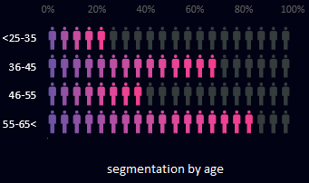
It visualizes data on the ratio of new/returning customers segmented by age category and presented as a percentage. There are 4 categories in total. As you can see in the figure, among new customers (in purple), most of them are 55+. In this age category, it is most difficult to retain an audience for these investment and business projects.
Block with visualization of commodity distribution by category:
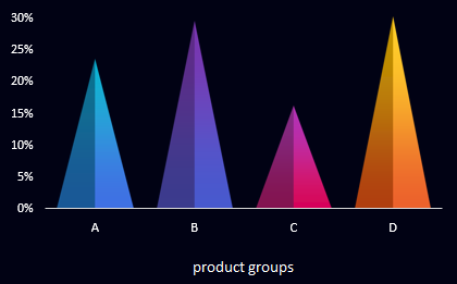
In each of the three projects, there are similar types of goods that can be grouped and segmented into categories A, B, C and D. But in each project, its own group prevails at one time or another period of seasonality. This is an important factor in diversifying business investment.
Block with a 3D diagram of visualization of the share of equity capital in the total amount of investment resources:
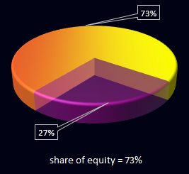
Everything here is simple and clear - borrowed and attracted funds are displayed in a transparent background. Equity capital is marked in gold.
The last small block of the bar chart to visualize the relationship between income and expense levels:

This block completes the general picture of the dashboard. Everything looks positive and harmonious. Despite the fact that a large number of colors and shades are used in the design palette of an interactive presentation, in general, the dashboard looks stylish and effective:
 Download dashboard for analyzing testing business niches and diversifying investments
This interactive report presentation template with data visualization does not use macros. All changes on the dashboard are implemented using formulas and standard Excel controls.
Experiment, analyze, act. Remember that successful fast-growing projects are at the intersection where this product is no longer relevant to professionals, and beginners do not know anything about it yet.
