Dashboard for visual analysis of test results in Excel
All large and small companies and corporations should regularly test the skills of their sales staff. After all, the basis of each business is the sale of goods or services. Sales managers must constantly improve their skills, as the conditions for sales are constantly changing. To monitor the effectiveness of invested funds in growing successful sellers of the company, it is necessary to conduct tests and analyzes.
Summary analytical report on the results of tests in Excel
This dashboard allows you to quickly analyze the growth or decrease in the ability of sales staff. We will simulate a situation.
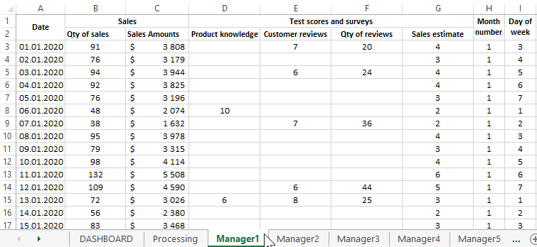
For example, from the ERP system, statistics were exported for the top 5 managers from the sales department for the previous 2020 year. Sales histories for each manager are on separate sheets in the same Excel file:
It is necessary to compile a summary analysis for the test results for the 3 main indicators of sales skills:
- Product - level knowledge of the product being sold.
- Reviews - The average rating for customer reviews.
- Sales - an assessment of sales performance.
All estimates for all three indicators are calculated according to a 10-point system in the range of numbers: 1-10.
On the “Processing” sheet, a summary calculation of the final values is performed using functions and formulas to build charts and diagram that are located on the “DASHBOARD” main sheet. That is, all diagram and diagrams refer to the "Processing" sheet:
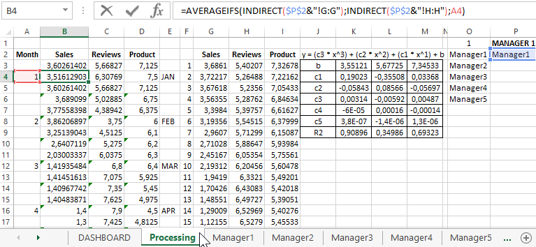
To substitute values from different sheets, use the INDIRECT function, thanks to which you can switch external links to different sheets. Thus, when changing the value in cell P1, which contains the name of the selected sheet, all tables of the Processing sheet are automatically replenished with the corresponding values. So the switch between the indicators of managers on the dashboard is implemented. Next, we describe the structure of the dashboard step by step.
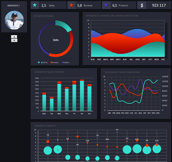
Dashboard template structure for employee testing in Excel
The top row of mini-blocks contains summary information on managers:

The last mini-block is the total amount that the manager traded for the year. And the first 3 mini-blocks are numerical values for the main first block in the second row - a summary diagram of the distribution of the shares of grades for different skills.
Further below is the same main block - “ESTIMATES IN THE AVERAGE”:
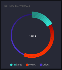
Here we see how the scores of the skills indicators tests are divided into the main 3 categories described above (sales, reviews and product).
On the graph in the second block, second row “DYNAMICS OF AVERAGE EVALUATIONS FOR THE YEAR”, these indicators are displayed in dynamics over the whole year, but averaged:
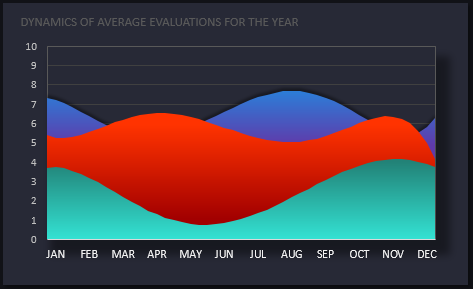
The y-axis is the number of points, and the x-axis is the number of points.
Next is the first block of the third row - “NUMBER OF SALES / REVIEWS”:
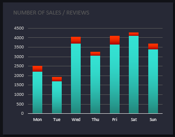
Here we analyze the ratio of the number of sales and the number of reviews left. These annual figures are segmented by day of the week. And we see that the clients of the current manager (at number 1) are most loyal to leave feedback on Friday. This information will be useful for building a survey strategy for buyers.
for this summary report, a very interesting and useful second block of the third row is “CORRELATION OF EVALUATION / SALES”:
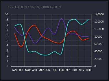
It already shows the actual and not the average indicators of estimates and sales. And most importantly, we can analyze how the changes in the number of points are correlated in the estimates on the main Y axis and the dynamics of sales in money on the secondary Y axis (right). Throughout the whole year, for months, the X axis. It is worth noting that the colors of lines and rows of charts or diagram constantly correspond to the 3 main indicators of test results:
- product is purple;
- reviews - red;
- sales - aquamarine.
And finally, in the fourth row, one of the largest last block with a bubble chart called “QUANTITY / QUALITY”:
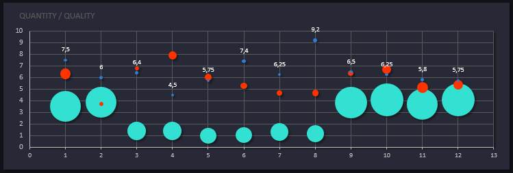
In this block, we analyze how the quality of evaluations (that is, the quality of skills) of a manager influenced the number of results in the past year. This block on the dashboard allows us to verify the reliability of the testing and evaluation system of sellers.
- along the Y axis - the number of points scored for 3 different skills;
- number of results is displayed by the diameter of the bubbles;
- on the X axis - serial numbers of months of the year.
It is also important to pay attention to the additional block on the right above the switch:

Here, when switching between managers on a dashboard, not only the signature “MANAGER 1” changes, but also the photo of the employee. Since this interactive dashboard was created without the use of macros, this solution was implemented using a conventional histogram with accumulation. Just instead of filling the columns of the histogram of the beat, we used a picture in * .PNG format with a transparent background. The switch itself was added as a tool from the menu category: “DEVELOPER” - “Controls” - “Insert” - “Counter”.
All sides form an integral picture of the dashboard with a summary analytical report to monitor the professional development of the advanced employees of the company:
 Download dashboard for analyzing test results in Excel
This dashboard is presented in the form of a template that can be changed to fit your needs. Add more sheets and employees, change calculation formulas for charts or diagram, etc. Use, modify and improve. After all, perfection is achieved not when there is nothing to add, but when there is nothing to remove.
