Dashboard for analyzing sales ranking factors in Excel
To quickly build a report in Excel for visual analysis of the ranking factors of sales indicators segmented by products, sellers, quarters, etc., you can use templates with ready-made solutions. With the help of standard tools for visualizing data in Excel, the user has the ability to design beautiful interactive reports even without using macros. For an example of these capabilities and functionality of the tools for creating presentable visual analyzes in Excel, consider the following template.
Dashboard for visual factor analysis of sales ranking in Excel
This template serves as examples of using data visualization tools in Excel, which are collected in one small mini-dashboard. Each of its elements can be used separately for your personal purposes and customized to suit your needs. With this simple visual report, you will quickly master the basic principles of designing interactive data visualization presentations in Excel without using macros.
For effective and quick assimilation of the training material, we will simulate an example situation. Let's say there are 10 sellers in a trading enterprise who sell 5 main categories of products (A, B, C, D and E). Over the past 5 years of the company's activity, favorites have formed among the successful sellers. The objectives from the analyst guide are as follows:
- Don't just identify the top 3 sellers, but chart their competition over the past 5 years based on sales history data.
- Provide an opportunity for visual analysis of the implementation of sales plans on a quarterly basis for the same accounting period (for the last 5 years).
- In parallel, present the factors of ranking sales for all the main 5 categories of products.
The first thing to do before using the dashboard template is to fill in the table with initial values for analysis on the Data sheet:
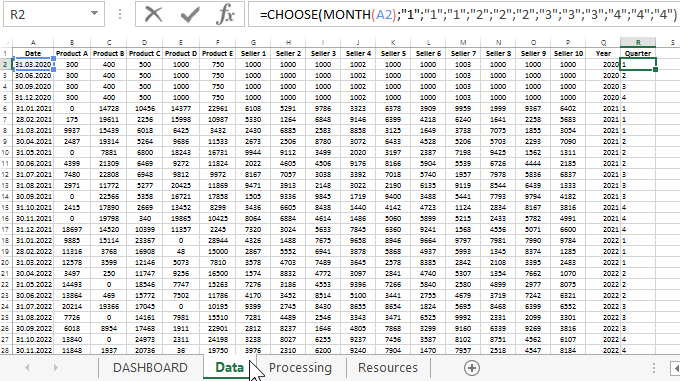
As you can see in the figure above, data from the history of sales for 5 main groups of products and 10 sellers of the enterprise are used as initial values.
Note! The data for the year 2020 (the first 4 months of different quarters) is used as the introduction to the dashboard presentation, and it has no logical structure. If desired, you can remove them and not use them. But the data for the rest of the years is already logically structured and as close as possible to real numbers. For example, the sum of all sales figures for 10 sellers is equal to the sum of all product groups sold by them in each month (margin of error = 1).
The last 2 columns "Year" and "Quarter" contain formulas. Additional two columns were added for convenient selection and processing of the initial data in the formulas on the "Processing" sheet:
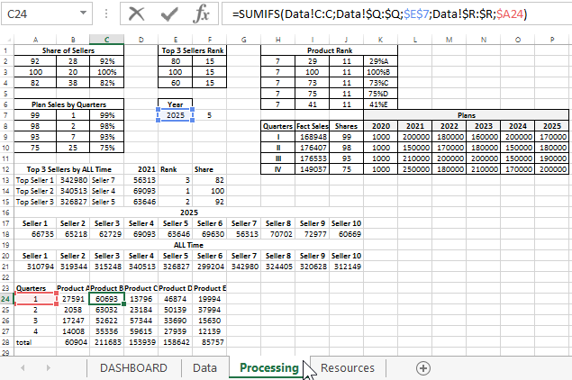
There are also tables for preparing and processing the ranking factors of sales indicators before displaying them on the main sheet "DASBOARD" for visual analysis.
Dashboard template for analyzing sales ranking factors in Excel
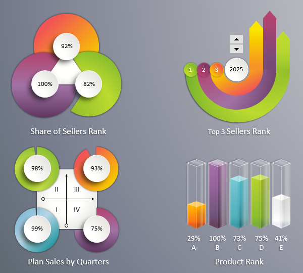
The dashboard consists of 4 blocks of charts. The data tables for each diagram are located on the Processing sheet and are labeled in the same way as on the report presentation sheet for easy search for relationships.
The first block "Top 3 Sellers Rank":
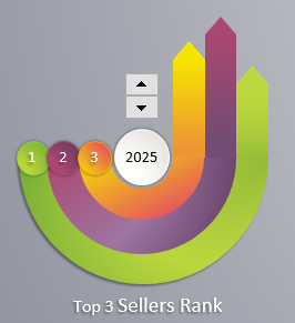
Displays the ranking of the top 3 successful sellers in terms of sales over the full accounting period - 5 years. Their place in the rating as of the selected current year is displayed here. The same block contains the only control element for the whole dashboard - the counter. It switches between the years 2021-2025. You can also choose 2020, but it is used for beauty as an introduction to the presentation - the first slide (as described above).
The second block of charts "Share of Sellers Rank":
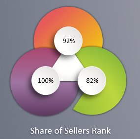
It displays the relative values of the shares that fall on the second and third places in the rating in relation to the first. In other words, the indicators in this block of the most successful sales leader are always 100%. The other two values are the percentage of the other 2 sellers fulfilled in comparison with the first leader.
The third block, called "Plan Sales by Quarters":
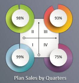
Here, the numerical values of the percentage of the enterprise plan for each quarter for the currently selected year are displayed graphically. All plans for each year are listed on the Processing sheet in the table with the same name as this block.
The last "Product Rank" block:
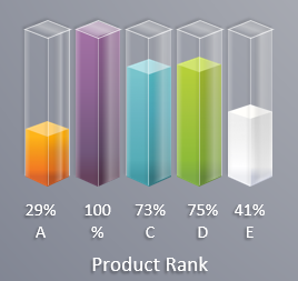
Similar to the second block, it shows the relative ranking of sales factors for all categories of product groups in relation to the leading group. Since there are no longer 3 (as in the second block), but 5 indicators, a different type of visualization should be used. That is, instead of three charts - one histogram of 5 columns.
All blocks form one holistic picture of a dashboard template for visual analysis of sales rating factors:
- by sellers;
- by product groups;
- by quarters of the enterprise plan.
 Download Sales Ranking Factor Analysis in Excel
It is worth noting that to decorate the last histogram, groups of shapes drawn in MS PowerPoint were used. All shapes are on the "Resources" sheet. Feel free to use them as cliparts for your visual reports. Most of these shapes can also be drawn in MS Excel. But MS PowerPoint has a more convenient and functional vector graphics editor that allows you to create shapes with increased complexity of shapes by combining primitive designs into one complex polyline.
Useful advice! If you need to quickly draw beautiful shapes, it's better to use PowerPoint, and then just copy the result of creativity directly into Excel. These programs are included in one MS Office package and exchange resources freely without loss of quality.
