Dashboard for gadget store sales report download in Excel
The most functional and interactive tabular report cannot replace an informative dashboard with graphical data visualization. Moreover, it is not objective to compare tabular reports of structured data and their visualization tools. Each of these analytical tools has its own advantages and disadvantages, goals and objectives. For example, let's look at a sales report for a gadget store.
Presentation of store payback figures in Excel
Let's simulate the situation of practical application of a functional tabular report and a dashboard in a single Excel file. Since the beginning of 2021, $500,000 has been invested in the gadget store. According to the investment plan, the payback period of the business is 5 years. Financial analysts need to create the conditions for mathematical and visual analysis of the effectiveness of the return on investment using statistical data for the full period of the payback period of the project.
The report should segment sales data in detail to provide a meticulous analysis with the ability to identify all of the weaknesses and strengths of the business strategy:
- Indicators of fulfillment of sales plans by time of accounting periods: year, month, week, day.
- By sales channels and revenue sources: wholesale, retail, Internet commerce, licensing.
- By project resources: nomenclature, customer base, top sales, discount offers.
- Separate the headliner products sold in different periods of sales seasons.
- Logistics load: separately transport and storage and picking (inclusive).
According to this plan of work, an interactive tabular report was initially made in Excel, and on its basis a dashboard with a presentable visualization of statistical data for all 5 years was built.
The tabular report makes it possible to effectively structure the history of the gadget store's financial activity collected over the entire period of its planned payback period.
Visualization of data on the dashboard clearly exposes the strengths and weaknesses of the decisions made by the business manager in a particular period of activity.
As a result, this report allows you to show lightning-fast reaction to make the right decisions in tactical, operational short-term tasks and the strategic objectives of the medium and long periods to further attract investment.
Also, this report allows you to prepare the business for a fair sale at a fair price.
Interactive sales report with data visualization
The source data for the dashboard is a pre-created structured report with interactive controls for summary data:
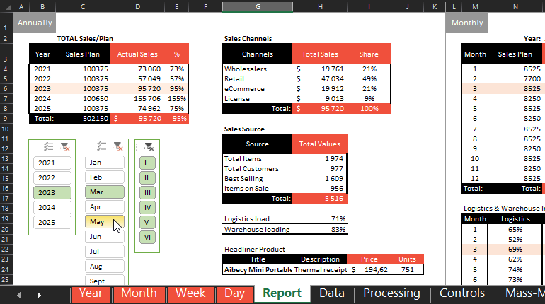
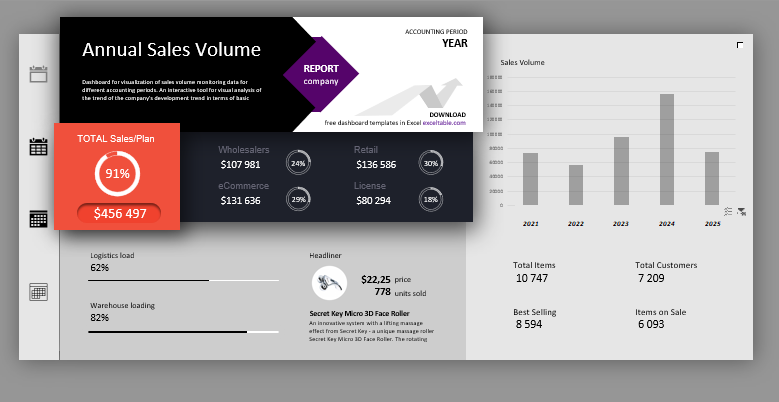
An interactive visualization was designed based on it. The dashboard consists of 4 pages. Each is dedicated to a detailed overview of a different accounting period: Annual, Monthly, Weekly, Daily. Therefore, all layers of presentation of financial indicators of the gadget store on the dashboard have almost the same structure of data visualization, which can be conditionally divided into 4 parts.
The first group of blocks exhibits the totals:
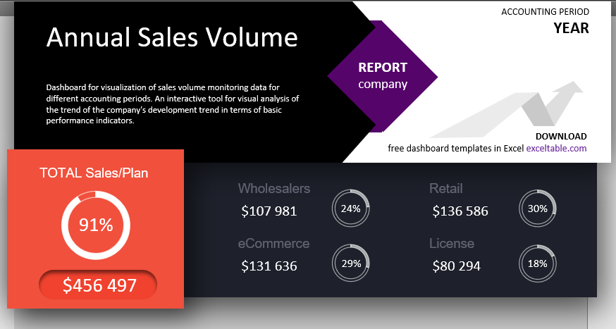
In the lower left corner of the first block, on the uppermost orange layer is the total amount of the fact and the total percentage of the sales plan fulfillment. On the right is the structure of the total amount segmented by the shares of sales channels, which make up the total amount of actual sales for the selected accounting period. Each channel has its own amount and share of sales as a percentage, which as a whole formed the resulting total.
The second block on the right contains:
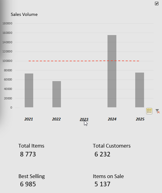
Sales chart with a plan level marker. In this block, the controls allow you to select and filter data by period. Below are the totals of the gadget store business resources. They change with the selected periods accordingly.
On the lower third block are:
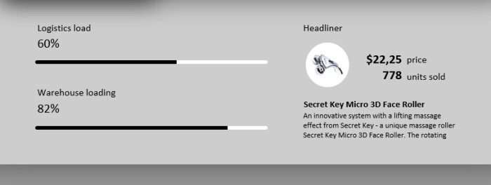
In the right block - two linear histograms on the load indicators for transport logistics and warehousing (together with the picking).
In the left block the successfully sold gadget headliner - name, photo-miniature, description, price and quantity of the most sold item in the store for the selected accounting period on the dashboard. The information in this block changes automatically and according to the parameters set by the dashboard user.
The last fourth vertical block on the left is the control panel, where the buttons for switching between accounting periods are located for visual analysis at different levels of immersion in the financial analytics of the gadget store:
 Download gadget store sales report dashboard
Despite the complex filtering and structuring of data on the interactive dashboard, no macros were used in this example. Everything was done using pure Excel formulas without any complications. For some tasks we used interactive capabilities of crosstabs, namely slices. Overall, the dashboard turned out to be very attractive for ideas of further extending its broad capabilities. Download the report visualization template from the link above and evaluate it in practice. For convenience, the graphical elements have been protected from accidental changes, but the password is not used. If you need to edit the design, select "Review"-"Unprotect Sheet" from the main menu.
