Easy example of 3D Pie chart with value than 100% in Excel
A large percentage of economic and financial indicators are relative values and are calculated as percentages. Accordingly, in reports, presentations or dashboards, these values are presented as percentages with a % sign. Very often, dashboard designers choose the pie chart to visualize data in relative values. An equally common question arises: "How to show over-fulfillment of the plan more than 100% in Excel on a Pie Chart?". This template is one example of a solution to this problem.
Practical Application of the 3D Percentage Chart in Excel
Let's first look at where and when the need arises to practically apply data visualization to present reports with relative values in percentages. For example, the most popular financial metrics for business performance percentages are:
- ROI - Return On Investment.
- ROA - Return On Assets.
- ROEX - Return On Expenses.
- ROS - Return On Sales.
They were used as derivative indexes for analysis of business efficiency. Each new modified index is formed depending on business peculiarities, analysis and aims to get certain information for effective appraisal:
- ROCE - Return On Common Equity;
- ROIC - Return On Investment Constant;
- ROMI - Return On Marketing Investment.
But there are also many other financial and economic percentages:
- WACC - Weighted Average Cost of Capital;
- TSR - Residual Total Shareholder Return;
- RTSR - Residual Total Shareholder Return;
- ETSR - Economic Total Shareholder Return;
- CMER - Containing Market Equity Return;
- RMER - Residual Market Equity Return.
It is necessary to note at once that not all relative indices can exceed 100%. For example, the financial margin is always shown as a percentage, but can never exceed 100% or be equal to this value. The market share ratio can be equal to 100%, but never exceed it.
The inflation rate is very unlikely to exceed 100%, but theoretically it is very realistic.
Interesting fact about inflation! From history we know for a long time that on the eve of World War II, to be exact in 1923, inflation in Germany reached 3.25⋅106 percent (3.25 million) per month (actually prices were doubling every 49 hours)!
Even the ROI of a business exceeding 70 percent is already suspicious, because in most cases it is almost impossible to get such a high return after paying all taxes. But on the other side the ROI of one share may go up to 300% in 24 hours, influenced by market panics. By the way, the dynamics of stock prices are also measured in percent.
A similar example is with GDP, which can be either an absolute or a relative value. If GDP is a relative value, then it is unlikely to be greater than 100%. But there are exceptions here as well. For example, as of 01.02.2021, the global stock market capitalization of $107.8 trillion is 123% of global GDP.
We can also mention the interest rates of microloans and overdue debt, which can also exceed the value of 100% per annum.
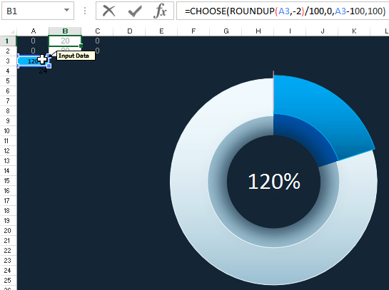
Pie chart Template for Visualizing Data Exceeding 100%
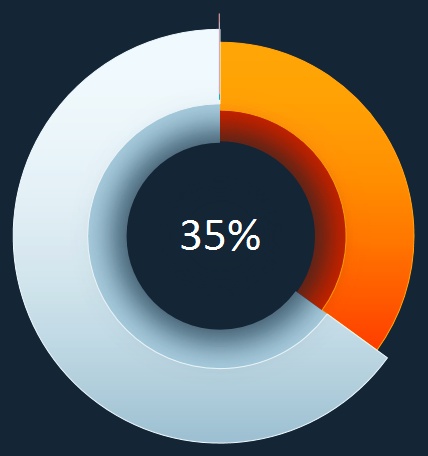
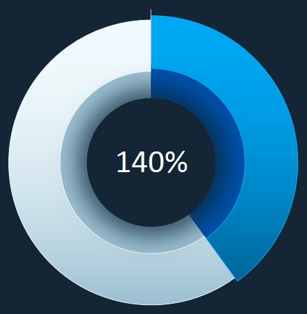
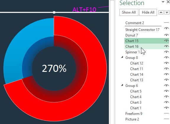
The principle of building this element of the presentation is simple. To solve this problem in Excel, it is best to use several charts that are superimposed on layers. Diagrams on each layer use their own separate source data, which are composed by formulas in the range of cells A1:C2. For ease of perception of the principle of the Pie chart, a conditional formatting of the dynamic highlighting of cells in the same range has been made. Groups of cells are highlighted in white, which at the moment is the initial value of the current active layer in accordance with changes in values and visualization. As shown below in the figures showing the operation of the three layers of Pie chart:
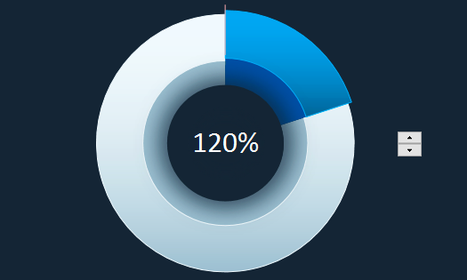
- The lowest layer with the Pie chart shows standard up to 100%:
- On the second layer, 100% and up to 200%:
- Correspondingly on the third 200% to 300%:
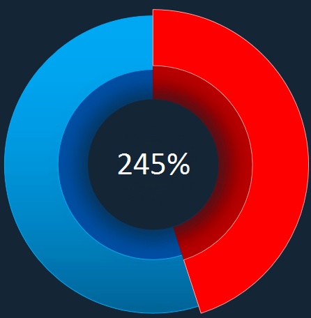
So you can impose a large number of charts, but it is worth noting right away that already on the third layer of the Pie chart is strongly destroyed by the meaning of data visualization. Obligatorily there should be a signature of the indicator on the Pie chart. But as you know the ideal visualization or infographics should be easy to read without the text and captions, which in this case is impossible. Therefore, in this template displaying indicators over 200% is presented as an example. You can delete unnecessary Pie chart layers, if necessary, in an additional window by calling it with the ALT+F10 key combination:
To enter the initial value with a relative value of this template, you should enter the percentages as integers in cell A3, which is highlighted in blue.
Helpful Tip: If it becomes necessary to enter percentages of raw data for cell A3 at once, then you should edit and rewrite the formulas in the range A1:C2, as well as in cell H12.
By default, there is no 3D volume ring Pie chart type in Excel, it will probably appear in the new version of MS Office 2022 which is scheduled to be released this year. Microsoft developers promise significant changes in this version of Excel 2022. At the moment, you can use the vector shapes to draw a 3D circle Pie chart in Excel by yourself, as in this example:
 Download a circular 3D Pie chart larger than 100% in Excel
This template does not use macros. The interactivity of visual changes in the circular 3D diagram is implemented by using a standard control that clicks the mouse to change the value first in cell A4 and then in A3, respectively. To add such a tool select it on the tab: "DEVELOPER"-"Controls"-"Insert". The chart group can be copied and transferred to another file along with the formulas, to use in your reports and dashboards when visualizing data in Excel when presenting beautiful financial reports.
