Financial analytics IT business for enterprise sales in Excel
Dashboard for financial analysis of sales in IT business with extensive segmentation and multi-condition search functionality. Especially useful for enterprises with a large nomenclature and a wide assortment of sold products. The wider the assortment of products, the more complex the database segmentation structure in ERP accounting systems. Often it is important to analyze and visually present not only the overall picture as a whole, but also in detail on a particular article of merchandise unit. Download a ready-made dashboard template at the end of the article. But first let's consider a brief instruction on how to use interactive data visualization in Excel with extensive report segmentation capabilities.
Example of using the dashboard for financial analysis of sales in Excel
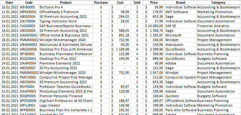
For a clear example, let us traditionally simulate the situation with the set practical task. Suppose an enterprise works in the field of trading software for IT business, and specifically for financial analysis, accounting, business plans, marketing tools, etc. From the statistical data of ERP system exported software sales history for the accounting period of 6 years (2021-2026):
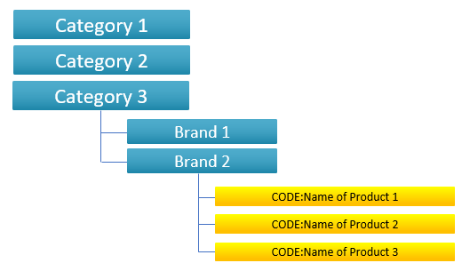
The assortment of the company is relatively wide, so its products are structured by categories and brands. The structure of the catalog of sold products is as follows:
Summary table with the initial data for a clear example:
Algorithm of products code with a concise meaning:
- The first two characters are the first characters of the words in the category name (for example: AB is Accounting & Bookkeeping).
- The third character in the code is the first character of the brand name to which the product code refers (for example: A is Avanquest or I is Individual Software).
- The fourth character in the code is the first character directly in the name of the product, that is, the software sold in the IT business (for example: M is MyInvoices & Estimates Deluxe).
- The remaining characters in the code consist of a three-digit number that denotes the sequence number of the current product in this category from the current brand (for example: 001, 002, 003, etc.).
This coding algorithm facilitates meaningful search by code in the general database.
It is necessary to make a report on the dashboard with visualization of sales data. The interactive capabilities of the dashboard should allow segmenting the raw data:
- By year.
- By month.
- By Category.
- By Brand.
- By product code.
The visualization control panel should provide a search function for the last three filters (by category, brand, and code). In addition, it should be possible to search by product name to analytically track its movement for the selected accounting period. In fact, the dashboard should be able to manage the database before displaying it on the presentation.
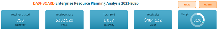
Data visualization blocks should visually inform about the indicators:
- The amount of purchased products for the accounting period.
- The amount of products sold.
- The amounts of purchasing costs.
- Sales volumes for the selected period.
- Comparison of income and expenses.
- Ranking of the top 5 best sellers in a specific period, category and brand control:
- ranking of the top 5 bestsellers by sales volume;
- rating of the top 5 by sales volume.
This dashboard can do all this, which is why it has such a complex control panel with so many buttons. Next, let's take a closer look at its structure.
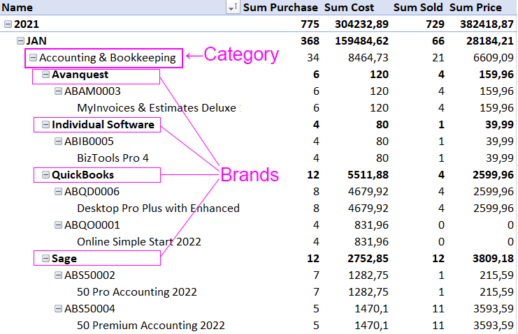
All blocks should be able to show the big picture by year and in detail by month. As well as the movement of products and financial flows of entire categories, brands and even selective products. Moreover, the dashboard should make complex segments for group multiple samples, i.e. for several years, months, categories, brands, articles at the same time.
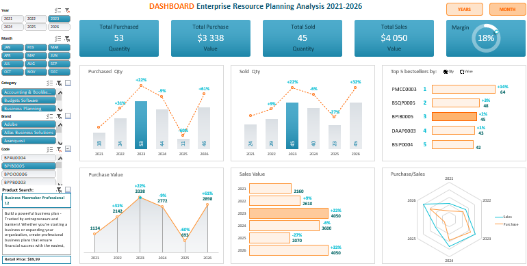
Dashboard for financial analysis of IT business sales in Excel
The header of the dashboard contains the totals from the data sampling results for visualization:
In the upper right corner there are 2 buttons to switch between the ways of displaying indicators:
- By year - for financial analysis of the overall picture of the IT business for the whole period.
- By months - for detailed analysis of the selected data by months for the specified year (or simultaneously for several years - as desired by the user).
Next, two vertical bar charts of the dynamics of purchases and sales of products in units:
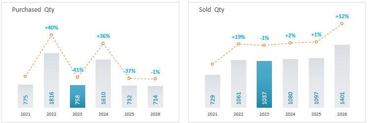
One vertical block on each chart bar is different in color. This clearly informs that the totals on the dashboard are shown only for the year 2023 and not for the whole period (6 years). The dynamics of changes can be traced on an auxiliary chart with labels of these changes as a percentage of the previous value.
Below in the left corner is a block with a visualization of the volume of financial expenditures for the purchase of products:
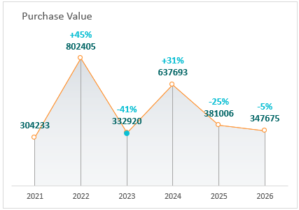
Here, too, the colored dot highlights the selected year 2023. And you can also see the dynamics in the relative percentage values of the change in amounts.
The block on the right is the sales volumes (annual or monthly - depending on the switch on the dashboard in the upper right corner):
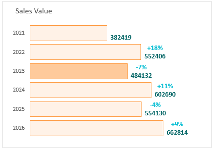
The selected year 2023 for the totals is also displayed in a different color. The labels of the values of dynamic changes in the amounts of sales are present in this chart.
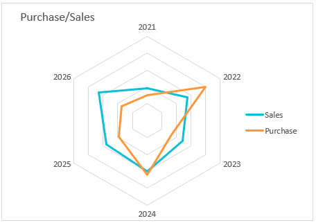
In the far right corner there is a chart (like a radar) for comparing the ratio of products purchases and sales (by year or by month - depending on the switch):
And finally, the last block with a bar chart to display the top 5 bestselling products for the specified period:
Two modes of bestseller rating:
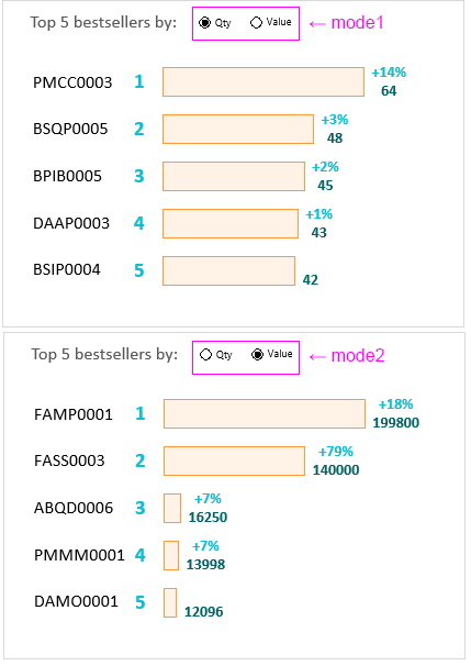
This block has its own internal switch to switch the indicators of quantity and sales volume. Note that the code of products in the top-5 ranking by sales volume and by quantity is naturally different.
In addition, it is worth noting that if you do a search on the dashboard by code of products from the top 5, then it will immediately highlight a different color for display in this block. And it will also indicate that the totals are displayed exclusively for that product:
 Download dashboard for financial analysis of sales in Excel
It is also important to note that at the very bottom of the panel displays a brief summary of the selected product for visualization on the dashboard of its movement for the accounting period. For example, when you clicked on the drop-down list button next to the code, a code from the top-5 "BPIB0005" was entered in the window that appeared. It was found in the Excel database and highlighted in color on the dashboard in the block of bestsellers. And also from a common database was displayed on this product summary information corresponding to the product with this code BPIB0005. Specifically:
- product name;
- short description;
- price.
With the help of buttons reminiscent element drop-down list can search by category, by brand, by product code (as in the current example), as well as directly on the name of the product (using the button against the "Product Search"). All functionality in the template is implemented without the use of macros. To create interactivity and automation, we used only standard Excel tools and formulas on the Processing sheet. The raw data, like on the other dashboards on this site, is filled in on the "Data" sheet. But this time you need to fill in the assortment information on the "Catalog" sheet.
