How to create a KPI dashboard in Excel Template free
The new version of the dashboard for visually presenting data on employee KPI performance indicators. A template for formatting with dynamic charts for the "Personnel" section in the ERP system with CRM module. An addition to enhance the capabilities of visual data analysis. You can download the ready-made dashboard template for free at the end of the article.
How to Use KPI Dashboard to Improve Business Efficiency
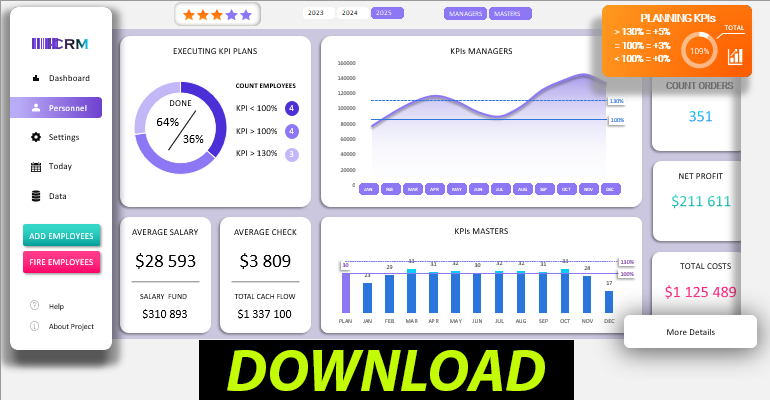
The structure of visualizing the execution of KPI plans on the Excel dashboard looks as follows:
The first dashboard block with a summary chart is called "EXECUTING KPI PLANS":
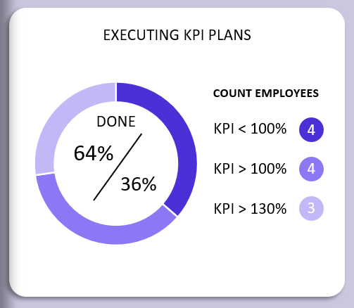
Here, the distribution of the number of employees executing the KPI plans is presented. Data segmentation for these indicators is performed in three categories:
- Employees who did not achieve the set task plan <100%.
- Successful employees with a performance rate of over 100% and received a 3% bonus.
- The top leaders category, who have exceeded their KPI plan by more than 130% and deserve the highest reward of 5%.
In the center of the summary chart, the percentage ratio of the total number of employees who have completed and not completed the company's plan is shown.
Performance Indicators for Different Employee Categories
In the next section of the dashboard, "KPIs MANAGERS":
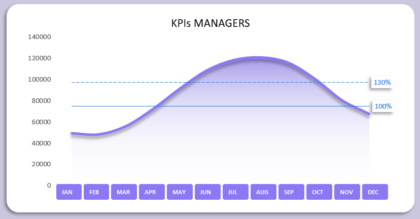
It visually shows where the levels of sales plan execution conditions are for the category of "Sales Managers." Also, in this section, there are buttons for segmenting and filtering visualization data by months.
If you click on the next orange block, you can set different KPI plan levels for each month for each category of employees:
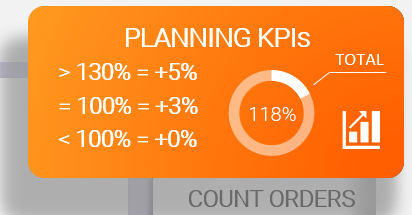
This "PLANNING KPIs" block simultaneously acts as a button and a summary of the established overall plans. The chart shows how much the overall KPI plan has been executed by all employees in all categories working in the company.
Different categories of employees have different conditions for KPI plan execution. For example, sales managers are linked to sales volume indicators, while masters are linked to the number of completed orders. Therefore, there is a separate visualization block for the masters' indicators with established plan levels:
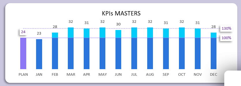
For each month, you can also configure different levels of achievement for premium rewards.
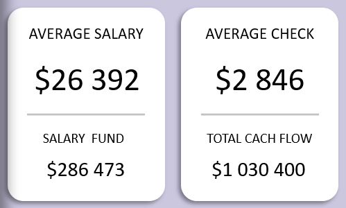
Following blocks display values for comparing numerical indicators of average salary and average check for the selected reporting period on the dashboard:
To set conditions for data sampling periods, you should use the interactive dashboard control elements:

Here, you can segment and filter the original data not only by years but also by two employee categories, "MANAGERS" and "MASTERS." It is important to note that by holding down the CTRL key on the keyboard and clicking with the left mouse button, you can simultaneously select multiple filter buttons. In this way, you can manage the dashboard and its dynamic visualization of enterprise performance indicators.
 Download the KPI dashboard template in Excel for free