Metro style dashboard design for charts in Excel
Despite its popularity, Metro's design style was invented back in 2006 by Microsoft designers. The inspiration came from signs in the King County Metro transportation system in Seattle, where Microsoft is headquartered. From this fact its name follows (and not from the word metrosexual, although it is also appropriate here). Although there have been attempts to change this design style to other names: card design, Modern UI or MDL (Microsoft design language) - the original name has remained the most suitable. Let's look at a specific example of how the minimalistic, but very informative Metro style of application interface design is useful for creating data visualization with charts and charts in Excel.
Data visualization design for metro style Excel report
The main advantage of this style of direction in the field of minimalist design is its high information content. Minimum graphics maximum information. And here immediately a strong connection is traced with infographics and data visualization, the principles of which are aimed at harmoniously investing maximum meaning in a minimum of graphics. Although the Metro style design was designed to create a user-friendly application interface, it is ideal for decorating charts and diagrams.
We live in an era of overabundance of information, the volumes of which are growing exponentially. For natural reasons, infographics and data visualization have appeared and are actively gaining popularity, which help to efficiently organize and present large databases. And the information content and minimalism of the Metro-style design fits perfectly into the overall picture of the situation. Excel visual reports must be graphically minimalistic in order to become understandable and beautiful to the taste of a modern person. As Michelangelo said about the creation of his masterpiece sculptures: "I just take a stone and cut off everything unnecessary."
Metro style design is based on flat graphics. Therefore, these are: bright colors, monochrome colors and their combination. To immediately understand what is flat graphics, remember Japanese anime. Next, we consider the practical use of flat graphics for informative visualization of data on a graphical interactive report in Excel.
Processing and preparing data structures for visualization in Excel
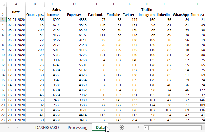
First, we simulate a situation. From the ERP-system of servicing an online store, a sales history was exported to an Excel file. This statistical information on the store’s activities for 2020 will be required to create a presentable report with interactive features for the purpose of further visual analysis. Based on the results of the analysis, a strategy for the further development of the company will be developed.
A brief description of the structure of the exported source data for visualization:
- Date of operations.
- The total amount of goods sold in pieces.
- Amounts of daily income.
- Amounts of daily expenses.
- Sources of the daily flow of attracted customers (for example, traffic from social networks: Facebook, YouTube, Twitter, Instagram, LinkedIn, WhatsApp, Pinterest).
Based on the data, analysts should provide information to find out:
- The most attractive traffic sources for a particular week number in a given month.
- The dynamics of changes in the number of sales of goods for the selected week of the selected month.
- The dynamics of weekly margin changes in the current month.
- Dynamic change in the ratio of income and expenses relative to the days of the week.
To obtain calculations based on the source data and provide answers to the above questions using visual presentations, special Excel formulas are used. All of them are an intermediate stage of processing and preparing the output of numerical information on the screen in the form of diagrams and charts. Therefore, these formulas are located on a separate intermediate sheet “Processing”:
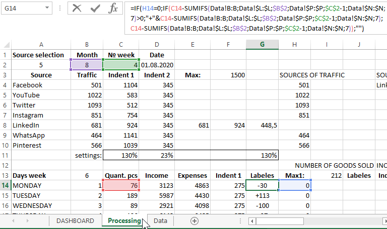
It is on the basis of the tables of this sheet that all charts and diagrams will be built to visualize the data of the weekly sales report for each month.
Excel dashboard principles
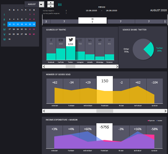
Since this report will break down monthly statistics by week, managing its calendar requires special attention. For this purpose, an interactive calendar has been specially made that breaks down the desired months separately into full and incomplete weeks. The calendar itself will be an interactive control element of the whole dashboard and a whole block will be allocated to it:
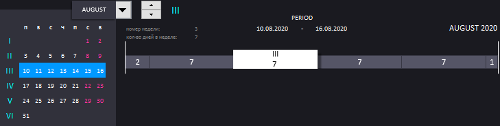
The principle of operation of an interactive calendar is very simple. From the drop-down list, select the desired month. And with the switch we switch between full and incomplete weeks of the selected month. In total, a month can be from 4 to 6 weeks with incomplete inclusive. It all depends on which day of the week the month begins and how many days in the same month.
On the left side of the block, the range of selected days is visualized as a blue rectangle on the calendar. Similar by the principle of creation, but with wider functionality, the calendar was used in another dashboard:
 Interactive calendar with visualization of data periods in Excel
On the right side is a scale that visualizes the same information only by a different method. Roman numbers on the scale cursor indicate the serial number of the selected week in the month. Arabic numbers on all blocks of the scale is the number of days in a week. If less than 7 - then this is not a full week. Each block on the scale represents a week, and its length is the fraction of the week in days in relation to the whole month.
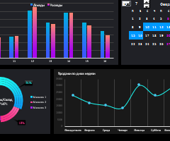
The next block “TRAFFIC SOURCES” consists of a bar diagram and chart:
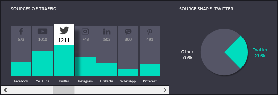
On the histogram, we visually observe the weekly rating of the popularity of the source for attracting customers to the online store. The histogram is interactive and has its own cursor, controlled under the control - the horizontal scroll bar. When the cursor selects one of the sources on the histogram in the right part of the block on the diagram, we analyze the share of the same source in relation to the total share of other sources of store visitors from social networks.
We proceed to the next block, the name of which speaks for itself "NUMBER OF SOLD GOODS":
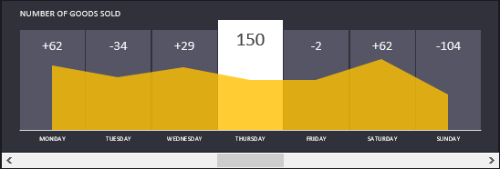
In this block, we track the dynamics of changes in the number of sales of goods by jokes. The block is also interactive and is able to interact with the user of the dashboard under the control of the element. He also has his own cursor, which displays the actual quantity of goods sold on the current day of the week as of the corresponding date of the day relative to the selected week on the interactive calendar. The remaining numbers are the level of change in the dynamics of quantitative sales relative to the previous day. A chart with areas visually visualizes these changes.
And finally, the last block informs its contents even more in the title "INCOME-EXPENDITURE = MARGIN":
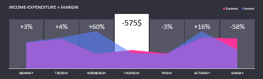
Although this unit is interactive, it does not have its own autonomous control element. It is controlled using the previous block.
The number on the controlled cursor displays the sum of the difference in the income and expenses of the company on that day of the week as of the selected accounting period with an interactive calendar. The remaining numbers represent the margin as a percentage. Margin itself is calculated by the formula:
(Income-Expenses) / Income = Margin
Read more about margin calculations and how it differs from the margin calculation formula here: How to calculate margin and markup in Excel.
Blue and scarlet charts with accumulation, visualize the change in daily levels of income and expenses. And also with the help of correctly selected colors they allow you to exhibit those days where expenses exceed revenues.
Together, all the units are harmoniously combined into one dashboard for visual analysis of the weekly sales report in the online store:
 Download dashboard with metro style design in Excel
This dashboard template can be used for its initial values of the same indicators by filling them with the first 11 columns on the “Data” sheet. It is important to note that this template absolutely does not use macros. And its interactivity is provided only by formulas and standard Excel controls, which are available on the tab "DEVELOPER" - "Controls" - "Insert". You have the full opportunity to independently edit the template and all ego elements to fit your needs. Just download the dashboard from the link above.
