Payment Processing Transactions Scheme New Chart in Excel
Today, Excel is the most versatile analytical computing tool in the world. There are many tools in Excel for data visualization with wide possibilities. But sometimes you need to create a new and non-standard solution with interactive capabilities. For example, for a visual statistical analysis of the transaction scheme in payment processing, it is necessary to create a new type of chart for highly specialized tasks that did not exist before. Thanks to Excel's versatile tools, users can significantly expand its capabilities for any type of task. Even without macros!
Example of how to create a new homemade chart type in Excel
Initially, let's define the terms of reference for the Excel dashboard developer. A new type of chart that doesn't exist before will be interactive and capable of changing the position of visualization elements depending on changes in the raw data. At the same time, only formulas will be used for automation without writing VBA macro code. Because the company policy forbids opening macro files in the whole corporate environment for the purpose of information security.
The principle of implementation of this specification is simple. First, a static scheme will be built according to the design script of the analytical report. Then the animation elements will be found and added to the interactive user requests for the chart.
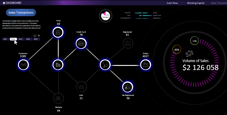
Scenario of data visualization on the user chart in Excel
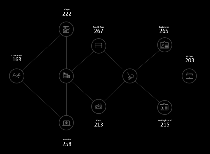
First, let's make a scenario to build a payment processing transaction scheme for all sales channels:
- All categories of the company's customers make their purchases through the online store or directly at offline points of sale.
- Two basic forms of payment are provided by credit card or cash.
- Each new customer is offered registration with the provision of contact information to receive notifications of the company's promotional offers if desired.
- The final payment is made and the purchase/sale transaction is closed.
This is what the payment processing transaction flowchart will look like graphically according to the above scenario:
This element as a background to visualize the data in the chart is not difficult to draw with standard Excel shapes. Plus we'll use icons from the icon collection in the Insert Illustration section.
Scenario for animating interactive elements in a new Excel chart
A description of the conditions for the implementation of the animation elements scenario is as follows:
- The direction on which channel the transaction moves is determined by highlighting the line.
- Each link in the transaction chain is highlighted by a circle.
- The values in the data signatures change.
Automating chart changes with formulas without macros
First of all we need to highlight the line automatically and by condition. Since we will not use macros, the state of the line will depend on the value in the cell, which is determined by the most popular logical formula in Excel - IF:
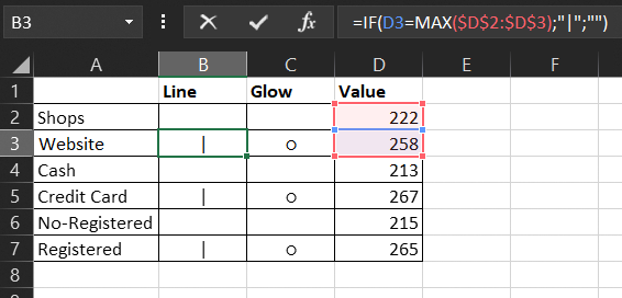
This formula should be read as follows: "If the number of trades exceeds Shop, then the vertical line symbol (I - alt code 0124, Unicode U+007C) is returned.
This symbol will act as a line with bright color. To do this, you need to create a new TextBox shape and make a reference to the cell in which the logical formula returns IF the symbol of a vertical line. And then change the color and font size in the TextBox element. To make the line thinner you should narrow the width of the TextBox figure:
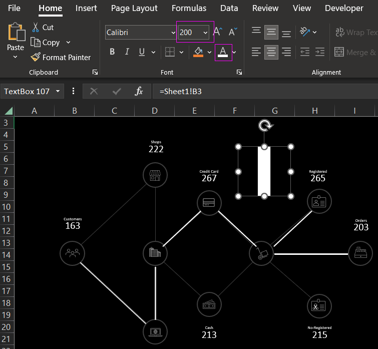
In the same way we make a highlight for each link in the whole chain of transactions. Only this time the character will be a white circle (○ - alt code 9, Unicode U+25CB):
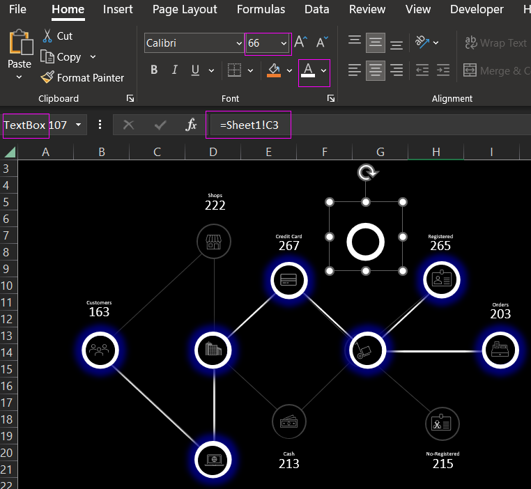
To change the inner diameter of the circle and make it thinner, you need to apply a circle with a slightly larger diameter than the inner ring of the ○ symbol in the TextBox shape. For aesthetics, the text can be decorated with additional glow and shadow effects.
Let's add some more additional charts to our unique custom chart for presentation and visual analysis of the payment processing transaction schema in Excel:
 Download payment processing transaction flowchart in Excel
Now the report will look more complete and harmonious. Download it and see for yourself how the functionality of the new chart created with standard Excel tools is arranged. Without the use of macros! This is yet another proof that Excel's capabilities are much wider than you might imagine. All it takes is imagination and a little experience.
