Petal Pie Сhart and benchmarking in Excel
Sector petal diagram as a kind of circular is convenient to use for performing comparative analysis in Excel. In this example, we will conduct a comparative analysis using an interactive presentation of data visualization for the activities of 6 branches and sales of 3 groups of goods in them throughout the year. All indicators will be combined into a single diagram and at the same time they can be easily read in graphical form.
Benchmark data in a pie chart in Excel
Data segmentation plays a very important role in the perception of complex large-volume information. With the help of segmentation, we are able to organize information and put everything in order to determine the most important data categories. All this allows you to make quick and correct decisions in the effective management of strategies for each project.
Segmented data visualization provides the ability to identify key indicators that have the greatest positive or negative impact on the result under certain conditions. Moreover, thanks to such opportunities, the project manager gets the strongest motivation, because as a result, all desires are transformed into intentions and supported by solid precedents. It remains only to act, to go towards your goal, and the direction has already been identified and supported by evidence of a real possibility of achievement. Like it was written in the book “The Art of War” (Sun Tzu) 2,000 years ago: “A real commander first wins, and only then fights.”
Terms of Reference for Benchmarking
First we simulate the situation. In a small chain of stores there are 6 retail outlets (branches). Throughout the year, the network trades in a certain category of goods, which can be divided into 3 groups - A, B and C. According to the statistics in the sales history, the following patterns are observed that affect sales:
- At different times of the year.
- Different product groups.
- Different sales performance indicators.
- To different shops.
Based on the report data, for the formation of the assortment strategy for the next year, it is necessary to determine:
- Which groups of goods to deliver in a larger volume.
- For which stores.
- What period of the year.
As a result, we get simultaneously 2 benefits:
- Next year sales increase for the whole network.
- Reducing the volume of goods leftovers in all stores.
For effective comparative analysis, it is desirable to combine all the segmented data into one diagram. At the same time, it should maintain a convenient readable appearance. How to implement all this in Excel?
How to make a pie chart from petal in Excel
Let's create a multi-layer pie chart, and the petal chart Radar will help us to realize this task in Excel:
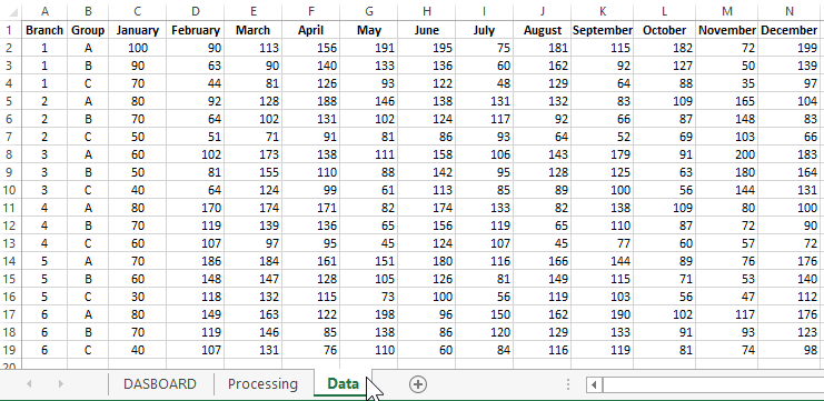
On the "Data" worksheet are statistical sales figures for all stores for all product groups for 1 year:
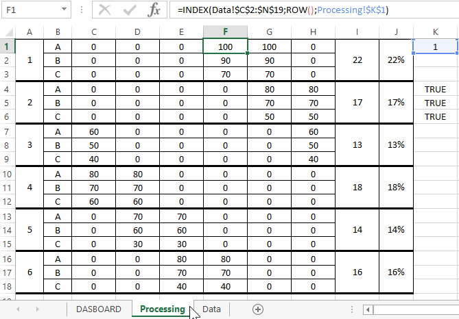
Based on the data obtained, fill out the formulas matrix table on the sheet "Processing":
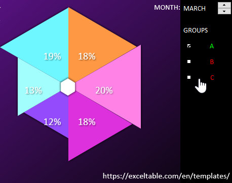
Based on the obtained matrix table, we construct a petal diagram. The matrix allows us to distribute the values so that the sector diagram is obtained from the petal diagram. We put it on the main sheet of "DASBOARD":
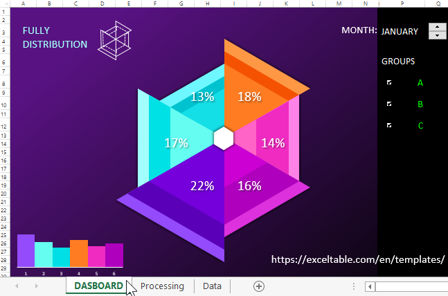
Dashboard controls have also been added that allow you to switch between monthly network metrics. Plus the ability to disable the desired product groups for convenient graphical filtering on data visualization:
To understand in detail the principles of this template, you can download it below the link.
 Download Sector Petal-Pie-Radar Chart in Excel
Sectors with similar colors show indicators of stores located in the same city (or district). The number of sectors can be increased by adding new columns in the table with the matrix on the sheet "Processing". To increase the number of groups, you must add new rows to the same table.
Useful advice! If, using your initial values, the layers of the chart sectors overlap each other, then use transparent fill colors within 50%.
