Monthly Sales Close Plan Template on Excel Chart
To draw up a business plan of an enterprise should not only be at the stage of investment and organization. A successful manager annually draws up a new business plan with calculations of potential volumes of sales of goods and services for his enterprise. To solve such a crucial task, you can use the universal analytical computational software tool Excel. Here is an example along with a template that can be downloaded at the end of the article.
An example of how to create an annual sales plan in Excel
Especially for you, a convenient Excel template has been compiled, which will serve as a professional tool for analyzing and planning the company's sales for the year. A brief description of the features of the template:
- Interactive visualization of data on sales and temporary accounting periods of the month (weekly for the preparation of weekly planning meetings).
- Display indicators in absolute (amounts) and relative (in percent) values.
- Segmentation of past or forecasted sales history by weeks, months, quarters, half-yearly periods.
- Connecting an interactive, controlled cursor for visual analysis of potential indicators.
- Displays the average level of values for totals.
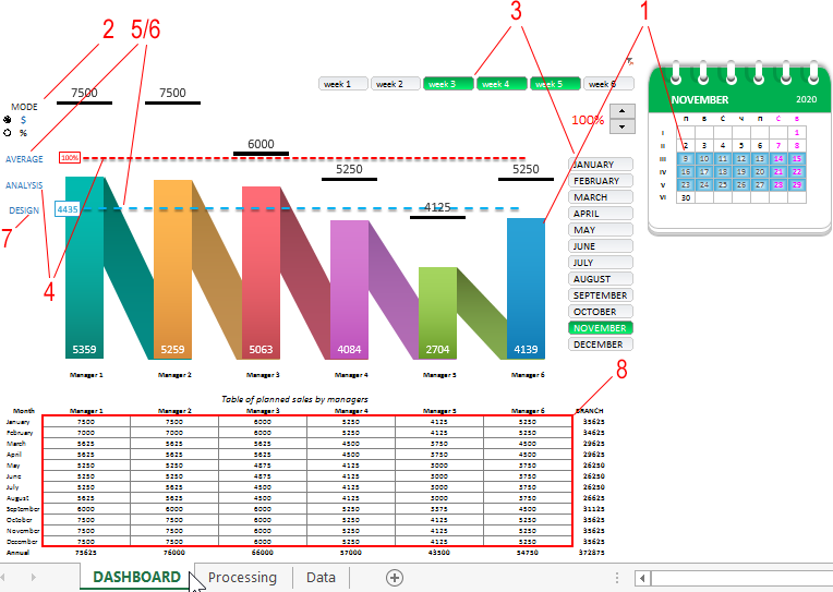
- Displays the level of overall implementation of the plan (monthly or annual) of the branch against the background of current sales figures for managers in percent.
- Switch design visualization.
- The ability to set sales plans separately for each manager for each month (for different periods of seasonality).
Set up a sales plan according to the instructions
First you need to fill in the past or potential (very often + 20% of the past) sales history on the “Data” sheet with values:
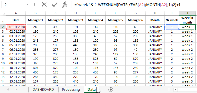
We only fill in the first 7 columns, but we don’t use columns with formulas.
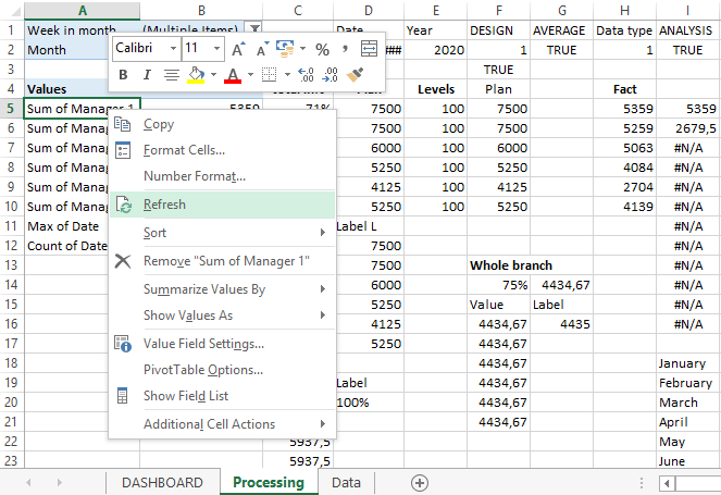
Then you need to update the values in the pivot table on the Processing sheet. To do this, we right-click on the pivot table and select the “Refresh” option from the context menu that appears:
After that, you can go to the DASHBOARD main sheet to set monthly sales plans for managers for the whole year.
Dashboard template for sales managers planning for the year
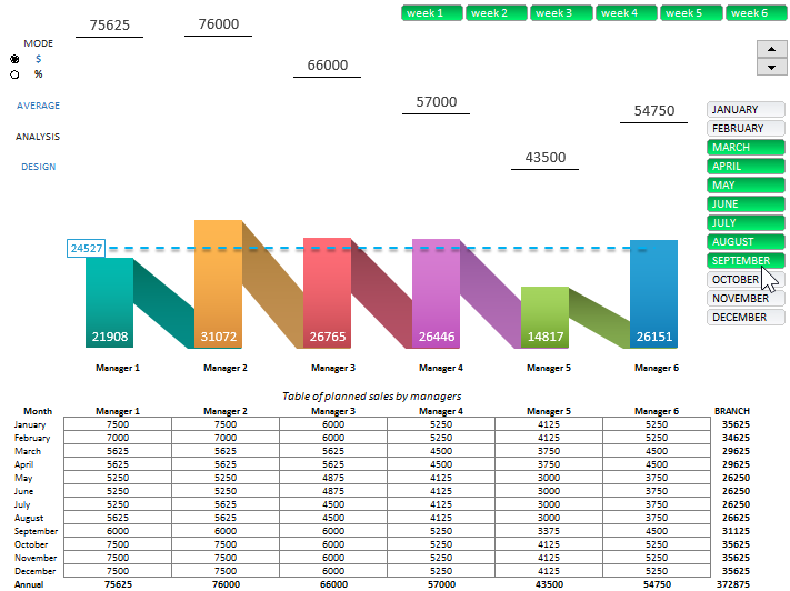
On the main sheet of the Excel template, first of all, you should fill out the table with sample plans for each sales manager:
We only fill the cells inside the table frames, and we do not use cells with formulas. If necessary, these values can be changed while working with the report template.
Options for managing dashboards in Excel
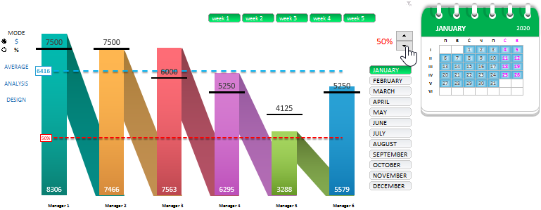
Thus, using the values in this table, we control the upper (black) values and the position of the bars on the chart. They correspond to the current level of the monthly sales plan for each manager.
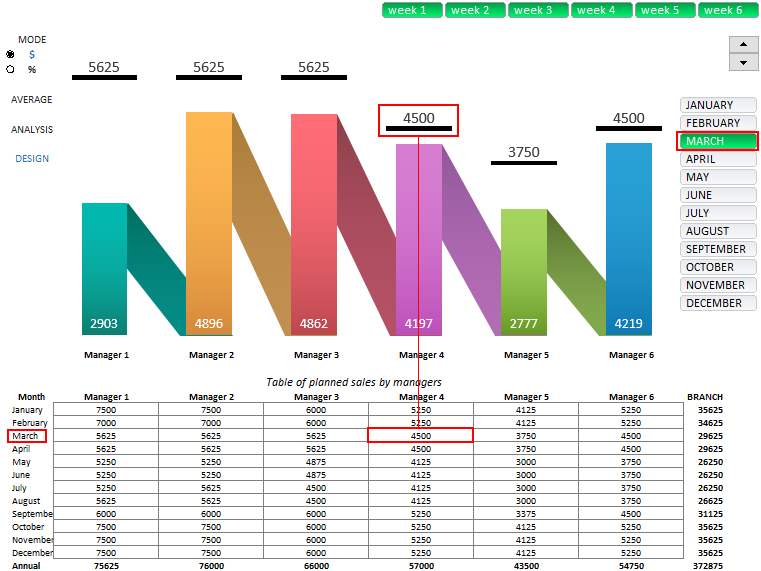
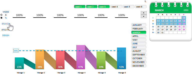
If we switch to the mode of relative values of indicators of sales as a percentage, and not in dollar amounts, then with the same table we manage the graph columns and lower (white) values. Indeed, in this mode, we observe how many percent is left until one hundred percent implementation of the plan for each manager:

As we see in the percentage mode picture, Manager 4 in March was in second place in fulfilling his sales plan, losing to Manager 6 by 1%.
But in general, no one fulfilled sales plans in the month of March. And in order to look at the chart the big picture as a result of the monthly plan of the branch, you should enable the option “ALL BRANCH”:
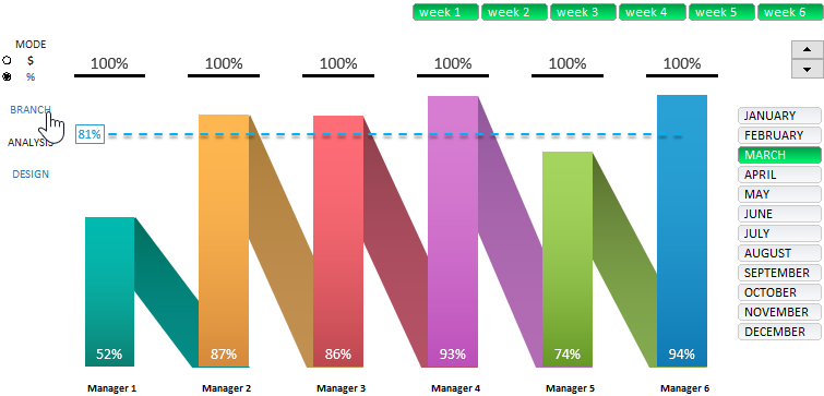
As a result, we see: total, the branch fulfilled the sales plan in March by 81%.
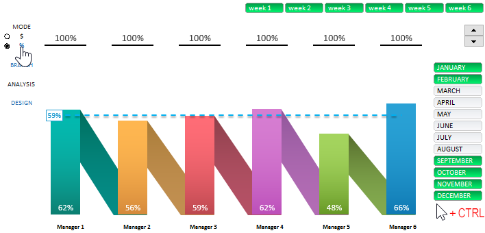
Again, switch the display mode of indicators in dollar amounts and turn on the “ANALYSIS” option:
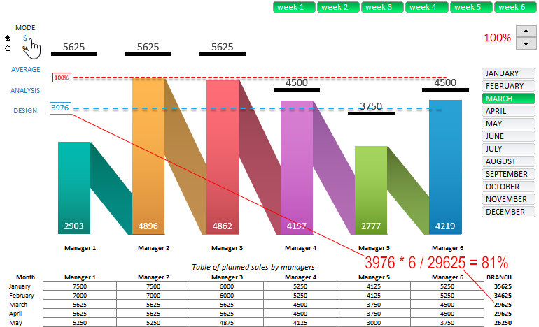
A new red level has appeared. And the old blue level now displays a different kind of information - the average value of the actual implementation of the branch plan in the current month. When switching in different modes, the blue level displays different types of data values in accordance with the schedule. This is done because the sum of all the average values of the actual implementation of the plan is a fraction of the total monthly plan. In other words:
3976 * 6 / 29625 = 81%
(6 – is six managers)
At the red level, we see where the level of one hundred percent fulfillment of the branch plan is located if all managers completed their plans to this level - the same. That is, some would have to overfulfill their plan.
The red level is interactive and the user of the dashboard can interact with him using the interactive element "Counter":
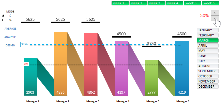
Thus, performing visual analysis of the data is much more convenient.
The last option in the left block of the DESIGN controls. It works as a switch between two ways to display the appearance of a chart - with or without oblique columns. Made specifically for those users of dashboards for which oblique columns interfere or do not find them aesthetically pleasing in the graphic design - especially when displaying small values. Also, this function can be used when printing a graph.
Work with the weekly calendar
This dashboard allows you to analyze the implementation of sales plans not only by months, but also by weekly periods. It is very convenient for preparing presentations for weekly planning meetings at the branch.
Suppose we need to display on the chart data only for the first 3 weeks of the month of March (by the way, the entire March month of 2020 is 6 incomplete weeks). To do this, we will use the button block with the inscriptions “Week” and holding the left mouse button we will carry out only the first three buttons of this horizontal menu:
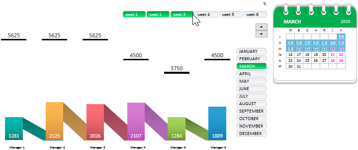
Visualization on the calendar allows us to navigate the current situation on the chart. If we also switch to the percentage data display mode and enable the “ALL BRANCH” option, then we will be able to see the percentage of the branch’s overall plan fulfillment as of the selected accounting period (mid-March):
As a result, we see that in half a month only 36% of the overall plan was completed. The greatest potential for fulfillment was in Manager 4 and Manager 6. Although at that time, Manager 4 had the championship with a noticeable margin of 5%. As we already know, by the end of the month the situation has changed. Most likely the plans were set correctly.
To reset the filter and return to the original display for all weeks of the month, you can not only select all the buttons of the horizontal menu, but simply click on the funnel icon in the upper right corner of this button block.
Quarterly and semester data segmentation
Similarly, we can select several buttons in the vertical menu block to select data for quarters, semesters, or other desired periods (for example, season or non-season). Here is an example of data sampling for the second and third quarter of the current year:
Attention! In this mode, the dashboard automatically switches to the performance indicators of annual sales plans for each manager.
To select the months of the season of active sales of the year (from September to February), you should additionally use the CTRL key on the keyboard when selecting non-contiguous copies in the vertical menu block:
In principle, we examined all the main features of the dashboard for the analysis of sales planning for managers for the year.
Useful advice! If you are substantially lacking in the vertical Y scale chart, you can add it using standard Excel tools. Just click on the graph, click on the plus button and from the pop-up menu "DIAGRAM ELEMENTS" select the option "Axes" - "Main vertical axis" by checking its box:
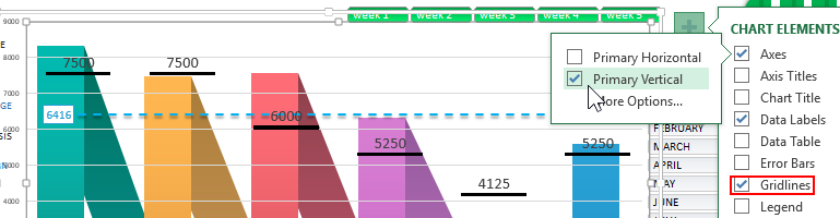
In the same way, you can add horizontal lines of level levels of the Y axis values by checking the Grid option. These options were initially disabled for the sake of aesthetics of the appearance of the dashboard:
 Download Sales Planning in Excel
This template is distributed absolutely free. It does not contain macros; all automation tools implemented using formulas and pivot table controls. It has no passwords. You can freely download the dashboard template and start planning sales right now. You also have the opportunity to edit, change, customize and improve this dashboard with data visualization in Excel to your needs and requirements.
