Shapes in charts and graphs for report presentation in Excel
Using Shapes and vector graphics, you can presentably present any standard diagrams and graphs in Excel. By drawing shapes on charts and graphs, you charge the data visualization with spiritual energy in your reports. The aesthetic beauty of the user of the report visually stimulates the growth of hormones of joy and satisfaction - dopamine. Better data visualization should not only allow easy perception of any amount of information, but also arouse a sense of satisfaction from the robot.
How to beautifully design charts and graphs for presentation in Excel
For stylish design of standard charts and graphs in Excel it is best to use:
- Vector graphics.
- The right color palette.
- Gradient fills.
Excel vector graphics are provided as shapes. All curly primitives are available from the "INSERT" - "Illustrations" - "Shapes" menu. But with the help of tools ("Scribble" or "Freeform"), you can draw your own complex shapes in Excel as in a graphical editor:
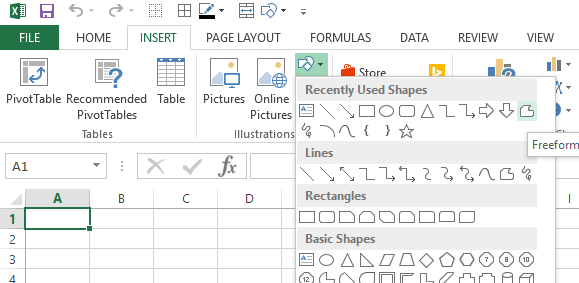
These tools will help you create your complex shapes if you did not find a suitable primitive in the catalog for further editing.
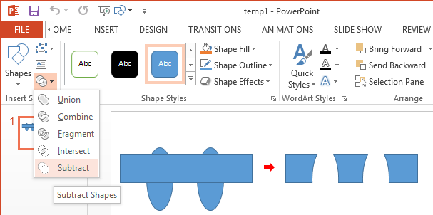
It should be noted right away that for drawing complex shapes it is much more convenient to use the MS PowerPoint program. There are more auxiliary tools, such as Eyedropper or Merge Shapes:
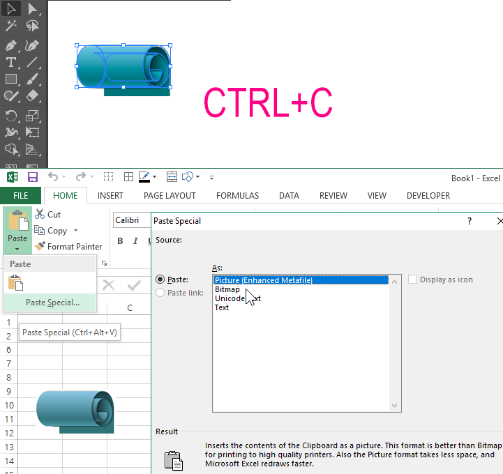
For more advanced PC users, it is possible to import shapes from vector graphics editors who narrowly specialize in the field of drawing illustrations. For example, the popular vector editor Adobe Illustrator. The best way to exchange vector graphics from Adobe Illustrator to MS Excel or MS PowerPoint is to use the * .EPS file format. First, we export the file from Adobe Illustrator to this format, and then we import into any program included in the MS Office package through the "INSERT" - "Pictures" menu.
But there is an even more convenient way - this is copying a vector from Adobe Illustrator to the clipboard (CTRL + C) followed by a “Special” paste. We do this: first, copy the drawn Shape to Adobe Illustrator, and then through the "HOME" menu - "Clipboard" - "Paste" - "Paste Special" (CTRL + ALT + V), call the window in which we select the option "Picture (EMF) ":
Then you need to convert the vector drawing into MS Office shapes. To do this, we right-click on the inserted image, and from the context menu select the option “Group” - “Ungroup”. As a result, we get a message about the conversion of the imported vector drawing into a Microsoft Office shape:
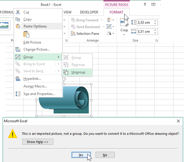
As a result, we have new complex but beautiful clip arts for stylish aesthetic design of charts or graphs in Excel. Imported vector drawings that are converted to shapes can be edited directly from Excel or PowerPoint.
How to outline charts and graphs in Excel
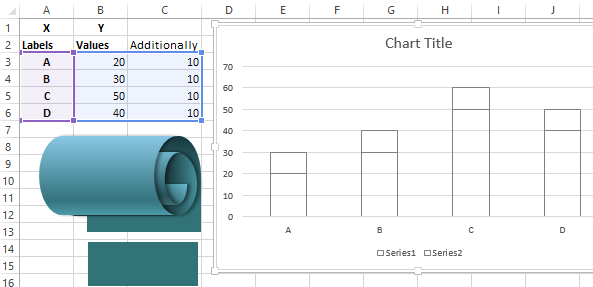
When creating standard charts and graphs, we immediately get an interactive design template for data visualization, which can be filled not only with a gradient color or pattern, but also with shapes. For illustrative purposes, create such a chart template and intentionally clear it of color, and then colorize it with shapes.
Based on the approximate initial values, we create a histogram with accumulation and remove the color scheme:
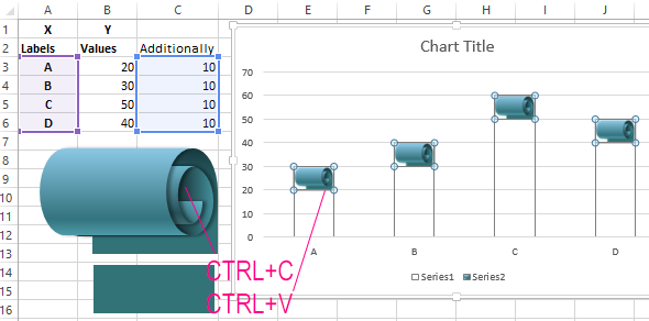
Now copy the top group of CTRL + C shapes and paste it into the top row of the histogram after selecting it with one click of the mouse:
In the same way, we repeat the same operations with the lower first row and get the final result of the histogram drawing by Shapes:
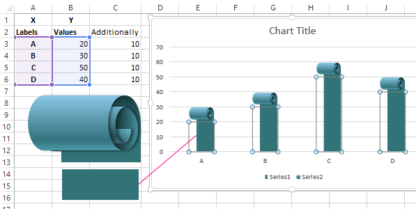
As you can see in this example, using vector graphics, the possibilities of data visualization in Excel become almost limitless.
Example of using shapes to draw presentations in Excel
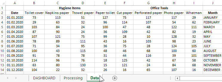
In each office, in any company, there are costs for paper supplies. For instance:
- Format paper for office and printers.
- Costs of hygiene items.
The table with data on expenses is located on the “Data” sheet and looks as follows:
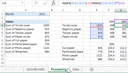
Based on the source data on the “Processing” sheet, a summary table and calculation formulas were prepared to prepare for interactive presentation visualization:
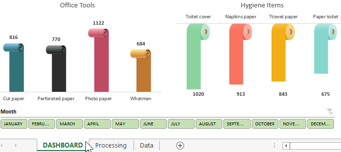
And on the main sheet of “DASHBOARD” we display all the information in the form of visualization of a realized histogram with the design of vector shapes:
 Download presentation with Shapes for reports in Excel
An interactive element in the form of a block of months buttons, implemented using a pivot table tool - filter slice. It is located in the menu "INSERT" - "Filters" - "Slicer". But the pivot table must first be highlighted. To select, just place the cursor in any cell of the pivot table. As a result, an additional menu “WORK WITH PivotTables” will appear. You can also add a block of slicing buttons in it by selecting an option in the additional menu on the tab “ANALYSIS” - “Filter” - “Insert Slicer”.
On the “Processing” sheet of this template, there are all groups with Shapes used in this presentation of the paper materials expenditure report at the office. Take them as examples and use them in your own interactive presentations in Excel.
