Simple DASHBOARD template in Excel without VBA-macros
We offer a simple dashboard without using VBA macros. According to the preferences of subscribers on my Facebook page: https://www.facebook.com/excelvisualdata/ most prefer to use Excel dashboards without VBA macros and third-party add-ons. To please the majority, this interactive dashboard template was created.
How to make an interactive dashboard in Excel without VBA-macros
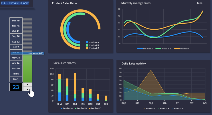
This dashboard template is designed to perform a visual comparative analysis of sales for the three product categories A, B, and C. This simple dashboard contains only 4 blocks. For 3 blocks, the accounting period is one week, and for the fourth block - 1 month.
Description of charts and graphs on a simple Excel dashboard
Consider each block individually:
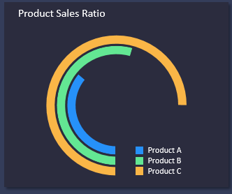
- The first block “Product Sales Ratio” visualizes on a c-shaped diagram the ratio of the quantity of goods sold for the current week. It also displays the ratio of the number of sold three product groups A, B, and C relative to each other.
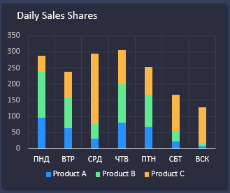
- As the second block “Daily Sales Shares”, a histogram with accumulation is used. With the help of it, the shares of each group of goods in the total volume of the total amount of goods sold separately for each day of the week are perfectly visualized. You can track trends on which day of the week, which group of products is most actively or passively sold. Based on this information, tactics or entire marketing strategies are built to promote goods in the right time period. To do this, use: promotions, discount coupons, discount programs, contests, etc. etc. There are many marketing tools that will not allow your products to settle on store shelves or in stock balances. It is only important to set the goal correctly and determine the right time for their effective application.
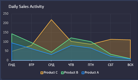
- The third block “Daily Sales Activity” is a graph with areas for comparing sales activity in three groups of goods during the current week. It is immediately important to note that this block is slightly different from the 3 remaining blocks. The fact is that his initial data on the Processing sheet was prepared in such a way that the group with the highest sales figures for the current week is always shifted to the background, and the group with the smallest is always in the foreground. Therefore, it is important to read the legend of the chart on it, since not every week the “C” group is the most active in sales. Accordingly, its color may be different, because the orange color is only for the type category in the background for this graph. This approach to visualization is made for convenient reading of graphic figures in visual analysis.
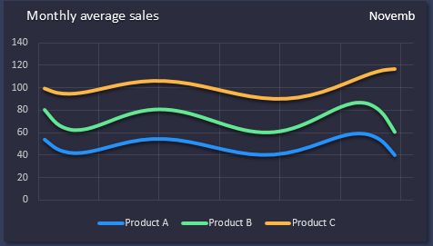
- And finally, the 4th block called “Monthly average sales”. This dashboard unit also has its own peculiarity. It displays curves with average sales for each product group for the current 1 month. Therefore, if all the other 3 blocks automatically update their values when changing the number of one week in a year, the 4th graph with curves changes its indicators only when the month number of the analyzed current year changes along with the week number. For example: February starts from the 6th week, and October starts from the 41st week, etc. Total 52-53 weeks in a year.
On the left side of the dashboard is a scale for visualizing the selected current period of the year:
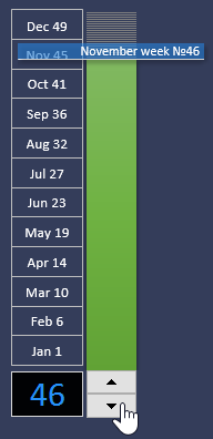
The dashboard is controlled using the counter control or by entering numerical values 1-53 into cell B22. When changing the values in this cell, all indicators on the dashboard change accordingly. And also moves the arrow on the scale. The scale itself is divided into 12 months opposite each month the week number is indicated with which the same month begins. Thus, the numbers on the scale serve as a hint for a quick transition by month by entering the corresponding week number in cell B22.
In general, we got a convenient template for interactive visualization of your data on a dashboard:
 Download easy Dashboard without VBA macros in Excel
The initial data, as always, is filled in the “Data” sheet. The template does not contain macros, so even a user below the average level of mastering of the universal Excel program can edit it.
