Stylish green dashboard for advertising download in Excel
Advertising is the engine of trade! This famous expression should be rephrased a little: not the engine, but the fuel, which should be controlled. Advertising allows you to boost sales, but subject to proper use within the framework of financial security techniques. Otherwise, you can get an explosion instead of the desired result. Therefore, it is important to monitor the effectiveness of advertising using all possible analytical tools, so as not to waste all advertising budgets in vain. As an example, consider the dashboard as one of such tools. The dashboard of this dashboard displays some important metrics of the effectiveness of the advertising campaign.
An example of visual analysis of dashboard metrics in Excel
This dashboard example is designed to analyze online advertising for online trading. Owners can use it: Internet stores, Instagram channels, Facebook page administrators on other social networks or on different marketplaces such as eBuy, Amazon, Alibaba, etc. Today, online trading has developed greatly and you can sell your goods around the world with a minimum threshold of entry for both investment and competence. Everything is as simple and affordable for everyone. But this same factor also affects the active growth of competition. Therefore, in order to successfully fight for their share of customers, one can not do without advertising. Especially in the initial stages when you need to build a customer base.
If in a nutshell to describe the principle of online trading can be expressed as follows:
- We attract a lot of traffic from various sources to our landing page to get as many leads as possible.
- We sell our goods and / or services to an audience.
But as they said in ancient Greece: "The best liars speak almost truth." Therefore, one should immediately look soberly at such a generalized picture. It’s not enough to buy ads and get a lot of traffic. If you attract not the target audience as a result you will get 0 sales. Therefore, you should be consistent and enter the business gradually applying the art of small steps. Life is an experimental science! First, you should do low-budget experiments with advertising, and then analyze the results using all kinds of metrics. As a result, you will find the best patterns for your business. And there is no better way to gain confidence than to become the owner of patterns.
Terms of reference for data visualization in Excel
As always, by tradition, to review the dashboard analysis of the effectiveness of advertising, we simulate the situation. Suppose we have our own online platform for the sale of three categories of goods: A, B, C.
Throughout the year, we bought small budgets for advertising in different states. And as a result, we got traffic with the target audience and sales. Just note that 5 types of advertising have been tested. But the emphasis was primarily on contextual advertising.
The advertising company was conducted on the following types of advertising:
- Contextual advertising.
- SEO promotion in search engines.
- Affiliate advertising is based on the distribution of referral links.
- Offline advertising page addresses resulting in direct clicks.
- Other traffic sources.
The fifth point was obtained as a result of the work of the previous 4 points. Since it can be passive and indirect new customers. They could hear about you from acquaintances who saw your ad or. As a result of the so-called “warm-up effect” effect - when the purchase decision was made much later than contact with advertising information. Whatever the growth of traffic from other sources, it noticeably correlates with the growth in the activity of advertising campaigns and should not be ignored.
We will analyze the effectiveness of an advertising campaign by metrics to find out:
- How much more effective is contextual advertising in relation to other types.
- For what type of advertising, which product group is most suitable.
- Which states are home to the most loyal audience for your offers.
- What is the share of customers who return in relation to new customers.
- What is the proportion of active visitors (activity is determined by the interaction: likes, reposts, comments, etc.).
- How the whole advertising company influenced the dynamics of average profit and marginal profitability by months.
To determine where the answers are on the dashboard panel devices, consider all its blocks with metrics.
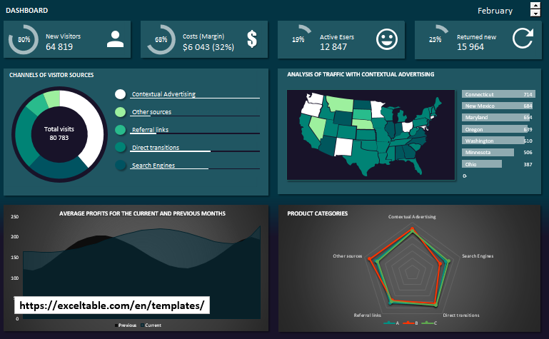
Dashboard for analyzing advertising traffic on charts in Excel
At the top of the dashboard is a panel of 4 buttons and an interactive control - a switch between months:

- New visitors. Share of new visitors to store pages. New visitors are those users who have not logged in for at least 2 weeks.
- Costs (Margin). Here you can track the change in total expenses and trading margins by month.
- Active users. The proportion of users who interact with any information on the store pages: comments, likes, reposts, purchases, etc.
- The proportion of visitors returning to the store in relation to the number of new ones.
The buttons show a brief summary of statistical information. And when you click on each button, a window appears with a chart for analyzing relevant information about the store’s activities throughout the current month by day:
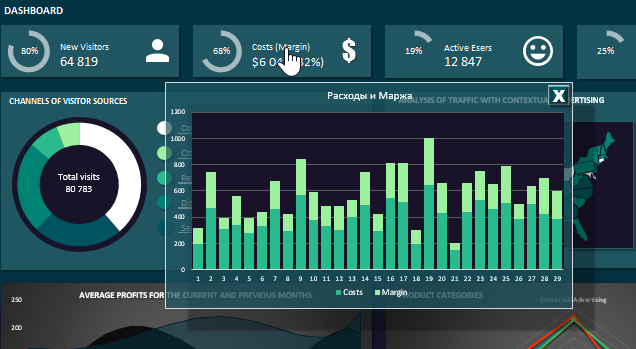
There is still a lot that is missing for a complete analysis of behavioral information about potential customers: average time spent on pages, popular pages, popular preferences of products, etc., etc. This is just an example of a dashboard. Any dashboard can be improved endlessly.
Below the left is the block “Visitor Source Channels” for traffic analysis resulting from an advertising campaign:
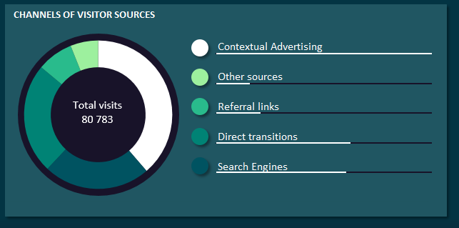
The diagram shows the distribution of traffic to the shares of the types of promotion used in this advertising company.
To the right of the chart, the bar chart shows the ratio of 4 types of traffic source with respect to contextual advertising. Since the entire advertising company focuses on this particular method of store promotion.
On the right is the following block “Analysis of traffic from contextual advertising”:
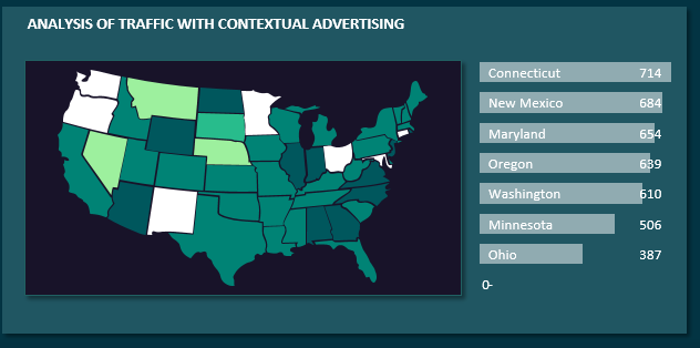
Here on a map of the US states, you can determine in which month, which state generated the most quantity from which traffic source. The states highlight colors on the map correspond to the block legend on the left.
To the right of the map is a bar chart of the states ranking for traffic generation only from contextual advertising. For each month, the information in the block is automatically updated.
In the lower left corner of the dashboard is the block "Average profit in the current and previous months":
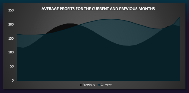
Here we can analyze the average profit. And also compare this indicator with current and previous months. Averaging was performed by approximating the data with a polynomial calculation formula to the 5th degree:
y = (c3 * x ^ 3) + (c2 * x ^ 2) + (c1 * x ^ 1) + b
In the foreground of the chart, the values for the current month are visually presented, and in the background - the previous month.
The last block of “Product Categories” shows a petal diagram for groups of products and with what activity they were sold depending on the source of traffic:
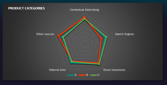
As can be seen above in the picture in February, category B was more actively sold to store visitors who came from search engines and by direct clicks to the page address (or hashtag). Although in general, contextual advertising had a positive effect on all product groups in a given month.
In general, the whole picture of the dashboard can serve as an excellent example of data visualization for analyzing business metrics:
 Download stylish green dashboard in Excel
Lastly, I wanted to remind you: data visualization not only allows you to conveniently and quickly make the best decisions, but nothing motivates as much as visualizing changes in results in any field of activity!
