How to change the chart in Excel with the settings of the axes and colors
It is not always possible to immediately create a graph and a chart in Excel that corresponding to all user requirements.
Initially, it is difficult to determine in which type of graphs and diagrams it is better to present data: in a three-dimensional split diagram, in a cylindrical histogram with accumulation or in a graph with markers.
Sometimes the legend is more of a hindrance than it helps in presenting of the data and it's better to turn it off. And sometimes you need to connect a table with data to prepare the presentation in other programs (for example, PowerPoint). Therefore, you should learn how to use the settings of charts and diagrams in Excel.
Changing graphs and charts
Create to a data plate as shown below. You already know how to build a diagram in Excel based on the data. Select the data table and select the «INSERT» – «Insert Column Chart» – «Clustered Column».
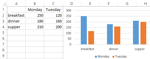
The result was a graph to be edited:
- to delete the legend;
- to add a table;
- to change diagram type.
The legend of the chart in Excel
You can add a legend to the diagram. To solve this problem, we perform the following sequence of actions:
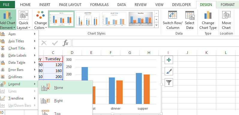
- Click the left mouse button on the chart to activate it (highlight) and select the tool: «CHART TOOLS» – «DESIGN»-«Add Chart Element»-«Legend».
- From the drop-down list of options for the «Legend» tool, point to the option: «None (Do not add the legend)». And the legend will be removed from the schedule.
The table on the chart
Now you need to add a table to the diagram:
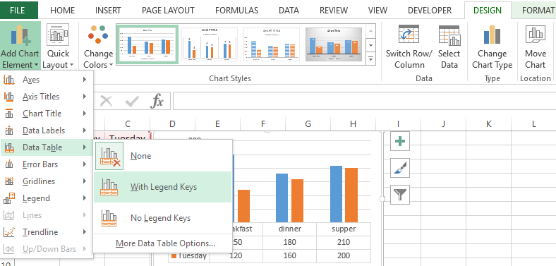
- Activate the graph by clicking on it and select the «CHART TOOLS»-«DESIGN»-«Add Chart Element»-«Data Table».
- From the drop-down list of options for the Data Table tool, point to the option: «With Legend Keys».
The types of graphs in Excel
Next you need to change the type of the graph:
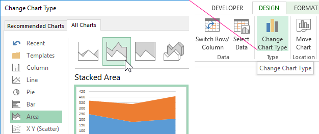
- Select the tool «CHART TOOLS» – «DESIGN» – «Change Chart Type».
- In the window «Change Chart Type» dialog box that appears, specify the names of the graph type groups in the left column – «Area», and in the right window select «Stacked Area».
For complete completion, you also need to sign the axes on the Excel diagram. To do this, select the tool: «CHART TOOLS»-«DESIGN»-«Add Chart Element»-«Axis Titles»-«Primary Vertical».
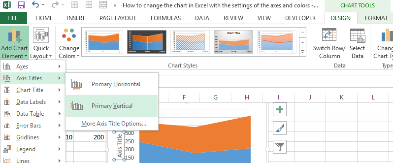
Near the vertical axis there was a place for its title. To change the text of the vertical axis header, double click on it with the left mouse button and enter your text.
Delete the graph to go to the next task. To do this, activate it and press the key on the keyboard – DELETE.
How to change the color of the chart in Excel?
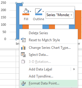
On the basis of the original table, create a new graph: «INSERT» – «Insert Column Chart» – «Clustered Column». Now our task is to change the fill of the first column to the gradient:
- Click once on the first series of columns in the graph. All of them will be allocated automatically. The second time, click on the first column of the graph (which should be changed) and now only it will be selected.
- Right-click on the first column to open the context menu and select the «Format Data Point» option.
- In the «Format data point format» dialog box in the left section, select the «Fill» option, and in the right section, select the «Gradient fill» option.
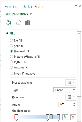
For you now available tools for complex gradient fill design on the diagram:
- the name of the workpiece;
- a type;
- a direction;
- an angle;
- gradient points;
- a colour;
- brightness;
- transparency.
Experiment with these settings, and then click «Close». Pay attention to the «Workpiece Name» available ready templates: flame, ocean, gold, etc.
How do I change the data in an Excel chart?
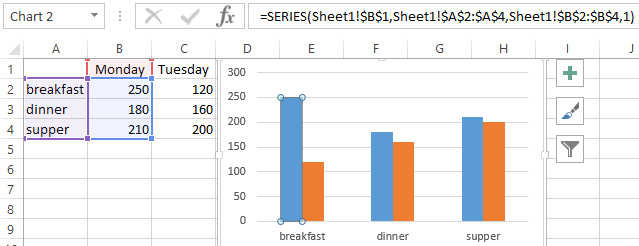
The diagram in Excel is not a static picture. There is a constant connection between the graph and the data. When the data is changed, the «picture» dynamically adapts to the changes and, in this way, displays the actual indicators.
The dynamic relationship of the graph with the data is demonstrated on the finished example. Change the values in the cells of the B2:C4 range of the source table and you will see that the parameters are automatically redrawn. All the metrics are automatically updated. It is very convenient. There is no need to recreate the histogram.
