Associative techniques for visualizing data sampling in Excel
Information that is easy for a person to perceive visually must be supported by associative imagery. Everything we understand is all lived experience. All lived experiences are stored in our memory in the form of index cards. For each described information object in human memory card index, there must be a picture of what the information object is associated with. Moreover, this applies to any objects of information, not just nouns. For example, we have the adverb "hot" reinforced with an image with the predominant color red or orange to store, search for, and quickly retrieve it from memory. It cannot be the color blue or purple with white speckles to associate with the word "hot." Given this fact, you can and should apply these rules in infographics and data visualization for easy perception and quick reads.
An example of using associative techniques for visualization in Excel
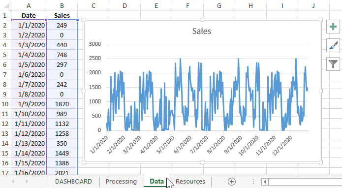
For example, let's simulate a situation. There is a history of daily sales for the accounting period of 1 year (leap year, historically unforgettable 2020). That is, as the initial data was exported "sous vide" table with dates and numeric values with a total number of lines - 366 pieces. To present the whole table with so many values on one Excel chart? Only an impudent lazy person would do that.
You should not ignore the visualization capabilities of Excel. You need to add an element of play to your presentation, make it readable and easy to comprehend. And to complete a masterpiece, it is worth daring to play the game of the mind with associative human thinking. So we will create a hidden provocation in the audience's presentation evoking different feelings: interest, admiration, and even criticism. The main thing is that no one will remain indifferent. After all, if there is an objection, it means there is interest!
There are different presentations with different ways to visualize data. Often there are similar graphic techniques - it is not important, but it is important that there was a mood. The user must create feelings at the moment of visual contact. And this does not mean that the design must be «sexy». Try to catch that fine line on the blurry lines between "sex" and a sense of style. Even animals have sex, but they don't have feelings and they envy us.
Description of the solution for the task at hand
And so the elements of association in the presentation. All 366 values are difficult to perceive as a whole. It is better to eat the sperm whale in pieces, it tastes even better. Therefore, in the presentation we will make a sample for analysis. In addition, it is very rational to apply segmentation of the original data for the presentation by different time periods. To do this, let's add the ability to switch between 3 modes:
- By day.
- By week.
- By month.
This will significantly suppress the noise on the chart and allow for more accurate and productive analysis. Thus, our data visualization will serve as an effective and important tool in developing financial strategies for the next year.
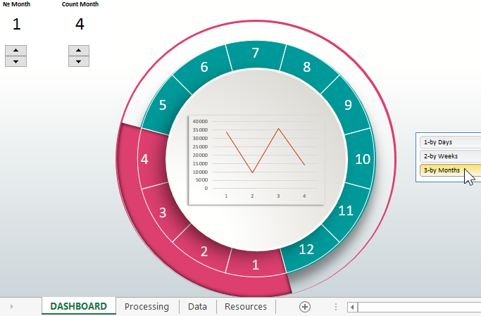
The initial data we have for the accounting period of 1 year. It is worth paying attention to such an associative expression that appeals to our memory as "all year round". As described above, the data will be exhibited - piece by piece. Most of the residual data will be conventionally depicted as a simple circle with sectors. Just as the circle symbolizes the "round year", so the sectors on it symbolize the months. Do not use the name of the months, but only sign each sector with the number of the month. In order not to overload the user at one moment, and to try to remove the information load from the background as much as possible, without compromising the understanding of the overall picture. On the one hand, our brain has limitless possibilities, but on the other hand it is so delicate that it is very easy to overload it and suppress its performance. It is important to treat users with care and take this fact into account at the design stage of infographics or data visualization.
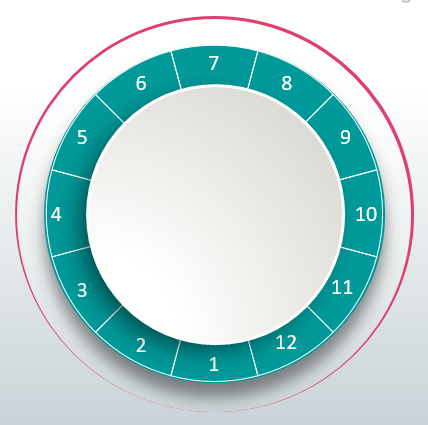
This example shows very clearly how easily you can fool yourself by playing with human associative thinking. Pay attention! We have a circle and twelve month numbers, so under no circumstances should we put the number 12 at the top of the circle. Otherwise a different association will be triggered at an unnecessary moment. That is, in most cases, the circle will be associated with a clock face, rather than "round year" and 12 months on the visualization. And it's so easy to mislead the user - you can't let that happen!
A year has different properties and 2 of them are beginnings and endings. The beginning is usually associated with a bottom-up motion. And the end of the year is associated with the completion of the circle from top to bottom. Therefore, the numbers 1 and 12 should be at the bottom of the circle. I see the year so its first month is the very bottom of the circle, but this is subjective. You need to be careful with this, reducing your subjectivity to a minimum, even if you can't get it down to zero. But in general, all held in objective algorithms of human association and it already means a lot.
Also note the red outline with different thicknesses of the eccentric ring, like an off-center circle. It's not just a design touch. The red outline symbolizes the phases of seasonal sales. The active sales phase occurs during the month of August and September.
For example, the season of active sales of swimwear in August ("velvet season"). Or in September there is an active increase in sales of fresh red game. Then activity decreases significantly in January and February, where the circumference is narrowed the most. The outline may not even be signed as an indicator of seasonality, the user himself intuitively associates and catches the essence of the graphic element on the visualization.
Visualization scale with interactive cursor
The cursor on the scale of our infographic is the linking semantic link between the first and second plan of the presentation. It visually informs which part of the information, in which place of the year and what proportion of it has been taken for exposition and detailed analysis in the first plane:
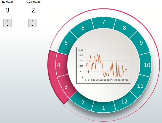
The cursor is a dynamic element and is interactively controlled by two controls on the left side of the presentation dashboard in Excel:
- The first element changes the position of the cursor on the scale, thus indicating which month the data sampling begins.
- The second element changes the size of the cursor, and with it changes the amount of the selected part of the data on the chart that is exposed. One step of change equals one month.
The maximum number of selected months for detailed analysis in the first visualization plan is 6. But you can increase/decrease it in the settings of the second control by calling the properties window from the context menu by right-clicking on the element.
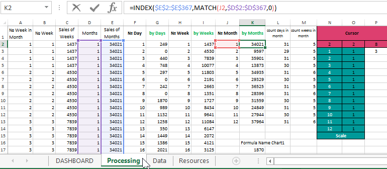
Formulas and initial values for the cursor functioning are on the "Processing" sheet. Their cells are highlighted with corresponding colors. All other formulas for controlling the dashboard are also there:
Dashboard error protection and error handling
This pattern uses error protection by resetting. For example, if the starting month was selected by the first element 10 (October), and the number of months to sample was selected by the second element - 3. Then nothing is displayed on the first element and the cursor itself disappears, because - this is an error! There cannot be 13 months in a year, only 12. To display the data on the graph again, you need to reduce the number of months in the sample to at least 2, or move the initial sampling period from 10 to 9. As a result, the data will again appear in the presentation in the foreground and the cursor will appear again in the background.
Segmenting data by day, by week, and by month
An equally important interactive element of the dashboard control is the 3-button menu block for switching between data segmentation modes by three time periods: days, weeks and months. These were implemented with the PIVOT TOOLS-ANALYZE-Filter-Insert Slicer tool for the summary table:
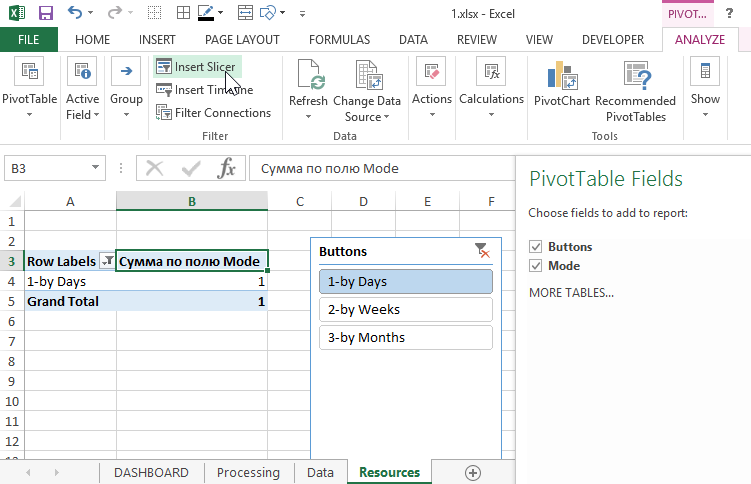
This built-in interactive tool in Excel allows you to create a mega-comfortable menu with highlighted and selectable buttons without using macros. Very user friendly and developer friendly! You can customize the layout, as well as create your own menu templates. Once you learn how to use it, you should not neglect it anymore. It's a neat solution with minimal time spent on developing the dashboard control menu.
By switching between different modes, we change the amount of data on the graph, which allows us to eliminate data noise and filter out statistical spikes if desired. It becomes possible not to look at the forest through a single tree, but to see the overall picture from a bird's-eye view. After all, everything looks different from above:
 Download visualization of data sampling in Excel
This template is convenient to use for interactive presentation of a large amount of data in parts. I also recommend checking out another way to solve this kind of problem:
 Graphical representation and visualization of big data in Excel.
Now that you have understood the instructions for working with this dashboard and mastered all its principles of operation, you have the opportunity to improve it to perfection. And optimize all formulas and functions to your needs and input data. Everything is free and available without passwords and even without using macro codes. All interactivity is implemented with standard Excel tools.
