Dashboard report quantity of products sold download in Excel
Download the summary report in Excel in the format of a dashboard for analyzing the growth dynamics of monthly sales of three categories of products over 3 years. There are no more false sales statistics than in money, so this example uses a quantitative report.
Dashboard report structure for analyzing items sold
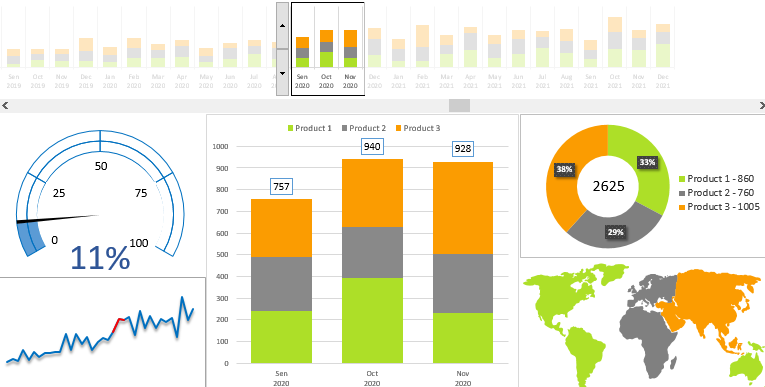
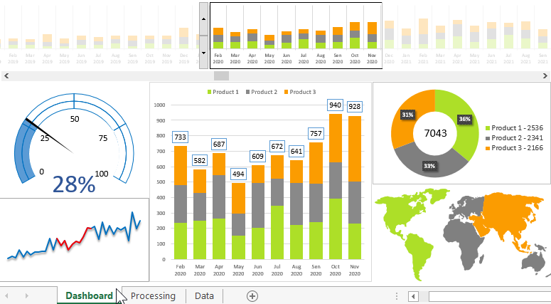
Your attention is invited to download interesting dashboards in Excel for a visual analysis of the development of the enterprise in the number of Products sold. The dashboard structure consists of 6 blocks and 2 report control elements. Blocks - not signed. Let us consider in detail each block and what it informs the analyst in the process of using this dashboard of growth / decrease in quantitative indicators of sales.
Sales history with navigation and data sampling for the period
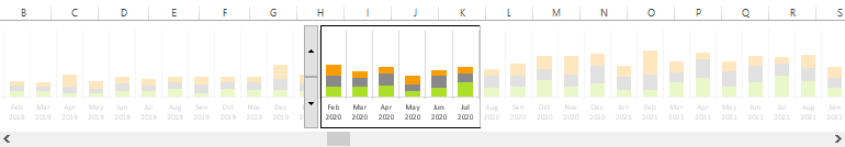
The first upper block is a navigation scale for the monthly history of the sold quantity of 3 categories of Products in pieces, for 3 years (2019-2021). The histogram scale has a special window for sampling a certain number of months in order to analyze in detail this period of time in the sales history. Window size can be changed using the first Spinner control. Thus, we can change the number (3-12) of months selected from the history for a detailed analysis. For example, in the figure, the half year of the second year from March to August is now selected - the period of the off-season and weak sales (as seen in the third block, the red segment):
The second Slider control is also located on the first dashboard unit. It is intended for scrolling the whole history relative to the window of the selection of months for detailed consideration on the remaining blocks of the dashboard.
Share of products sold for the selected period of total sales
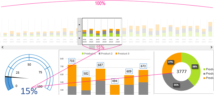
On the left is the second block, which informs the user of the dashboard about what is the proportion of Products sold for the selected period for a detailed analysis. Now the part from the second 2020 of the 1 / 6th period is selected in the figure and the sales volume also amounted to about 1 / 6th of the total volume - this indicates that despite the decrease in dynamics due to seasonality, the auctions were held at a decent level.
For example, the last 12 months (1/3 of the period) account for 45% of the total amount of Products sold in three years:
This means that in the last year the level of sales was significantly higher than average.
Navigation for the dynamics of growth in sales of products
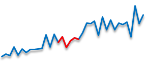
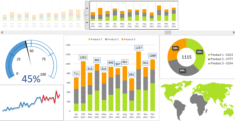
Below the second is the third block, which also performs its navigation role, like the first. But in the first block we move in time, and in the third in dynamics - which is also important for analysis. For example, using controls, we can move or highlight a red segment on the graph of a sharp decline or dynamic growth in sales. And then you can analyze in detail on the remaining blocks in order to determine the reasons for the sharp decline or growth in the development of the enterprise.
An interesting fact, but most entrepreneurs analyze more often only the reasons for the decline in sales dynamics. But the reasons for growth are no less important in the analysis of any business. For example, the third category of Products, 38%, which was most actively sold in Asia, allowed the stagnation of the first half of 2020 to come out of stagnation:
Already 11% of the share fell on these 3 months of active growth. Although before this period, the second category of Products prevailed in Asia. And the leading category was the first group of Products, actively sold immediately on 3-4 continents with a three-month share of not more than 7% -8%. Who would have thought that the Azoic market would react so impulsively to the third category of Products and draw all the dynamics out of stagnation.
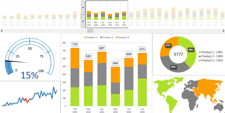
Histogram with accumulation for comparative analysis
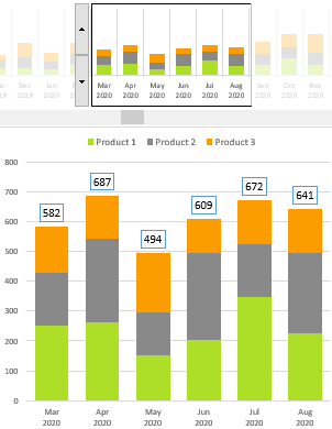
The dashboard focuses on the main fourth block, which is not only an enlarged version of the window for selecting data from the first block. Here, we already have access to quantity levels and the exact total values of Products sold for a given month. Although we do not dispute the fact that this block is primarily intended for convenient reading of a long histogram from the first block.
Pie chart of products sold for the selected period
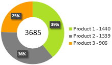
In this block we see the percentage ratio of the three categories of Products. Also, their number sold in the selected period is both total (indicated in the center of the ring), and individually (indicated in the legend of the chart). If the second block tells us the selected share in percent, then in the fifth block - the selected share is actually presented in quantity.
Dynamic map of the distribution of activity of sales of products
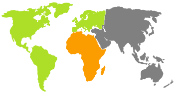
And finally, the last no less informative and important block is a diagram in the form of a map map of the distribution of the best-selling categories of Products by region. The appearance of this unit speaks for itself and does not require detailed analysis. In this example, a map of 6 continents of the world is presented, but when creating such a dashboard for your business, you can make any other map: countries, regions, districts, etc.
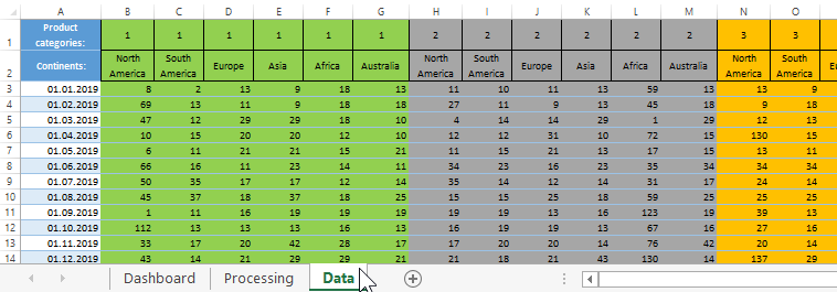
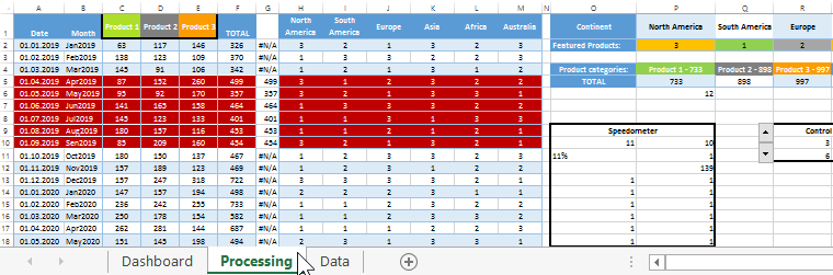
Source data for dashboards and their processing in Excel
Excel sales quantitative dashboard consists of three sheets:
- Data. Here are the source statistics downloaded via export from an ERP system report to an xlsx file. To make such a report at least a little readable, you can highlight the color of individual indicators by product category. This will simplify the development of the dashboard a bit.
- Treatment. This sheet contains the mechanical part of the data visualization. Here are all the formulas and calculations on the basis of which graphs and charts are built.
- Dashboard. The result of the visualization of the source data after processing. Data visualization is designed to quickly make the right decisions, in other words: to show an effective reaction in business.
Without conditionally a dashboard in this form looks mildly said - damp. Despite its already interesting features, it’s not enough here:
- descriptions or block names;
- values of total sales;
- indicators of change in percentages of the total and selective dynamics (in the third);
- legends for the map (on the sixth), etc.
Therefore, there is a suggestion - download this example from the link below and finish its design yourself, there is still a lot of space for your creative ingenuity and imagination.
 Download dashboard report quantity of products sold in Excel
Macros are used for dynamic data visualization in this dashboard. And to display the map, ordinary vector shapes are used. Therefore, this file can be opened and fully used on any version of Excel.
