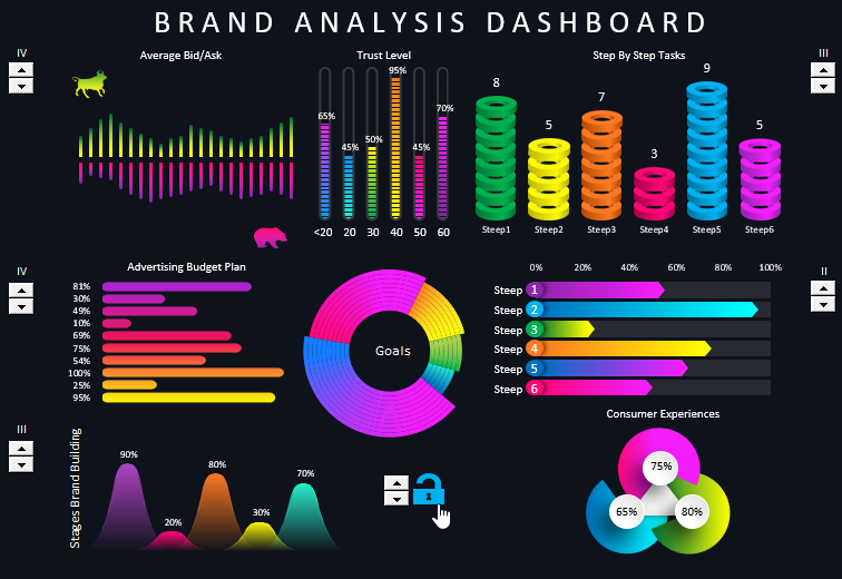
Beautiful dashboard for brand strength analysis in Excel
The stronger the brand, the more the consumer overpays in relation to the cost of production, the more margin he gives to the manufacturer. Where is the logic? There is no logic! It's not about logic, it's about the human heart. Your brain is still checking the facts, but your heart has already made a choice. But the idea is not to trade common sense for emotion, but to balance effectiveness in the two genres at once. The art of branding is about combining these two opposing and incompatible elements.
In this example, let's look at a dashboard for marketing analysis of brand strength indicators. It is worth noting right away that the "controversial" design for the dashboard was chosen intentionally. Note: Evaluating all the elements logically in this dashboard violates the rules of design, but it pleases the heart.
What is brand or marketing and why do they need design?
Do small businesses need a brand? The answer is obvious - everyone needs a brand. What is a brand? It is the attitude of your customers toward you and your business. So everyone has a brand, the only question is whether you develop your brand or not!
Branding is both the ability to feel your customer and change to satisfy them faster and better than anyone else. A predictable system makes predictable decisions that leave the consumer emotionally indifferent. As a result, predictability and systematicity begin to work against the company making it boring and uninteresting, and therefore not attractive or competitive.
Therefore, design is very important for a brand. After all, design directly appeals to the heart of the consumer. It is design that gives rise to an inexplicable desire to possess.
Dashboard design structure with description of visualization elements
The full composition of the dashboard consists of 8 blocks of visualization data on the basic indicators of the brand:
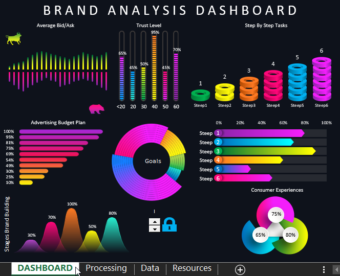
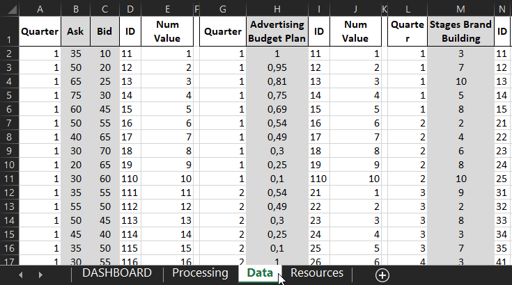
The raw data is on the "Data" sheet in cells highlighted in gray:
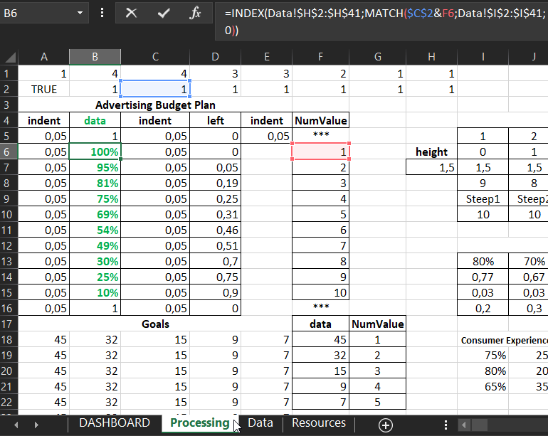
The second "Processing" sheet processes all of the raw data from the "Data" sheet using formulas to prepare the tables and output them to the dashboard data visualization:
The first block "Average Bid/Ask" represents the average strength of the bulls and bears in the stock market where the shares of the current brand are listed:
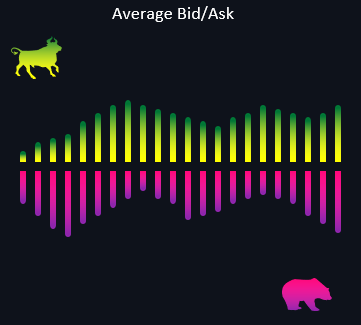
If the presentation represents the brand of a non-public company, in which case the ratio of purchases and sales of goods produced and sold under the brand of our brand can be represented here.
The second block "Trust Level" shows the level of consumer trust segmented into 6 age categories:
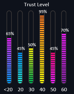
- Less than 20 years old.
- From 20 and up to 30 years old.
- 30-40 years old.
- 40-50.
- 50-60.
- 60 and over the age of the buyer.
The third "Step By Step Tasks" block visualizes the number of tasks assigned to brand promotion for the current quarter:
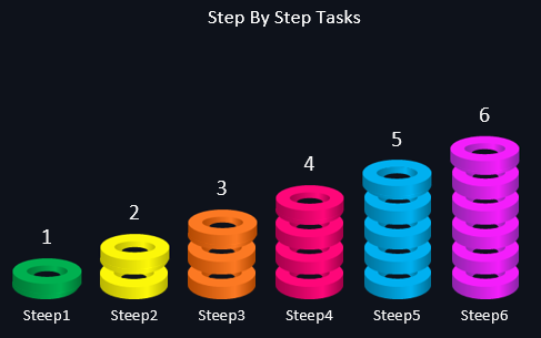
Each step has its own specific number of tasks that need to be completed or have been successfully cut.
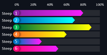
Immediately below this block is a chart of the task plan for each step as a percentage:
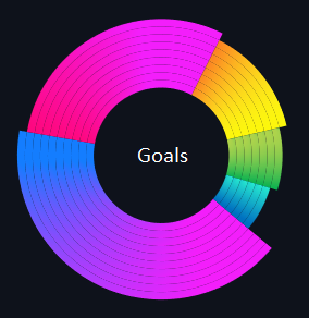
In the center of the dashboard is a nice chart of the goals the brand is pursuing on its path to excellence:
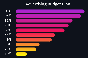
To the left of it comes the "Advertising Budget Plan" bar chart of advertising campaign spending for each quarter:
Below is a "Stages Brand Building" chart to analyze the completion of each stage of brand building across all 5 baselines:
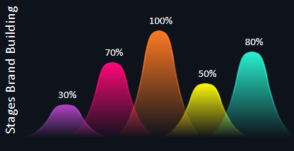
- Brand Management.
- Organizational culture.
- Objectives.
- Brand essence.
- Implementation and sourcing.
Less than 50% is a weak stage. Conversely, if it is more than 50% it is a strong stage. Thanks to this analysis, an overall evaluation is made.
Finally, the last block on this dashboard is "Consumer Experiences":
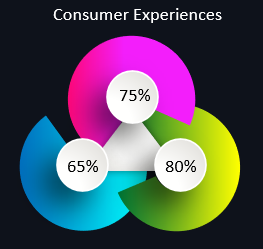
It should be divided into 3 stages of customer interaction with brand products:
- Experiences before making a purchase.
- During the purchase.
- Customer experiences after making a purchase and/or closing a transaction.
This analysis is actively conducted in the field of contact branding.
All together the blocks harmonize into a holistic picture of visual brand analysis through an interactive dashboard for Excel:
 Download Dashboard for Brand Analysis in Excel
Note the interactive elements on the dashboard for user interaction. By unlocking the lock, we have the ability to change the data independently for the 5 data visualization elements. Each of them can display different neighborhoods. But if you lock the lock, then all the elements work in sync as a complete clock mechanism.
All interactivity is implemented without the use of macros. Only standard Excel tools and formulas are used.
