Dashboard for analyzing of advertising and sales in Excel
Today, for each online store, you can find and connect a module for collecting statistical marketing indicators about customers with subsequent visualization of data in graphical reports and dashboards. The owner of the online store site places a special javascript code that collects statistics on the site in the administration panel and presents information in graphical form. But what to do if you need to collect and visually present the same indicators for a regular offline store?
Excel dashboard visualization system for analyzing advertising
Modern technologies provide devices for collecting some statistics in stationary stores. For example, special motion sensors allow you to find out traffic in the store for different periods of time and day. And in order to qualitatively and effectively analyze these statistics, you can use this dashboard, which is made in the most popular universal analytical program Excel.
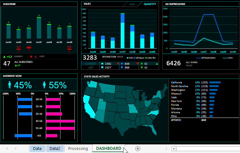
This Dashboard for analyzing the activities of the store will be useful primarily offline stores, although it can also be useful for online stores. The structure of the dashboard consists of 5 blocks. For the practical analysis of the use of the dashboard analysis of the sales performance of the store on an example, simulate the situation.
Let's say we have a network of stores in different 10 states:
- Arizona.
- California
- Florida
- Missouri.
- Montana
- New York
- North Carolina.
- Ohio.
- Utah.
- Washington.
At each outlet, data is constantly collected and recorded:
- Store attendance.
- The amount of revenue for each working period.
- The number of sales.
- The number of customers who have signed up for the newsletter.
- The number of unsubscribed subscribers from the newsletter.
- The proportion of men and women among customers.
- Age categories of buyers.
- Statistical indicators of the activity of advertising campaigns.
All this data is quite possible to collect from each offline store with a low error. If traffic sensors are used to collect attendance statistics, then simple questionnaires for potential regular customers are used for gender or age indicators. And regular customers bring 60% of the profit. The same indicators of gender and age categories proportionally correspond to new and non-regular customers, but to determine them it is necessary to conduct a survey.
In exchange for subscribing and providing age information, the store offers its customers floppy cards with small discounts. And if you offer customers to install the application of your offline store, then you can collect even more types of marketing indicators about the success and shortcomings of your stores. After all, the phone today is the most personal computer. Marketers say that for a modern person, a smartphone is part of the body.
Visualization tools for statistical indicators of advertising and sales
The structure of the dashboard consists of 5 blocks. They can be defined in 3 groups:
- Analysis of the effectiveness of advertising campaigns - 1,2 and 3 blocks.
- Analysis of subscribers (potential regular customers) - block 1 and 4.
- The geography of sales activity in a chain of stores is block No. 5.
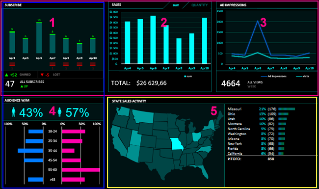
Analyzing the first group of blocks 1-3, we can visually assess how the activity of advertising companies is correlated with the activity of customer behavior in stores. Example:
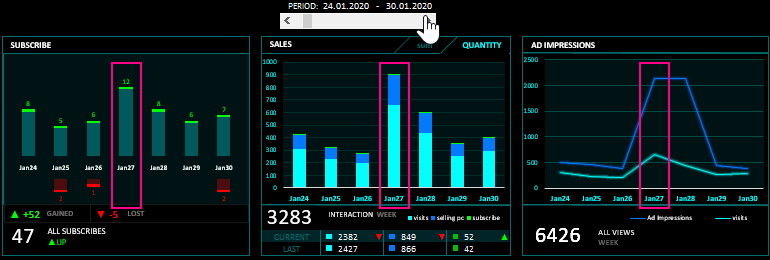
Pay attention to the date 01/27/2020. The 3rd block on the dashboard showed a sharp increase in advertising activity. And the first and second blocks show the reaction and behavior of visitors to stores. The advertising company performed the best efficiency on the first day. The audience immediately reacted violently to the advertising proposal. And on the third day of January 29, 2019, there was no longer any sense in promoting this proposal and it would be better to stop holding its advertising company so as not to waste advertising budgets in vain.
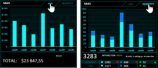
You should also pay attention to the fact that the second block has a switch "SUM / QUANTITY" of sales. Switching, we are able to analyze advertising not only regarding the reaction of the audience, but also regarding the payback of advertising budgets:
The third block of the dashboard informs us about the audience of subscribers for the current week:
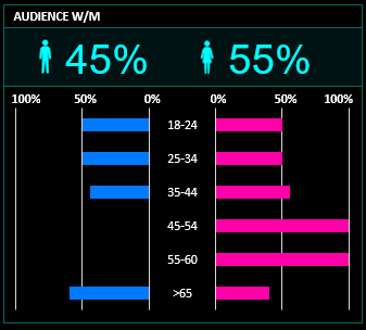
It can be seen that a large proportion of customers are female. But if you segment the audience by age categories, it is clear that in the category of under 35 years old young men dominate among the customers of the chain store.
The most informative block is the geography of sales activity in network stores in different states:
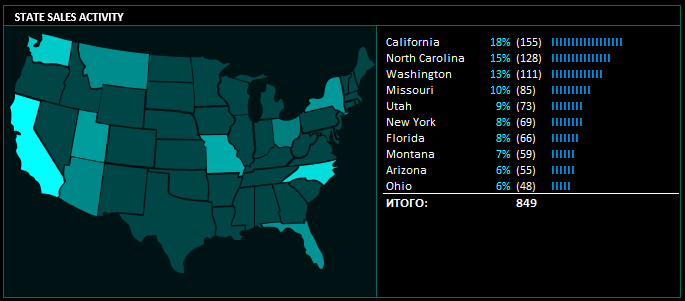
Everything is simple and clear here, the higher the sales activity in the state, the more light its color on the heat map. It should be noted right away that the state map is colored with a macro based on the colors of the heat map cells created using conditional formatting on the Processing sheet in the range of AF1:AF48 cells. In this version of the dashboard, when the colors in the conditional formatting are changed, use the RGB code where:
- for the first red RED color, a one-digit number (in this case, 0 for the minimum value of dark color and 0 for the maximum value of light color);
- the code for the second green GREEN is a 3-digit number (in example 70 for dark and 255 for light);
- code for the third blue BLUE of 3 digits (70 dark, 255 light).
Thus, the RGB code (0, 70, 70) is a dark color for the minimum number and the RGB code (0, 255, 255) is used for the maximum light color in this conditional formatting. If the code will have other numbers of digits in colors (for example, RGB (15, 123, 51)) then this version of the macro will throw an error.
Entering data for visualization in a dashboard template
As a result, we get a useful informative dashboard for analyzing the effectiveness of advertising for the stores of the whole network based on the entered statistics on two sheets:
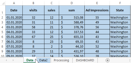
- Data - data on the QUANTITY of visits, number of sales, total sales, number of ad impressions, for each state.
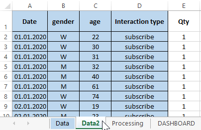
- Data2 - data about customers subscribers: gender, age, type of interaction (subscription or unsubscribe).
And based on all the data you filled in, the information on the DASHBOARD main sheet will automatically update. Each block displays information for 7 days. To move by dates, use the scroll bar control at the very top of the dashboard:
 Download dashboard analysis of advertising in Excel
This dashboard template can be used to automatically visualize the collected statistical data for the accounting period of time (in this example, 1 year 2020). By visualizing information, it is much more convenient and faster to find errors in business activities for their urgent elimination. And also data visualization allows revealing hidden new opportunities in a business strategy.
