Sample Excel Dashboard for Cash Flow Analysis Report
Introducing a dashboard template for analyzing cash flows within the business. Every enterprise must perform at least two functions for managing financial flows. What is the difference between an accountant and a financier? The accountant is more involved in managing external finances, such as tax accounting. The financier is more concerned with internal finances. Therefore, this dashboard aids not only the business owner but also the financial specialist. This visual report clearly presents information on how funds move within the company over a specified period of time.
Structure of the Cash Flow Analysis Dashboard
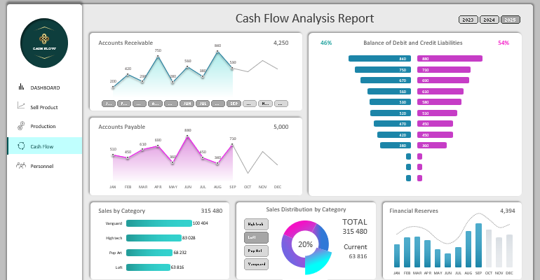
The dashboard grid consists of six blocks with data visualization. Some of them have global and local data filter control elements, resulting in an interactive report.
Accounts Receivable
The first block is designed for the analysis of monthly accounts receivable:
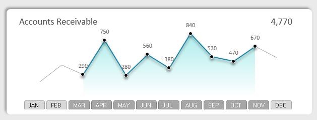
This is a standard chart with markers, but it has a global "Slicer" control element. It allows implementing data selection for a specific period of months. By controlling the global element, we manage the entire dashboard on all its screens. As a result, the selected data for a certain number of months will be updated on all dashboard charts and will correspond to the specified filter criteria.
The chart design does not include the Y-axis, so the values for the current selected month are displayed above each marker. Additionally, the total accounts receivable value of 4,770 is located in the upper right corner of the chart.
Accounts Payable
Below is a block of visualization for monthly company accounts payable:
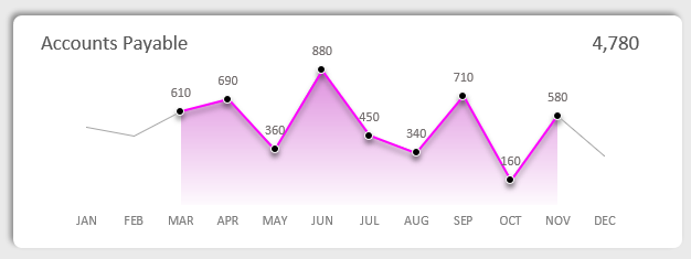
This block does not have any control elements but is subject to global control from the upper block. The "Slicer" filter for monthly data selection applies to it. Otherwise, the chart has a similar structure. It differs only in color and data source. For visual analysis, it is better to always place charts on accounts payable and accounts receivable side by side.
Balance of Debit and Credit Obligations to the Business
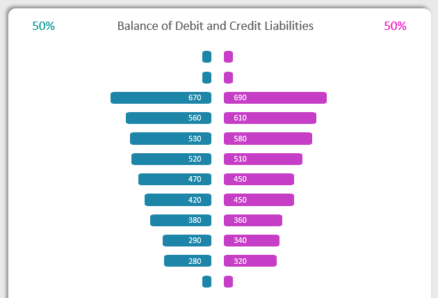
This visualization block is convenient for performing a visual comparative analysis of accounts receivable and accounts payable indicators. There are a total of 12 pairs of indicators, which are sorted in descending order. This provides an opportunity to compare the largest and/or smallest monthly indicators to assess the difference between accounts receivable and accounts payable.
In this situation, the highest credit debt indicator is slightly higher than the debit debt indicator, as shown in the figure above. This is not critical yet but already requires attention to take necessary measures in a timely manner and avoid irreversible mistakes. There is still an opportunity.
This visualization block is subject to the influence of global filters for data selection by years and months.
Sales Ranking by Product Categories
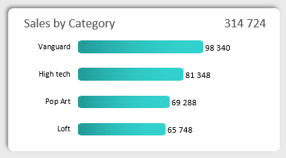
The horizontal histogram represents the volume of sales segmented by product categories. Each product category is ranked in descending order to form a ranking. In this situation, the Avant-garde category is the favorite. The category names correspond to the names of styles in which the product designs are executed.
Sales are the main source of financial flows in any business. Therefore, it is important to monitor them to assess the internal financial condition of the company. After all, even if the level of accounts receivable significantly exceeds the level of accounts payable, but sales are declining, in such a case, one cannot rely on a positive balance of the enterprise.
Sales Distribution by Product Categories
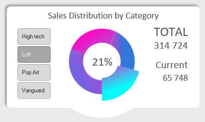
Since sales are the main source of internal financing for the company, they require special attention in cash flow analysis. Therefore, another pivot chart is dedicated to them on this dashboard. Here, we assess the shares that each product category (for example, 65,748 is 21%) occupies in the total sales volume of 314,724.
This visualization block contains its own local filter slice with limited authority to influence, which applies only to indicators within the block. We use it as a switch between categories to expose their values during visual analysis.
Analysis of Monthly Financial Reserves
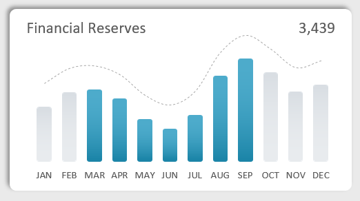
In the last data visualization block in the lower right corner of the dashboard grid, there is a bar chart for analyzing monthly financial reserves. This is also a very important indicator for analyzing internal cash flows. After all, even if the debit and credit balance is normal and even sales are growing, but the financial reserves of the company are at a low level, it indicates poor management of the business's financial resources.
The chart is controlled by global filters and provides the ability to select data by months and years.
Business Summary Report Design in Dashboard Style
If you look at the overall picture of the summary analytical report on cash flow, you can see all the filter buttons. Please note that in the upper right corner, there is a Slicer for switching between years. Using global slices, we filter data and make the report interactive to expand the possibilities of visual analysis. Filtering allows us to delve into a more detailed analysis of a specific accounting period. It also helps exclude statistical outliers, etc. Thus, optimize the data design for specific analytical tasks.
 Download Dashboard for presenting cash flow reports in Excel
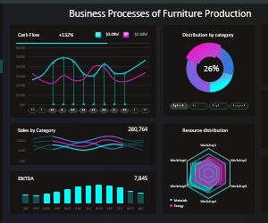
The visual style of the dashboard design is done in a modern business style. If it seems too dull to you, you can download its dark version from the previous article:
 Free Download 5 business dashboard templates in Excel.
There, all 5 dashboards on all screens of the report template are more detailed, created as an application in MS Excel. Moreover, it is done without using macros, only with the help of standard formulas and functions. All algorithms are on the "Processing" sheet. The "Data1" sheet is filled with initial data for the enterprise. The "Control1" sheet contains pivot tables for creating filters.
