Free Download 5 business dashboard templates in Excel
Template Dashboard 5 in 1 for furniture manufacturing business in a modern style. The entire data visualization report consists of 5 different dashboards on different screens of the Excel application. Each of them is designed for a detailed analysis of individual properties of the manufacturing enterprise: sales, production, cash flow, personnel, and a consolidated report on the main page.
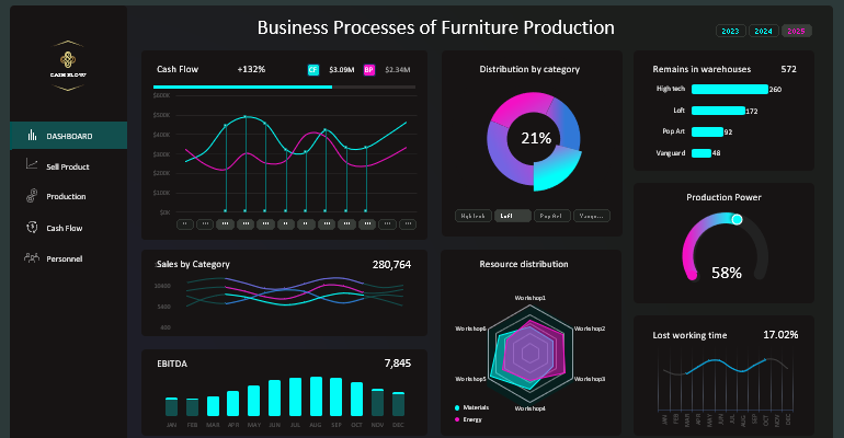
Structure of the Consolidated Report on the Furniture Business
The structure of the overall data visualization consists of 5 screens. The main screen is the "DASHBOARD". It contains summary charts analyzing the overall state of the business in the selected accounting period.
The dashboard structure consists of a total of 8 data visualization elements. It also includes 3 control elements to enhance the interactive capabilities of the visual report.
Cash Flow
The first data presentation element on the dashboard is Cash Flow:
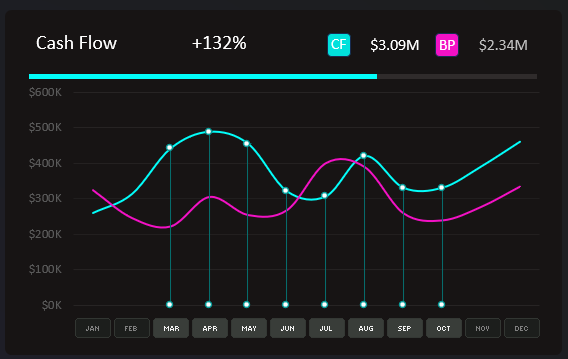
Here, a visual comparative analysis is performed. Two curve lines represent the comparison of Cash Flow indicators (light line) and the same indicator planned in the business plan (pink line). Planning took into account market seasonality and enterprise capabilities.
If the light line (Cash Flow) deviates from the pink line (planned values in the business plan), then their percentage ratio changes. Currently, it's +132%. This value is valid for the selected accounting period: from March to October, as shown in the figure. Setting the range of selected months in a year is facilitated by the standard Excel "Slicer" control element. The authority to control the dashboard using this element extends to all data visualization screens in this application created with MS Excel.
The chart legend with labels is located in the header of the presentation block:
- For the light CF (Cash Flow) line – the absolute value of the indicator as of the selected accounting period is indicated nearby.
- For the pink BP (Business Plan) line and its absolute value planned for the same accounting period.
Immediately below the header of the block, a horizontal bar chart is placed to represent the share of Cash Flow in the selected range of months relative to the total value for the entire year.
And below is the chart itself with curves and vertical lines. Only selected months from the overall chart are exposed using vertical lines.
Distribution by Categories
In the upper central part of the dashboard, there is "Distribution by category":
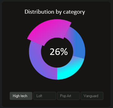
The block is designed to represent segmented data for 4 categories of manufactured products:
- High tech.
- Loft.
- Pop Art.
- Vanguard.
Each category's name is the style of the manufactured furniture.
This block also contains filter buttons, but its authority extends only to exposing segments and presenting their current share values in the distribution by relative values. Thus, we control only encapsulated within the block without affecting other charts and values.
Thus, the template demonstrates different possibilities of creating and using global or local filters. Everything depends on the specific tasks outlined in the Technical Specification for the developer. In MS Excel, all tasks for the visualizer can be implemented in various ways.
Remains in Warehouses
In the upper right corner is the visualization named "Remains in warehouses":
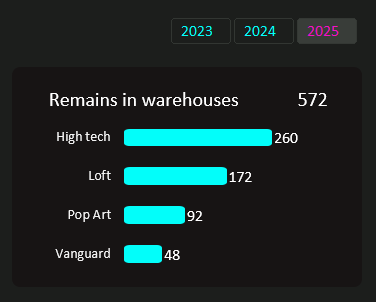
Here, current indicators of remaining manufactured product stocks are tracked. They are segmented by categories of design styles. Each category is presented in absolute values (quantity of units). It also shows the quantity of unsold products in each category, ranked in descending order.
Next to this block in the upper right corner is one of the main dashboard control elements – a data selection switch by years. This data slice relates not only to the current block but to the entire dashboard. Its control authority extends to all data presentation screens in the reports.
Sales by Categories
In the next row of the dashboard grid on the left, there are sparklines titled "Sales by Category":
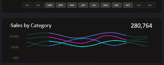
Here, you can superficially track the dynamics of sales for each category of manufactured furniture and components. Values are presented in absolute terms, but only the total is 280,764. To delve into a detailed analysis of sales, you should go to the "Sell Product" screen using the main dashboard menu.
The selection of values by months in this chart is controlled by a global filter from the block above, as shown in the figure.
Resource Distribution
On the same level on the right is the chart "Resource distribution":
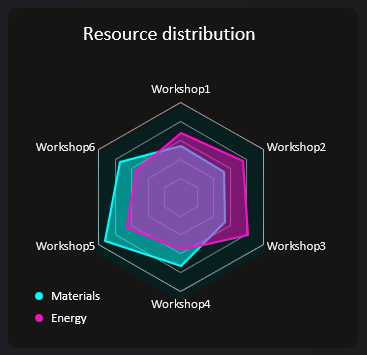
Here, the distribution of Material and Energy resources in production workshops is analyzed. Each workshop may have its purpose and type of equipment, consuming different types of resources in varying amounts. But sometimes resources are spent unfairly. Therefore, this type of report is crucial for any manufacturer in any industry.
Production Power
On the middle level of the dashboard grid on the right is "Production Power":
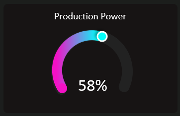
Here, a summary of production productivity is displayed on average. Production process strength values are displayed in percentages. Based on this indicator, we can assess the load on the enterprise's production capacities.
EBITDA Analysis
In the bottom left corner of the dashboard grid is the "EBITDA" indicator:
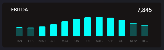
This bar chart tracks the dynamics of changes in EBITDA values for the selected accounting period. Data selection by months and years is done using global dashboard control elements.
Lost Working Time
In the bottom right corner of the dashboard grid, traditionally, is the last data presentation block. This time, it presents the "Lost working time" indicators:
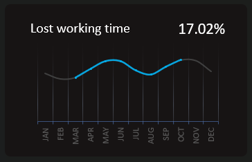
Only final values are output and presented in percentage format (e.g., 17.02%). But there is an option to sample for a specific accounting period using global data slices.
Consolidated Report Sell Product in Excel
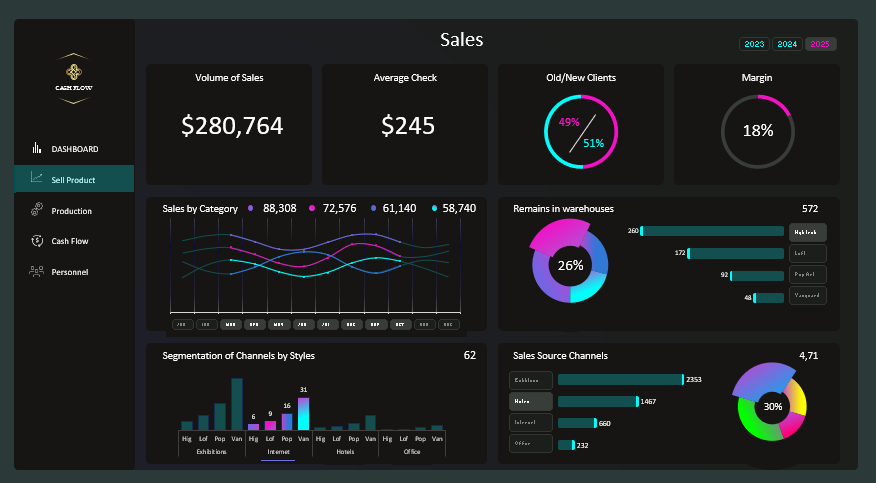
In this data visualization screen, we analyze the efficiency of selling manufactured furniture on pivot charts. The dashboard of this screen also includes global and local data filters.
For example, the bottommost control element in the Sales Source Channels block is not global, but it is not encapsulated either. Its authority extends immediately to two blocks with charts. Initially, the element influences the management of its own block to switch between sales channel sources:
- Exhibitions.
- Hotels.
- Internet.
- Office.
Under its influence, the adjacent block on the left is also included: "Segmentation of Channels by Styles". There it performs the same function, but the data is presented in a different visualization style. It creates new informational value for the business owner. Thus, with one element, we control two blocks, but its sphere of influence is limited and does not have the ability to impact the entire dashboard. This method is presented as an example of data management capabilities in an interactive presentation in Excel.
Dashboard for Visual Analysis of Production Processes
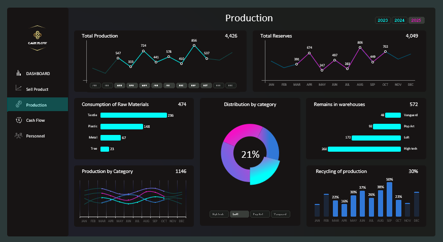
This consolidated report allows visually analyzing and evaluating the current situation based on key furniture production indicators:
- Total monthly quantity of manufactured products.
- Final monthly furniture stock quantities in warehouses.
- Ranking of material expenses by basic categories.
- Distribution of furniture production volumes by categories of modern design styles.
- Ranking of warehouse depletion by categories of manufactured furniture.
- Monthly production volumes segmented by furniture categories.
- Volumes of material processing capabilities from production waste.
This comprehensive report presents outputs based on algorithms of a specific production type. Use the template for your missing indicators and algorithms. Expand its capabilities according to your needs.
Cash Flow Movement Report
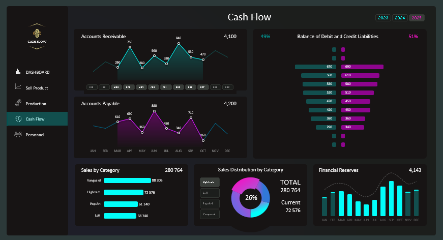
A consolidated analysis of financial position indicators of the production enterprise. The dashboard presents data visualization blocks on:
- Analysis of monthly accounts receivable.
- Analysis of accounts payable.
- Comparative analysis of the ratio of monthly accounts receivable volumes ranked in descending order.
- Ranking of sales volumes by categories of furniture design styles.
- Distribution of styles of manufactured products in percentage terms of total sales volume.
- Monthly financial resource reserves.
Consolidated Report on Personnel Management Efficiency
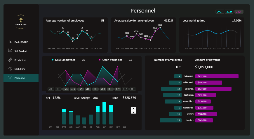
The dashboard of the report on key personnel indicators allows evaluating the efficiency of enterprise management in different accounting periods of data sampling.
The dashboard presents summary charts with final values selected under multiple filter conditions. All chart types are distributed in separate thematic data presentation blocks:
- Average monthly number of working employees in production.
- Monthly average salary for company employees.
- Monthly losses of working time in percentages.
- Comparative analysis of opening and closing of vacancies by months.
- Performance of annual and monthly plans for KPI set for employees.
- Comparative analysis of the ratio of the number of employees to the average salary in different positions.
It's worth noting that the chart for KPI analysis on the dashboard uses one local filter, which works encapsulated with minimal authority within only one block. At the same time, the chart is subject to the influence of global dashboard slices such as: selection by months and/or years. Using the local control element (Spinner) in the "KPI" block, we set deviations in plan performance levels to optimize business strategy or completely re-plan conditions. In other words, similar to "what if" analysis: what if the plan were 10% lower or 20% higher? What bonuses would have to be paid at such values? We manipulate the data to determine the most optimal experimental level, etc.
Modern Design Dashboard for Business Presentation
 Download 5 free business dashboard templates for Excel
This template has a very modern design, somewhat reminiscent of the cyberpunk style. This color palette is more suitable for designing reports on cryptocurrency or other high blockchain technologies. Or for presenting the accounting capabilities of artificial intelligence, etc. However, nothing prohibits a small furniture manufacturing business owner from using such a modern design for their summary reports, presentations, and dashboards.
For enthusiasts of less provocative contrasting colors in business reports, another dashboard in a light design style has been developed. It can be downloaded in the next article.
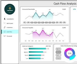 Sample Excel Dashboard for Cash Flow Analysis Report.
