Excel Comparative and Correlation analysis of sales download
At McDonalds and Apple, marketing works in such a way that the task of their sellers is only to accept payment and dispense the goods. But in most companies every sale is the result of coordinated work of marketers and sellers with an equal degree of effort to achieve it. And what happens when the desired results are not achieved and sales drop? A revolt begins, and employees are divided into two camps sales team and marketing department. In order to determine the true causes of a drop or surge in sales, the company's CEO should use an effective tool to perform timely comparative and correlation analyses of the results of the marketing and sellers's work. Interactive data visualization can help.
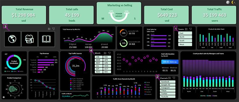
The Excel Dashboard for Benchmarking and Correlation Analysis of Sales
Very often it happens that marketers and sellers do not want to share the company's defeats and victories. When sales are poor, marketers blame sellers for poor and untimely order processing. Sellers complain about the quality and volume of leads supplied to them by marketers. Also, when there are spikes in growth on sales volume charts, marketers claim that this is the result of their productive work. At the same time, marketers are convinced that their undeniably high level of customer service is most influential. A business owner should be able to resolve disputes, unite teams of employees on the way to the global mission of the company. And a more important task should be to analyze and determine the true cause of victories and defeats in the execution of overall corporate plans. The best tool would be an interactive presentation with data visualization as an overall picture of all trading resources of the company on one dashboard. We offer a functional dashboard for comparative and correlation analysis of sales and marketing teams for timely operational, tactical and strategic corporate decisions. Download the interactive dashboard template in Excel at the end of the article.
Benchmarking allows you to study dynamic data changes under the influence of changes in the specified criteria. For example, in different periods of time the comparison shows regular differences in the indicators.
Correlation analysis examines the relationship of data when certain criteria change. For our functional dashboard with interactive data visualization we set a task to use it as a tool of correlation and comparative analysis. What it perfectly copes with.
For an example of its practical use let's model the situation. There is another conflict between marketers and sales department at an enterprise. It is necessary to analyze the influence of marketers and salesmen on positive and negative results in selling. For this purpose dashboard allows to segment data according to four groups of criteria:
- Sampling of data by sales teams.
- Filtering data by traffic channels as sources of orders (leads) from customers.
- Segmentation by three selling products: online course, training videos and book.
- Data sampling for different accounting periods of time:
- month;
- quarter;
- half a year;
- year.
At the top in the center of the dashboard in the area of totals there is an infographic in the form of weights to determine the direction of comparative analysis:
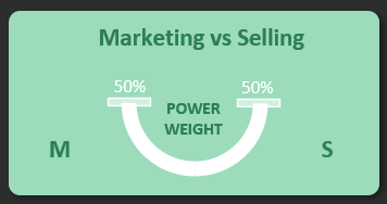
Clearly displays the outperformance in favor of the marketing or sales teams when changing various sampling, segmentation, and filtering criteria for the raw data. For example, it can be indicators on fulfillment of KPI plans, etc. It's important for the business owner to analyze what happened with sales and what were the reasons for the outweighing of efforts to the marketing or sales people. How the results of these two categories of employees correlate compared to different conditions and time periods.
Conventionally, all the blocks on the dashboard for comparative and correlation analysis can be divided into 3 categories:
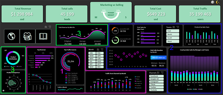
1 Visualization block group for marketers
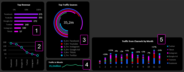
- Ranking of traffic channels by sold volume.
- Levels of spending by traffic channels.
- Leading channels with the largest amount of traffic generation.
- Trends in total traffic volume by month.
- Analysis of monthly traffic shares by source channels.
2 Group of blocks for visualization of data by sales teams
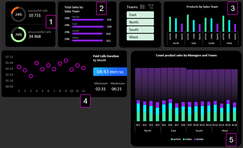
- Comparative analysis of relative and absolute values of successfully processed orders (leads).
- Revenue volume distribution by sales teams.
- Analysis of the distribution of selling volume levels by sales teams.
- Average duration of a salesperson's communication time with a customer.
- The activity of sellers in each department for each product.
3 Common blocks provide high value for marketers' and sellers's metrics
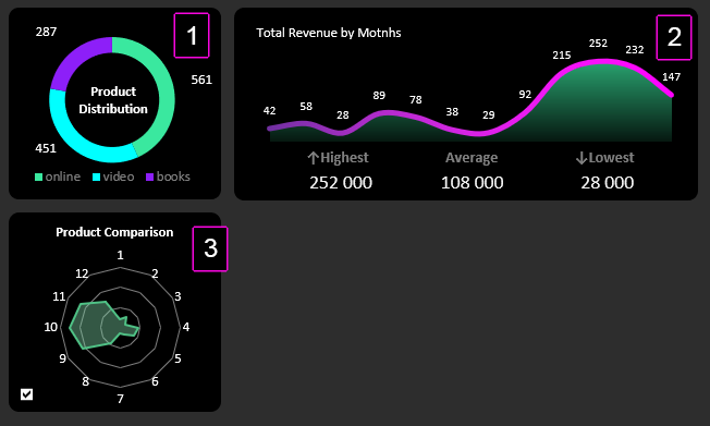
- Distribution of total selling volume by product.
- Monthly sold volume chart (value captions rounded to thousands for readability).
- Selling dynamics by months with a function of total and separate comparative analysis by products (switch in the lower left corner of the block).
This interactive dashboard is a great tool for performing timely correlation and comparative analyses in Excel. With all the controls in place, the raw data is segmented according to several criteria at the same time - this is the analytical value of this tool:
 Download Comparative and Correlative Sales Analysis in Excel
This example once again proves that Excel is the most versatile analytically computational tool. Some business owners refuse to separate the sales team into marketers and sellers - a big mistake. They just need to learn how to use the right analytical tools effectively and in a timely manner.
