How to make a Map Chart for logistics management in Excel
Map Chart is the main object on the dashboard for the presentation of logistics management indicators through data visualization. There are many solutions for building a Map Chart in Excel. Let's look at another unusual example with interesting possibilities for presenting logistics routes on a USA map.
How to draw a map shape on the outline of a picture in Excel
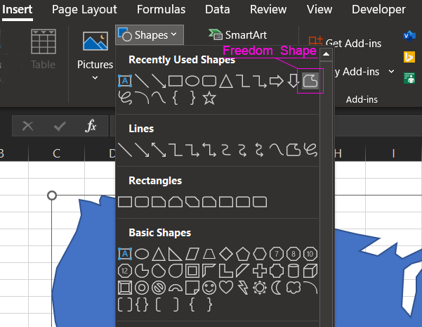
Drawing a USA map shape for Excel is not difficult. Just select the tool: Instert → Illustrations → Shapes → Freedom Shape:
Even if you don't get a nice outline of the map the first time you try, you can edit the key points of the shape to fix the flaws. Right-click on the shape and choose Edit Points from the context menu that appears:
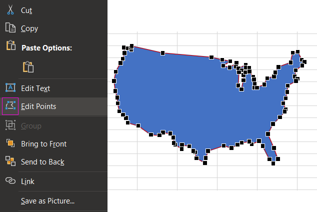
Edit the points in the right places according to your requirements.
This is how we will create the basis for the Map Chart. But further on we will have to create some more figures to improve it. Make it presentable with interactive features for analyzing logistic routes between US cities.
Scenario for data visualization design in Excel
First, let's define the terms of reference for the data visualization developer in Excel. To do this, we initially simulate a situation with an example of practical use of the presentation. A New York company has its own logistics department with a small fleet and staff. There are a total of 3 trucks and 3 drivers. Two of the drivers have two routes each. And the third has only one. The routes lie through eight cities in different parts of the United States:
- New York to New York State.
- Chicago to Illinois.
- Nashville to Tennessee.
- Dallas - Texas.
- Denver - Colorado.
- Los Angeles - California.
- San Francisco is the state of California.
- Seattle - Washington.
Each driver, truck, and route has its own specific characteristics that should be considered for visual analysis of supply chain efficiency. Therefore, the dashboard must be able to segment the data based on these 3 key parameters in order to properly assess the current situation:
- Driver data.
- Truck specifications.
- Properties and features of routes.
This report will allow the logistics management department to develop effective strategies for the company's expansion into new cities with the most efficient use of the development budget.
A description of the terms of reference for the development of an Excel Map Chart
The dashboard shall have an interactive Map Chart in the center showing the logistic routes driven by trucks. When selecting a route or a driver assigned to that route, the map should show a corresponding curved line crossing the points of the key cities. According to the path map of the selected route.
For a comfortable visual analysis should be able to change the color curved lines of routes directly on the map.
All the interactivity functionality should be implemented without using macros, because the internal security policy of the company prohibits the use of macros in all types of files in the MS Office package.
How to create a Map Chart in Excel step by step
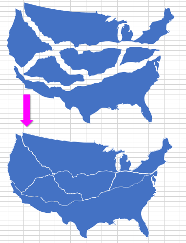
To solve this problem without macros, we need to reconstruct the map of the United States from several figures, so that the boundaries of their connections pass where the paths of logistics routes. And make a small indentation between them:
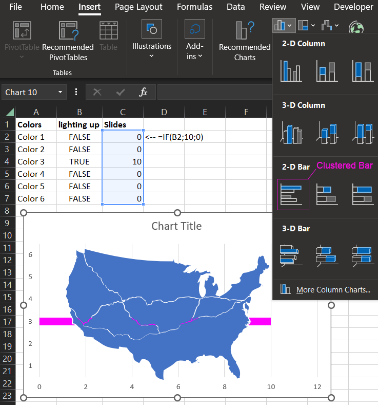
In the background, we will place a horizontal Bar Chart. It will act as a slider if you want to change the color of the route.
Interactive color highlighting of logistic paths on the map
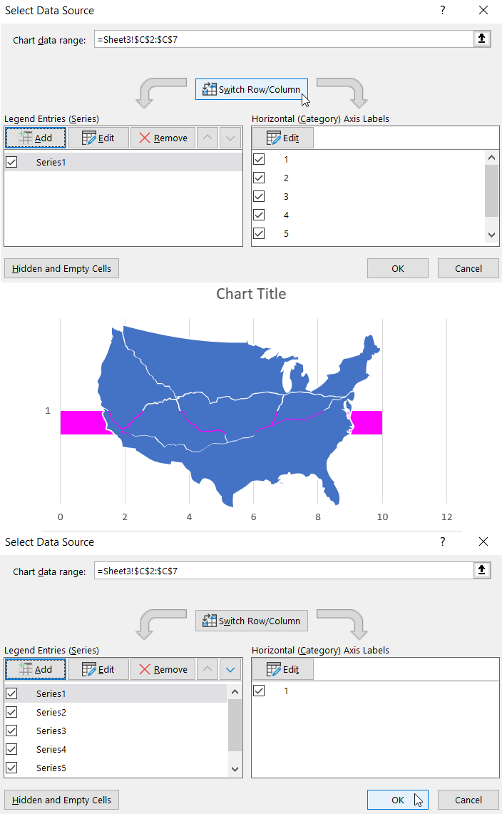
Create a table of three columns to manage slider colors. Use the values of the last column to build a linear Bar Chart. Select the range C2:C7 and select the tool - Insert → Charts → 2-D Bar → Clustered Bar:
The first two columns contain the initial values, and the last third column contains the formulas of the control algorithm:
We need to configure our color slider. Let's perform a series of sequential steps to adjust the visualization object in Excel:
- First of all, you need to swap the XY axes values. To do this, select Bar Chart and use the tool - Chart Design → Data → Select Data. Then please click Switch Row/Column:
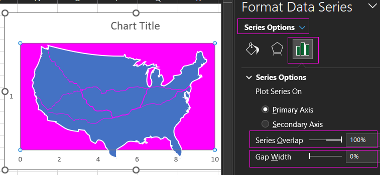
- In the next step, change the appearance by maximizing the width of the bar in the two parameters Series Options - Series Overlap = 100% and Gap Width = 0%.
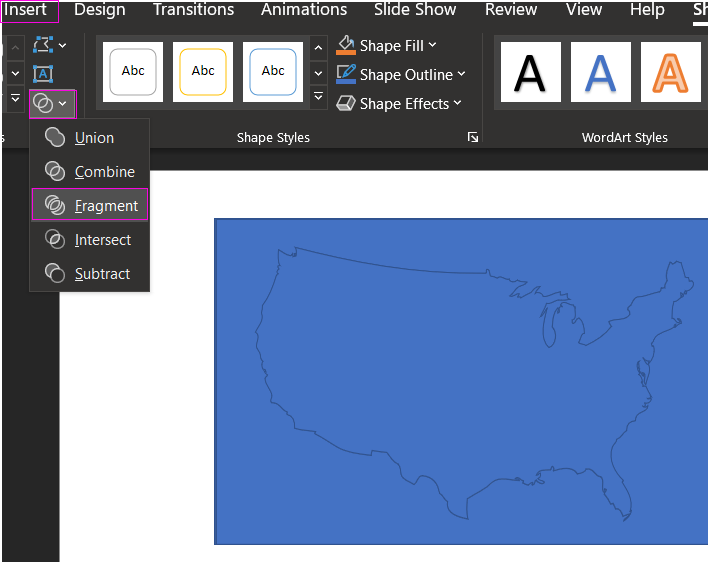
- Now we must hide the Bar Chart by overlaying it with a new figure in the foreground so that the color is visible only within the boundaries of the U.S. map. But not outside of it. To do this we need the program MS PowerPoint, which is also included in the basic MS Office software package. There we have you in the shape of a rectangle, in the center, cut a hole in the shape of our map of the United States using our shape. We open the MS PowerPoint program. There we draw a rectangle shape and add our Freedom Shape "map of the USA". Place it on top of the rectangle, select both shapes and select the tool - Insert → Insert Shapes → Merge Shapes → Fragment. This tool is not in Excel, you have to use MS PowerPoint:
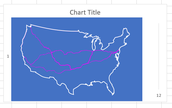
- Collect all data visualization objects into one Map Chart for further development of the dashboard in Excel:
The main principle of functioning of interactive visualization without macros on the map is already clear.
Formulas of the algorithm for interactive routing
Next, we need to make the most complex algorithm, which will hide the color of the curved line in the right places. After all, now we see all the routes, and according to the specification, each path of the route should be able to stand out individually and/or entire groups of routes.
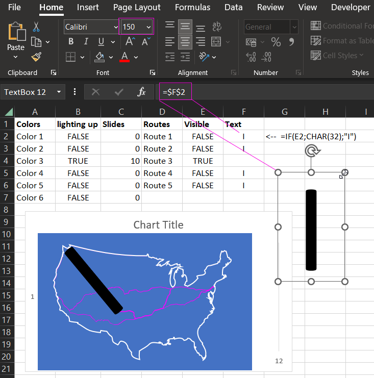
To do this, let's apply a clever Excel trick of overlaying text characters as separate text shapes that can disappear depending on the values in the cells they are referencing. This will allow us to eliminate unnecessary curved path lines that are irrelevant to the map of the selected route. The text shapes will appear or disappear according to an algorithm depending on the selected route. So we will need two additional columns in the table to control whether the text characters appear or disappear on the map. In the last column, the formula for displaying the text symbol "I" depending on the logical values of the cells in the previous column:
The CHAR(32) function outputs a space character - that is, there is no "I" visible if the value in the previous cell is TRUE.
Create a text figure by selecting Insert → Text → Text Box tool. Without de-selecting the Text Box, type the reference to the first cell of the last formula column into the formula line "F2". Change the font size to 150 points and place the symbol on the map:
Thus, we create several Text Box shapes and overlap unnecessary curved lines with them. After that, simply change the font color in all the Text Box shapes to the same as the background of the map:
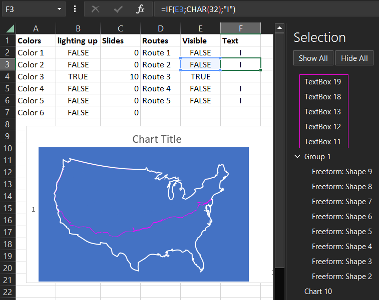
Now if you select a different route, other lines will be displayed according to the algorithm.
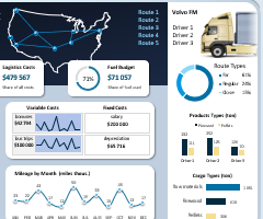
Presentation of logistics management in Map Chart in Excel
On this principle was built dashboard with Map Chart, which can be downloaded for free at the end of the article:
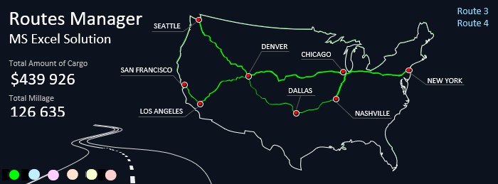
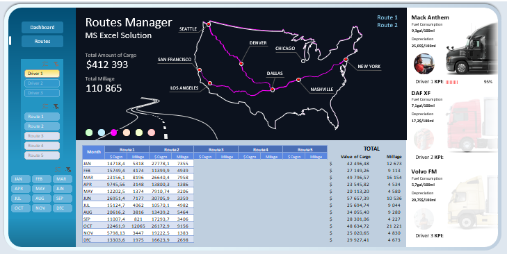
As you can see here, two routes have been selected and green to highlight the manes of the track lines on the logistics map in the United States. The full view of the dashboard can be designed with additional useful features for visual analysis of logistics management:
 Download Map Chart for Logistics Management in Excel
This is a continuation of the article:
 Logistics and Supply Chain Management in Excel Download
By mastering just a few simple secret tricks for building data visualization in Excel, you can create presentation masterpieces. Excel is more than a spreadsheet and is constantly evolving. To its versatile analytical computational tools are added interesting ideas for creating dashboards, infographics, and other interactive report presentation techniques. It has everything to make a comfortable visual analysis of business performance and build a better development strategy.
