Logistics Tracking Excel Spreadsheet Free Download
Today we live in an era of overproduction. Logistics is now a key factor in influencing the final cost of goods to the consumer. The role of logistics in business is difficult to overestimate. As the American General John Pershing said, "Infantry wins battles, and logistics wins wars." The visualization of data on the functioning of logistics supply chains greatly simplifies the work for all employees. From rank-and-file drivers to the entire department of a corporation's top managers. Here is our first solution in Excel for the visual analysis of logistics and supply chain management.
An example of a business idea for analyzing logistics management in Excel
To give an example of the practical use of a dashboard for logistics metrics, we traditionally model a new situation with the Technical Specifications (TS) of the report presentation developer.
A description of the business idea as input for the presentation
The U.S. Department of Agriculture has developed a new technology to produce artificial grass firewood. According to the technological composition of the recipe, wood chips up to 40% in relation to grass 60% should be added to the raw mix. In the process of pressing pre-prepared raw materials: properly dried shredded grass and wood chips under pressure wood glue is released, which serves as a natural binder. The result is a briquette of environmentally friendly artificial grass firewood at the exit of the extruder press.
This technology has created a profitable and attractive business idea based on the processing of vegetable waste into artificial bio-firewood:

Two basic components for profitable biofuel production:
- The main component is 60% hay. There is a lot of grass clippings everywhere. Thousands of tons of it are collected annually from lawns of homesteads and schools and parks all over the United States. It is then buried in the soil for humus.
- The second component is 40% wood chip. It can be obtained from the fast-growing Quaking Aspen poplar tree. This aspen-shaped poplar is the most popular tree throughout North America. Quaking Aspen reaches a height of up to 35 meters and a growth rate of about 2.7 meters per year. If large volumes of wood chips are needed, Quaking Aspen can be grown quickly in private nurseries. The wood from Quaking Aspen wood is unsuitable for furniture, boards, and is not even suitable for firewood. But it is ideal as a binder for processing dry grass into an energy product with high consumer demand.


Interesting fact! Quaking Aspen is recognized as the oldest surviving plant on our planet today. The largest colonial root structure of this tree is called the Pando Forest, it is located in Utah (USA). This forest consists of a huge grove of Quaking Aspen trees and covers an area of 43 hectares. But what is particularly interesting is that the Pando Forest consists of only one species of Quaking Aspen tree and has a single root. To date, Pando is the largest living organism on our planet with a weight of 6,000 tons.
Artificial bio-firewood emits many times fewer harmful substances when burned compared to conventional firewood. They hardly clog up the chimneys of the fireplaces. In the process of production of bio- firewood you can add essential aroma oils and other useful additives for a spectacular change in the combustion process in the fireplace:
- saturating the room with pleasant and beneficial aromas of essential oils;
- change the color of the fire;
- harmless natural additives to repel insects.
Especially popular artificial firewood with fragrance additives: mint, lavender and eucalyptus.
The same technology produces not only briquettes, but also pellets for use in boilers with automatic feeding of solid fuel. There is already a great demand for such a valuable energy product. All the more so because the price of firewood increases every year. The profitability of the grass firewood business easily reaches 100%, but half of the cost goes to logistics.
Interesting fact! Between 2030 and 2040 there is a cycle of decreasing solar activity in our galaxy. It happens once in 400 years. In this cycle we will have a mini ice age. The average temperature on the planet will drop.
Before 2030, it is important to have time to set up the logistics of delivering firewood around the world.
In doing so, a branded manufacturer of artificial firewood and grass pellets must pay special attention to logistics to control costs.
Technical Specifications for developing logistics data visualization in Excel
All aspects of the above business idea are included in the terms of reference for an Excel data visualization developer.
Top 3 shipments transported:
- Purchasing raw materials - hay cut grass from lawns and Quaking Aspen poplar logs.
- Main product sold - artificial firewood for fireplaces with aroma oils and natural additives.
- An additional product to expand the range to increase sales - pellets for fueling boilers with automatic feeding of solid fuel.
Delivery of goods is carried out by three drivers. On five routes. The first two drivers have 2 routes each and the third has only 1 route.
The main production facilities are located in New York City. That's why the delivery of manufactured goods in the USA will be realized in the direction from New York. And deliveries of raw materials in the opposite direction - respectively. The firm at the stage of development. Its sales network is established only 8 cities in different states of the United States:
- New York-New – York State.
- Nashville – Tennessee.
- Chicago – Illinois.
- Dallas – Texas.
- Denver – Colorado.
- Los Angeles – California.
- San Francisco – California.
- Seattle – Washington.
Each route has a different distance in miles, which affects different logistical factors. All dashboard parameters are filled with initial values on the Input Value sheet:
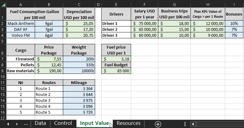
- Vehicle fuel consumption in gallons per 100 miles.
- Depreciation for each 100 miles traveled on the truck.
- Salary for each driver.
- Travel expense limits per 100 miles.
- KPI plan - only when the plan is exceeded will the appropriate bonus be paid.
- Amount of bonus rewards for exceeding the KPI plan separately for each driver.
- Cost of one package of cargo.
- Weight of a package of cargo in pounds.
- Cost per gallon of fuel.
- Annual budget allocated for fuel to fuel the trucks.
- Distance of duration of each route in miles.
Only colored cells in blue and green can be changed.
Warning! After changing the parameters on the Input Value sheet, remember to update the Excel spreadsheets. To do this, go to the Controls sheet and place your Excel cursor in a cell of any crosstabbed table. Then select the option: PivotTable Analyze → Data → Refresh → Refresh All.
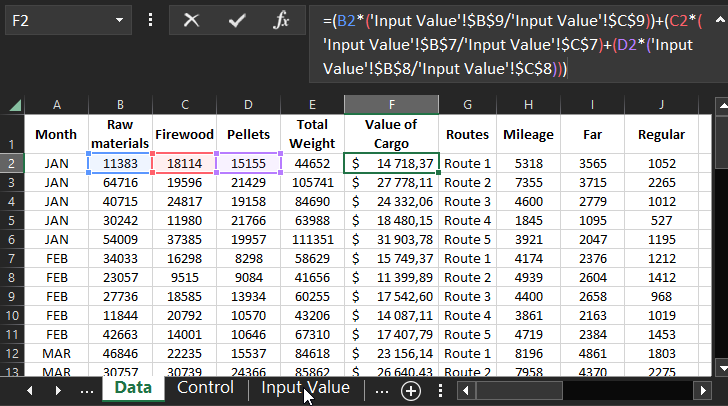
The raw data of the logistics performance statistics are filled in on the "Data" sheet in the corresponding columns without formulas:
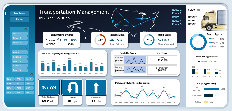
Structure of Logistics Performance Dashboard in Excel
The dashboard for analyzing the efficiency of logistics management has a complex structure and consists of many blocks. Let's consider all the purposes of each of them.
On the left side is the dashboard control panel, which consists of 4 blocks of buttons:
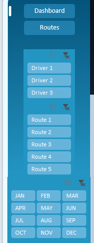
The first two buttons are for switching between the two modes:
- Visual analysis of the overall picture of logistics performance on the dashboard.
- Presentation of the indicators of cargo transportation routes by U.S. cities.
Below is a block of 3 buttons to separate the data by filtering separately for each driver.
Next is a block of 5 buttons for segmenting the indicators by route.
On the fourth block of the control panel there are buttons for selecting data by months. The structure of the buttons is in ¾ format to make it convenient to select both by months and by quarters.
In the center in the dashboard header is an interactive Map Chart for schematic representation of route directions through key delivery cities.
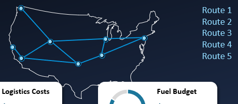
If you select a single route or an entire group, the supply chain layout on the U.S. map changes accordingly.
Below are the 3 blocks of the first plan with the final key values:
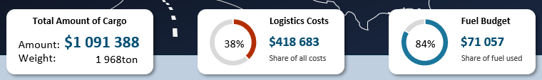
- The total value of the transported cargo for the accounting period, as well as its total weight. In fact, this indicator is equal to the indicator of the company's turnover or as close to it as possible.
- Total indicator of logistics costs. The diagram shows the share of logistics costs in the total turnover of financial resources.
- Total fuel consumption and its share in the allocated budget in this accounting period.
Below the blocks there is the Bar Chart of the total cost of transported cargo by months:
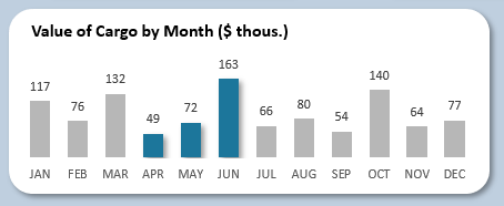
This Bar Chart is able to display selected accounting periods on the dashboard control panel. This is how the figures for the second quarter are highlighted.
On the right side is a block of charts and cost indicators:
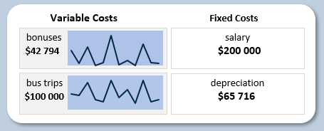
Secondary logistics costs to pay:
- payroll;
- bonus rewards;
- depreciation;
- travel expenses.
Immediately below this block is a graph of the dynamics of distance traveled in miles by month:
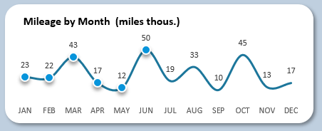
The graph is also able to expose selected periods with markers. The picture shows how the selected period looks like - the first half of the year.
On the left there are 3 blocks of mileage indicators at once:
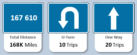
- Total distance covered.
- Course distance not completed.
- The number of completely passed route distance or more.
In the upper right corner of the dashboard there is a slider with a photo of the cars of the selected drivers:

When you select a driver, a photo of his respective vehicle is displayed. Also, when switching between routes, the driver responsible for the route and his truck is automatically selected.
Below is the Pie Chart divided into segments of the distance run categories:
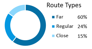
here we analyze the ratio of the number of distances covered with different distance categories:
- long route;
- medium;
- short.
At first glance an unusual, but very important logistical indicator for rapid re-planning of the route scheme. And also to test strategies for scaling coverage and covering new areas.
Graph with grouping for comparative analysis of transported goods in relation to drivers:
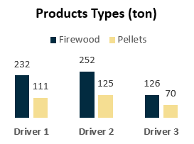
The assortment basket consists of only two items: bio-firewood and pellets. Each driver delivered a different number of tons of finished products in different product groups.
Comparative graph of the distribution of the number of tons of cargo by product categories:
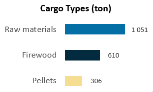
Wood and pellets were produced from the raw material and all were transported through our logistics chain in the procurement and sales processes in a substantially covered area of the United States.
The overall dashboard picture for visual analysis looks like this:
 Download Logistics and Supply Chain Management Analysis in Excel
In the next article, we'll break down the second dashboard screen for route management analysis. There you will find a more interesting solution in Map Chart for the presentation of route diagrams through key cities in the U.S. and much more:
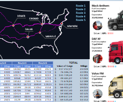 How to make a Map Chart for logistics management in Excel
All of the functionality of this template is implemented without the use of macros. The file is open and suitable for any security policy on any office.
The topic is logistics for data visualization is too broad to cover all of Excel's capabilities in this area of analytics with one example. Therefore, there will be many more templates for solving logistics problems in Excel with interactive data visualization on the dashboard.
