How to use tools to create BI dashboard template in Excel
Example of developing a BI dashboard in Excel with data slicers function for multiple conditions: month, year, department. The step-by-step process of developing a BI dashboard in Excel is presented below in a video tutorial. You can download the ready-made data visualization template in business intelligence style at the end of the article.
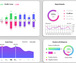
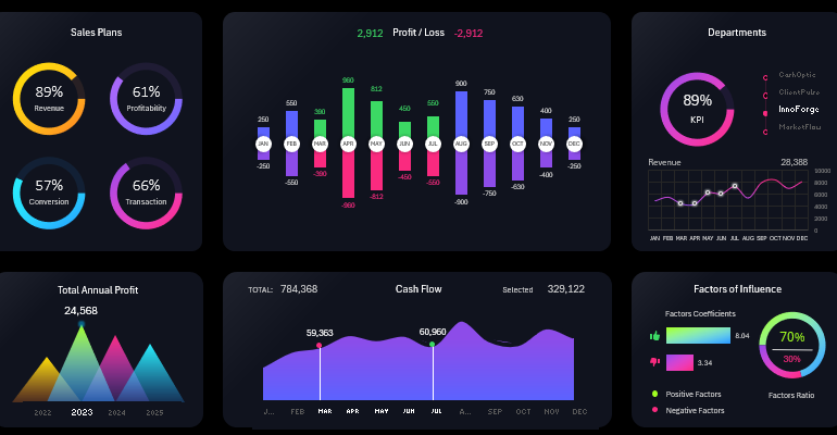
Structure of Visual Data Presentation by Key Indicators
The BI dashboard grid consists of six visualization blocks. Three blocks contain interactive presentation control elements. Let's consider the purpose of each block.
Sales Plans
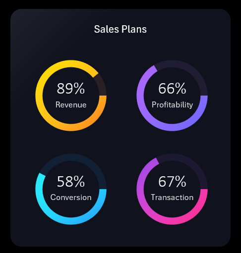
Four identical key performance indicators of sales plans represented as separate charts in percentage values:
- Revenue plan attainment.
- Profitability plan.
- Sales conversion plan.
- Percentage of successfully closed deals plan.
An important feature of these charts is the ability to display plan overachievement with values exceeding 100%. In this case, the entire pie chart is colored with the corresponding color, and overachieved values are displayed with a portion of white color.
Overall Annual Profit
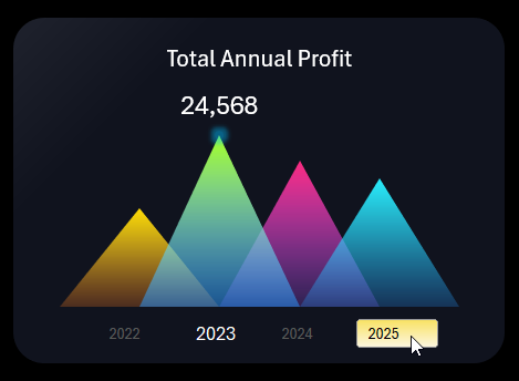
Simple visualization of overall profit levels for quick visual comparative analysis by year. This block also contains a BI dashboard control element for data slicing. It should be used to switch between years using slice buttons, which simultaneously serve as X-axis labels.
Cash Flow
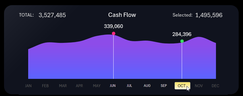
In this block, we observe the dynamics of monthly cash flow levels over the course of a year. This block also contains a slice control element. Sometimes, it's necessary to select a whole range of values from the reporting period. The MS Excel application provides us with this capability. To do this, hold down the left mouse button and drag the cursor over the selection conditions. In this example, these are the names of the necessary months for data slicing on the BI dashboard. Additionally, you can achieve the same result by separately clicking on slice buttons while holding down the CTRL key on the keyboard.
Factors Impact on Results
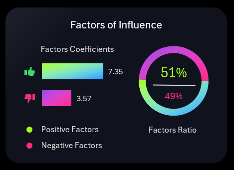
On the left side of the horizontal histogram, positive and negative factors influencing the business are compared in absolute terms.
On the right side of the diagram, these two values are compared in percentage terms as relative values.
Profit and Loss Statement
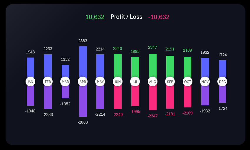
A non-standard butterfly chart for Excel. Here, everything is logical and clear. As seen in the image, data selection over a period using slicing by months also affects this visualization block.
Segment Data of the BI Dashboard by Departments
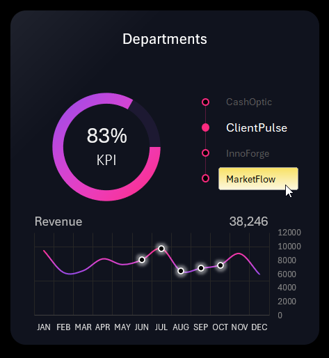
The chart presents the KPI plan attainment indicator by departments. Below, on the line chart, you can observe the dynamics of revenue changes. This block also contains a visualization data slice control.
The control element in this block allows us to obtain BI dashboard functionality on overall data visualization. Using this slice, we have the ability to segment all dashboard data separately for each department of the company. Once we specify which department to filter the data by, we immediately transform the summary company report into a detailed departmental report. This advantage is a key distinguishing feature of the BI dashboard.
Why Do You Need a BI Dashboard and Where to Apply It?
A BI dashboard is a business intelligence system. Its main function is to assess the current state of the business for making strategic decisions. Its easily understandable data visualization facilitates understanding the current state of the business and identifies trends and patterns using charts or diagrams. As shown in the example:
 Download an example BI Dashboard template in Excel
As shown in the video tutorial above, all the interactive functionality of the dashboard can be implemented using standard Excel tools - without using macros.
Considering the exponential growth dynamics of information volume in the world, greater demand for BI dashboards and not only in business should be expected.
Read more about this in the previous article: