Using Business Intelligence Dashboard with Excel for report
In modern business, where data volume is increasing every day, effective information management becomes a key element of success. Given this fact, it is worth paying attention to modern solutions in the field of data visualization. Just as every car needs a dashboard, so does every business need a dashboard to monitor its condition in different situations and conditions of operation. Without a dashboard, you won't get far. Perhaps for this reason, 90% of businesses close within the first 2 years after opening. I believe that if drivers did not use dashboards in their cars, their vehicles would also fail within 2 years of operation in 90% of cases. Therefore, the question is not whether data visualization is needed for business. It is much more important to focus on the question: "Which modern dashboard will provide a competitive advantage?".
Advantages of BI Dashboard for Business Reporting
A specialized application for developing dashboards with data visualization is called Power BI. The abbreviation BI stands for "Business Intelligence". The main advantage of BI dashboards lies in their ability to convert vast amounts of information into simple, easily understandable charts and diagrams.
Another advantage to consider is the improvement in the productivity of strategic planning to enable lightning-fast reactions in the search for optimal solutions.
Another important advantage is the motivation to achieve results. Sufficient research has been conducted on this topic, confirming the impact of regular visual presentations of progress on employee productivity indicators. Even the presence of a simple progress bar scale helps employees significantly increase their sense of impact on results, thereby increasing their desire to achieve goals faster.
At the same time, MS Excel is a versatile analytical and computational software tool capable of creating charts and diagrams to visualize summarized data. Therefore, the logical question arises: "Can MS Excel's standard tools create a BI dashboard?". Let's try to implement this task in practice, which will naturally give us the best answer.
What is a BI Dashboard and How to Use It in Business?
Before composing a technical task for dashboard development, let's first delve a little deeper into what Business Intelligence is and what key differences BI dashboards have compared to ordinary data visualization. If you need to master an object, simply study it.
A BI dashboard, like any other report with data visualization, should be able to tell the story of your business based on statistical data of financial and economic indicators. However, this should be limited to only key work processes to avoid overloading the user with information and maintain a balance between ease of perception and the significance of the information.
The user should be able to: track performance, conduct monitoring, perform analysis, etc. The developer should provide the minimum set of features that will allow for quick, simple, and easy decision-making based on well-founded decisions. To achieve this effective result, BI dashboards provide the function of segmenting data visualization. That is, to break it down into parts, filter, and expose it to easily focus on key values that have the greatest impact in a particular situation.
Therefore, to develop a BI dashboard in MS Excel, it is important to pre-think and prepare the structure of the source data. Correctly combining sources of various databases in tables will give us a comprehensive overview of the business's state.
At all stages of development, it is important to remember that we need a powerful tool that provides business leaders with up-to-date, accurate, and visually appealing information. No compromises! Only in this case will the Business Intelligence dashboard serve as the heart of management information in any business project.
The Role of Data Visualization in Business
Data visualization itself is a very important tool in any type of business. Its usefulness is hard to overestimate. Graphs, diagrams, heat maps - these are all tools that help make information accessible and understandable to all levels of management structure. Moreover, in the near future, it will go beyond corporate use and will be applied even in household devices. There will be a mass adoption and it will conquer the mass market. Like any successful solution, it will go through all stages of the evolution of consuming a new product:
- Innovation. The process of product birth, just starting to enter the market and capture the media field of attention through the media.
- Exclusivity. The new product is still expensive and not widely available, but its usefulness fully justifies its cost. At this stage, consumers often use the new product to confirm their high status.
- Entertainment. The product is still not cheap, but it is already more affordable in price, and it has already proven its value and usefulness in practice. Thanks to this, it has gained popularity.
- Household belonging. At this stage, the product has the lowest cost, but the widest consumer base. Affordable price, useful unique and indispensable qualities make it an integral part of a person's life. Also, it becomes an integral part of the history of humanity. Thanks to this, the product becomes self-realized and brings the greatest profit.
This process is inevitable. Data volumes are growing exponentially. The problem of information overload is becoming more and more common. Data visualization will organize large volumes of data in such a way as to relieve us from the daily process of absorbing gigabytes of information garbage. With the integration of data visualization into our lives, we will be able to focus only on the key indicators most important to us in a particular situation under specific conditions. Today, the fear of missing important information in a huge stream of info-garbage overloads our physical abilities to concentrate and practically paralyzes us. Today we need more freedom for development, and we so rarely get it that we have already forgotten how to use it. Data visualization developers await tremendous market growth to realize their creativity.
The Power of Business Intelligence and Data Visualization in MS Excel
Business Intelligence and data visualization mutually reinforce each other. As a result of their fusion, we get BI dashboards. This symbiosis allows business leaders to quickly recognize key insights and adapt to changing market conditions. In fact, the MS Excel application allows us, at a basic level, to perform the merging of BI & DataViz. It's a bit more complex than standard visual reports because we'll need:
- Properly organize the table structure with the source data.
- Create an intermediate pivot table.
- Add data slicers control elements.
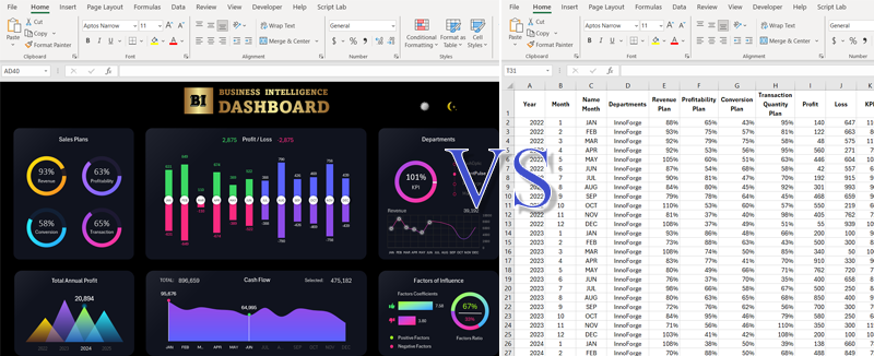
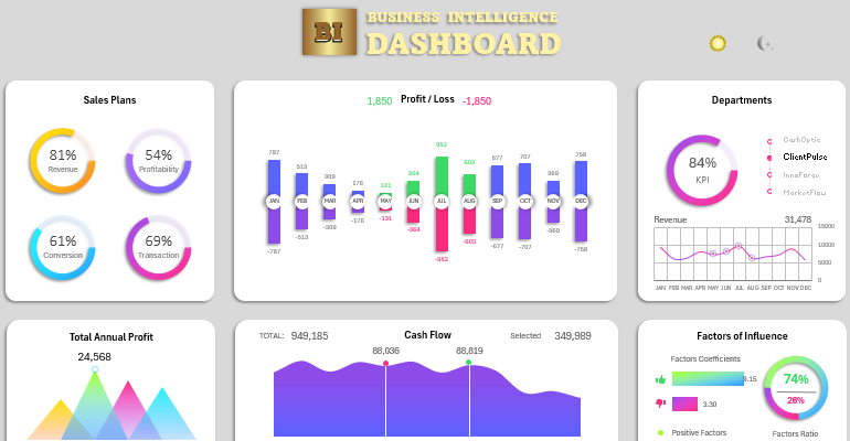
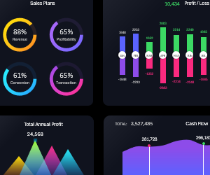
Luckily, all of this is available in the arsenal of MS Excel tools, and with this, we can attempt to create our own BI dashboard. You can see how it turned out for me by downloading the ready-made example in Excel document format below:
 Download Business Intelligence Dashboard in Excel
This example BI dashboard contains control elements for segmenting visualization data. It has interactive capabilities but does not use macros. Only standard tools were used for experimental purity. How the BI dashboard is structured and its operating principles when used are described in detail in the following article:
Naturally, for creating BI dashboards, it is better to use specialized software tools such as the Power BI application. But what if you are an active user of MS Excel, and the entry threshold into the principles of Power BI development is currently too high for you? Or do you just need to quickly create a visualization prototype? MS Excel can also help you with this, albeit at a basic level.
Create and, more importantly, practically apply BI dashboards in business and beyond. Their proper use helps to create an analytical culture in the organization, which is the foundation for sustainable growth and successful business management.
