Analysis Sale of learning Courses Excel Dashboard Download
Example of a dashboard with interconnected source data in four categories for segmenting the report structure. We offer you a versatile data visualization with a complex structure for segmenting interrelated reporting metrics. On this dashboard, you can finely track sales figures of training courses, video lessons and books by visualizing data in Excel under different criteria of value sampling conditions. You can download a finished example at the end of this article.
Correlation Analysis of Training Course Sales in Excel
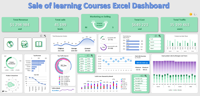
In the header of the dashboard are the totals of the indicators and not only:
Dashboard for correlation analysis of sales by multiple criteria
A professionally designed and developed dashboard in Excel should be able to tell an interesting story about all the indicators in the report with the help of informative data visualization. Traditionally, we first simulate the situation of practical application of the next dashboard, but this time the data story will be fascinating - it is promised without exaggeration!
And so, the example is as follows. An educational enterprise for publishing training programs in the highly specialized field of Excel data visualization has developed 3 new info-products:
- A paid online course: "Developing Dashboards in Excel."
- A series of video tutorials on "How to Make Dashboards in Excel".
- An illustrated tutorial, "Dashboards in Excel for Dummies."
All of the above information products have become bestsellers due to their effective promotion on the World Wide Web. The marketing team in the enterprise simultaneously used six channels to attract traffic to the landing page (landing page) in order to collect orders (leads). Naturally, the budget for the campaign is not evenly distributed, since each traffic channel has a different:
- promotion opportunities;
- conversion rates;
- responses and interactions of the target audience, etc.
Therefore, sales figures for different traffic channels are also significantly different. Four sales teams with 4 employees in each department worked on processing requests at once:
- Northern department.
- Eastern department.
- Southern department.
- West.
At first glance, the overall dashboard picture of the final results alerts us to a relatively even distribution of the effectiveness of sales managers in each team. But still, deep segmentation of the data tracks significant differences, as well as the strengths and weaknesses of salespeople across the different products offered. To expose these differences in order to perform a correlation analysis of sales allows 4 blocks with controls of different segmentation categories:
- By training products.
- By month.
- By sales teams.
- By traffic source channels.
All categories in this report are interrelated and allow you to separate reporting into thin segments for in-depth analysis and presentation of obvious correlations of product sales figures.
Such a multifunctional dashboard allows you to solve many strategic tasks for your enterprise. This example clearly shows us how much the overall picture of the report can differ from the complex segmentation of dynamically changing individual indicators. The seemingly evenly distributed overall picture of the totals as a result of the comparative analysis contains many jumpy sales realizations that require urgent attention. They need to be identified not only to prevent errors, but also to identify significant new opportunities on the way to shortening the time to financial goals.
Presenting such a report with data visualization in Excel solves many problems simultaneously. Here is a short list of correlation analysis tasks solved with such an interactively structured visual dashboard report:
- Dependence of each training product on annual seasonality.
- The relationship of product type and audience loyalty across different traffic communication channels.
- Effectiveness of each source for attracting traffic during different periods of the year for different communication products.
- The difference between audiences from different sources in terms of retention rates when contacting and interacting with a salesperson.
- The effectiveness of sales teams on:
- products;
- selling period;
- traffic channels.
This list of features of this tool can go on for dozens of items. It's better to go straight to the principles of work and structure of the dashboard.
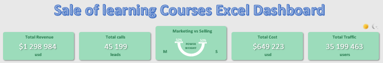
As you can see in the central block there is an unusual infographic in the form of a scale chart. Here, using elements of infographics, the ratio of the weight of the invested efforts of the marketing and sales teams for the overall growth of the company is visualized (the greater the value, the greater the weight and the lower the "cup" of the scales). In every enterprise there is a conflict between marketers and salespeople, as they do not want to share wins and losses equally. As soon as sales fall between these departments, mutual accusations begin immediately. Marketers bring in few and low-quality requests (leads), and the sales team handles them poorly and too slowly. On the one hand, the business manager must make friends with the marketers and salespeople, on the other hand, it is important for him to understand where the causes of the decrease in sales come from. The correlation analysis allows to trace where the main problem of non-fulfillment of KPI plans comes from, which team and for what reasons. In the same block you can only visually understand from which team you should start the analysis if the forces invested are unbalanced. And also in the process of segmenting the data according to various criteria, this diagram informs when and under what conditions the efforts were unbalanced between marketers and salespeople.
More information on "how to befriend marketing and sales" can be found here:
 Excel Comparative and Correlation analysis of sales download.
Download a dashboard for comparative and correlation analysis of marketing and sales results. How do you friend marketing and sales with an Excel report?
Also on the right side of the dashboard's header is the first control to switch between daytime and nighttime interface design styles for user-friendly use of the dashboard at different times of day.
Next comes a block of three buttons to toggle and exceptions selling education products:

- Online Course.
- Video lessons.
- Book.
You can use this element to group, filter, and segment indicators by this category of value selection criteria.
Next is chart of selling by month:
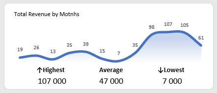
The values in the captions are rounded to thousands for easy readability. Under the chart, the highest and lowest values for the accounting period of 1 year are selected. As well as the annual average (in the center).
A block of two charts for a visual analysis of the ratio of sales calls to no results (any type of communication with customers). Although the second category is only conventionally called ineffective calls, because there is still an important effect in marketing - warming up of the client, who may eventually take a positive decision in response to the proposal:
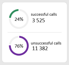
The figures are given in relative (percentage) and absolute values (number of fact).
A bar chart block to analyze the distribution of volume across all sales teams:
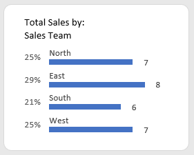
Also, the values are displayed both as relative and absolute (rounded to thousands for readability on the dashboard).
A block of buttons to switch between departments on the entire dashboard:
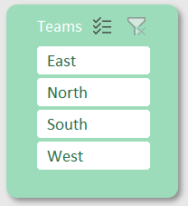
Teams can be selected either individually or in groups.
Bar chart to analyze the distribution of types of training products by sales teams directly:
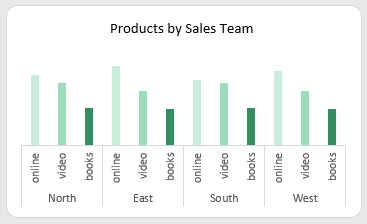
There are no indicators in this block, only a visual comparison of which department and how each info-product is sold.
Diagram of the final distribution of sales volume by product:
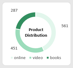
Here we track which product sold more or less relative to other products under certain data segmentation conditions. Absolute figures are in numbers and relative figures are visualized.
The block for the comparative analysis of changes in the dynamics of revenue by month and by digital goods:
In the lower right corner there is a switch of two modes for displaying the total change in dynamics and separately by products.
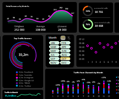
The block of rating of channels of customer attraction by success in selling, as well as analysis of expenses of the same traffic channels:
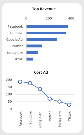
In this block it is important to present two charts at once in order to trace the interrelation of incomes and advertising expenses. The signatures of the names of the traffic sources in the expenses are sorted according to the profitability rating. As you can see in this case, expenses are correlated with revenues - and they should be. But in case the pattern is broken in the comparative visual analysis, it is important to pay urgent attention and apply appropriate measures to avoid draining advertising budgets!
Visualization of the leading channels of client attraction by the amount of attracted traffic:
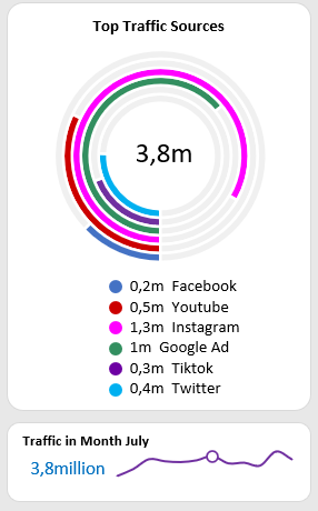
The bottom of the sparcline shows the change in the dynamics of the total traffic by months. The current month is determined by the button on the month selection controls block. If the month is not selected, the value for the current year is displayed.
The block of buttons for selecting months:
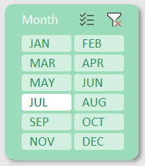
You can select months individually or in groups. For example, if you want to visualize different accounting periods on the dashboard: month, quarter, half-year, year.
A block of indicators of the duration of customer retention during a call or any type of communication with a salesperson:
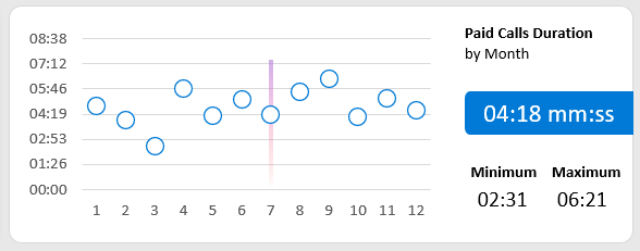
On the one hand, the longer the duration of seller-consumer communication, the greater the likelihood of closing the deal. But at the same time, the level of expense increases proportionately. That's why one dashboard is always better than a dozen different reports. After all, some indicators must correlate with others in order to properly compare them and assess the current situation. And also to develop long-term and medium-term strategies.
Analysis of traffic channel shares in each month:
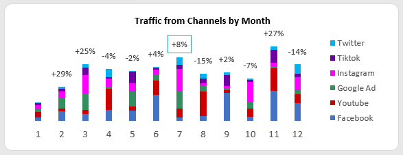
Here you can visually assess how traffic is distributed by source on a monthly basis, for an entire year under different criteria of all filter slices.
The channel management block for advertising traffic sources:
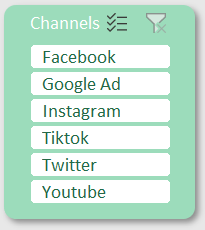
The selection can be grouped as on all other blocks with dashboard controls.
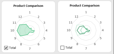
Visualization of managers' activity in each teams for each training product:
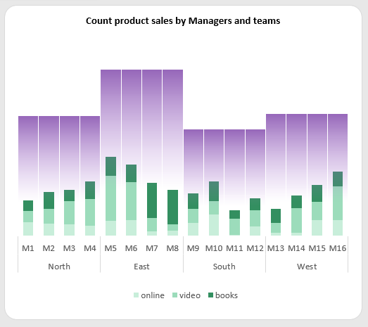
Each team includes 4 employees and each sells 3 information products. Correlation analysis on the dashboard under data slices control allows you to expose the best employees in the best training products under different conditions at different times of the year.
All of the data visualization blocks presented above merge harmoniously into a coherent multifunctional dashboard for correlation analysis of retail selling of training products:
 Download the dashboard development course sales visualization in Excel
All data visualization elements are built on tables with formulas on the "Processing" sheet. But all dashboard control functionality is based on summary tables from the "Control" sheet. The data source for all crosstabs is on the "Data" sheet. The interactivity and automation of dashboard management is implemented without the use of macros. Only standard Excel tools are used: formulas, crosstabs, and form controls.
