Beautiful dashboard for analyzing sales processes in Excel
Excel, the most versatile analytical application, can also create beautiful dashboards with sophisticated algorithms for interactive data visualization. Even without using macros. It's very convenient to have tables with input data on various sales processes and a dashboard with a nice comfortable design for their visual analysis in the same application. In order to present Excel as a dashboard development platform we have presented a new project.
A beautiful dashboard should be able to tell a story about the processes
Let's simulate the situation to draw up a terms of reference for the developers' department of interactive data visualization in Excel. A young company has been on the market for 5 years and has managed to scale well during this period:
- In terms of financial sources of capital inflows.
- By the number of objects for investment.
- Geographically in terms of coverage by opening new branches in 8 of the largest and most populous cities in the United States.
Any business is always the sale of goods or services. There is no business without sales. Therefore, it is always important to analyze all sales processes of a company during its existence.
Attention the main strategic goal of the analysis! It is necessary to analyze and determine the prospects of the company while choosing the priority of investment in one of the three above-mentioned areas for further scaling. After all, any market strives for monopoly, and any business for expansion. And all this in order to survive.
The result of the analysis will also determine the strategy for the further life of the company. Perhaps in all three directions we will face significant obstacles in the near future and the company will have to change its business strategy in the direction of investment to hedge risks. After all, the difference between a businessman and an investor is fundamentally significant:
| Businessman | Investor |
| Loves his job | Shouldn't love his job |
| Basic income from operating profit | Basic income from capitalization |
| Should focus | Should diversify |
| Striving for growth in profits | Striving for sustainable capital preservation |
| Analyze the benefits of his business | Analyze the risks of his business |
| He makes money with his love for work | He makes money with someone else's love for work |
| The main skill is labor management | The main skill is efficient investment of labor |
| Employs his people for profit | Employs his money for profit |
Interesting fact! The richest businessmen always earn more than the richest investors.
But what will be the further strategy of the fate of the company? A visual analysis of sales processes on a beautiful dashboard with interactive report presentation capabilities will show everything.
Possibilities of Excel for developing beautiful dashboards on sales
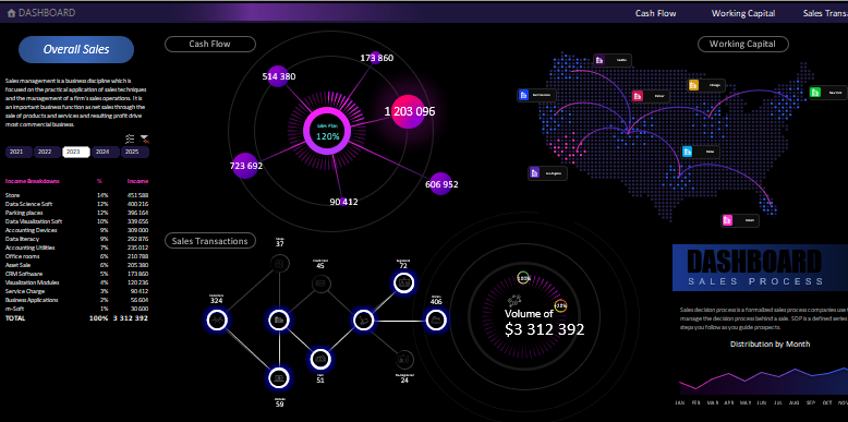
The structure of this dashboard for the presentation of sales processes in Excel consists of three main blocks of visualization:
- Cash Flow.
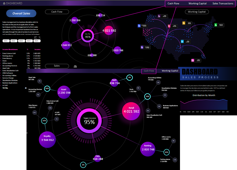
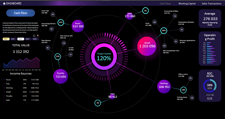 Circulation and direction of capital flows on financial assets. Allows you to anticipate and timely eliminate cash gaps. All processes in the phases of charting are described here step-by-step:
- Working Capital.
- Sales Transactions.
Example of Cash Flow visual analysis on Combo Chart Excel
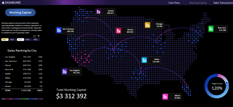 Allows you to visually analyze branch interaction activity over an accounting time period. Example description - how to make an interactive chart with a map:
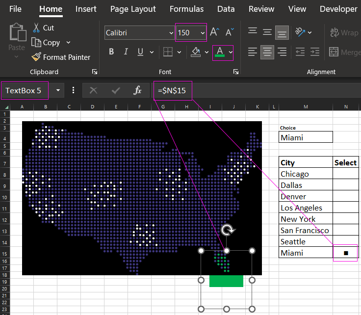
Example of creating simple interactive Map Chart in Excel
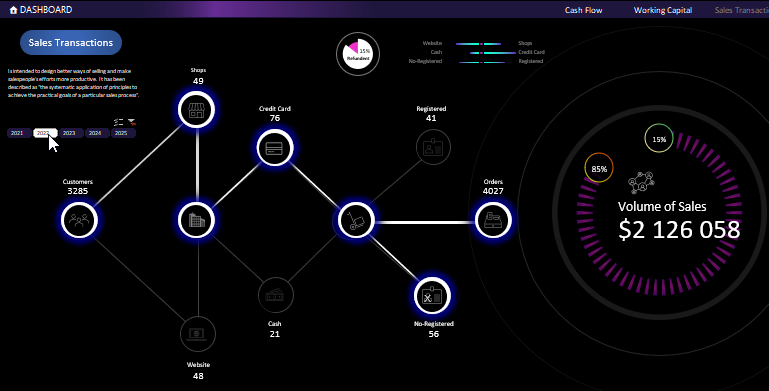
Visual analysis of transaction chains in sales processes. Interactive presentation of cash flow directions for customer financial services. Example of developing your own homemade chart in Excel with descriptions:
Other blocks of dashboard elements serve as auxiliary for the comfort of visual analysis:
- control block - allows you to interactively manage the dashboard for sampling and segmenting by accounting period (in this case 1 calendar year), either in groups or individually;
- menu block - allows you to dive deeper for a more informative and detailed visual analysis on any of the three main blocks;
- rating table - all data is automatically sorted in descending order;
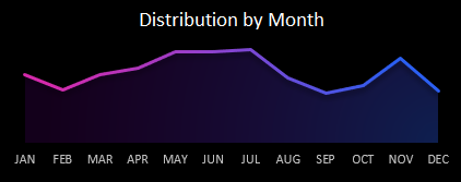
- monthly sales chart - distribution of total sales by months, taking into account the selected group of time periods;
- block with a header - the developer's or company's logo can be placed there;
- 2 blocks with a brief description.

All blocks as a whole are harmoniously combined into a beautiful dashboard as a general picture for visual analysis of the main sales processes carried out during the 5 years of the company:
 Download the most beautiful dashboard made in Excel
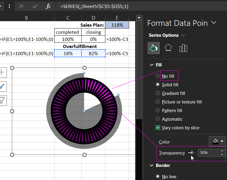
All the raw data are on the "Data" worksheet. No VBA-macros were used for the automation of the dashboard interactive capabilities. Such a visualization template does not represent a threat or limitation for the internal security policy of the corporation. The automation was implemented with standard Excel tools: formulas and summary tables. They are all located on the "Processing" worksheet. Some graphical resources you will find on the "Resources" sheet. They have a structure that is easy to edit. We took care of you! So you can free download, customize and edit the whole dashboard template to your needs.
